A stepper UI guides users through a multi-step flow — checkout, onboarding, signup wizard, survey — by visualising progress, current step, and what is still ahead. These 12 hand-coded steppers cover every production pattern: horizontal multi-step form wizard, numbered progress bar, e-commerce checkout with order summary, vertical timeline, animated icon steps, onboarding flow, breadcrumb tracker, validation states (success/error/warning), circular SVG progress, glassmorphism, dark mode, and animated connector lines. All semantic HTML with proper aria-current="step" and aria-valuenow, scoped .stp-NN__* class names so multiple steppers coexist on the same page, respect prefers-reduced-motion, and ship MIT-licensed. 11 use vanilla JavaScript for step navigation; 1 is fully static (Demo 03 — useful as a display-only checkout indicator).
12 unique steppers1 Pure CSS11 CSS + JS100% copy-paste readyPublished
01 / 12
CSS Multi-Step Form Wizard Progress Indicator
CSS + JS
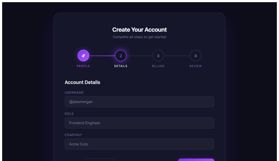
A 4-step account-creation wizard with animated node states, gradient connector lines, scoped pulse keyframe on the active step, and a checkmark success panel — all navigated by prev/next JS.
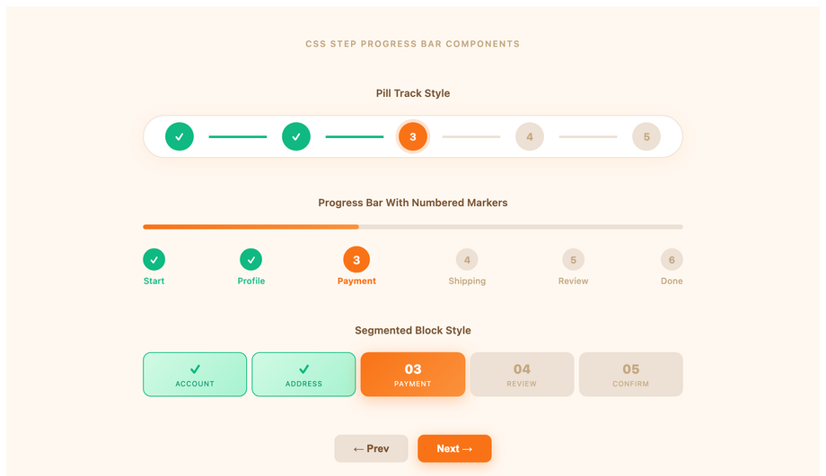
Three synced numbered progress bar variants on one page — a pill track, a segmented block bar, and a dot-connector strip — all advancing together from a single prev/next controller.
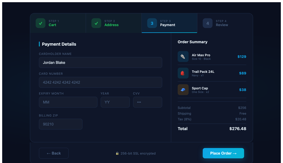
A dark navy e-commerce checkout flow with a tab-rail step header, sidebar order summary, three product line items, running totals, and an SSL trust badge — step state driven by JS class toggling.
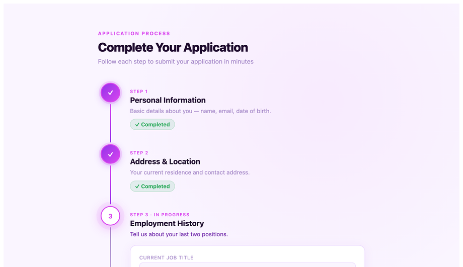
A vertical spine stepper where each step expands into a full content card when active, with fuchsia accent connectors, slide-in panel transitions, and a running progress bar on the left rail.
Icon bubble steps with a checkmark overlay pop animation, an SVG arc ring that advances its stroke-dashoffset per step, and a teal/emerald colour scheme — designed for onboarding and setup flows.
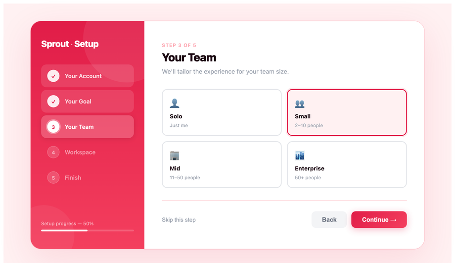
A full-panel onboarding layout with a left sidebar step list, animated slide-in content panels, choice card selections, a live progress bar, and a coral/rose colour scheme built for SaaS welcome flows.
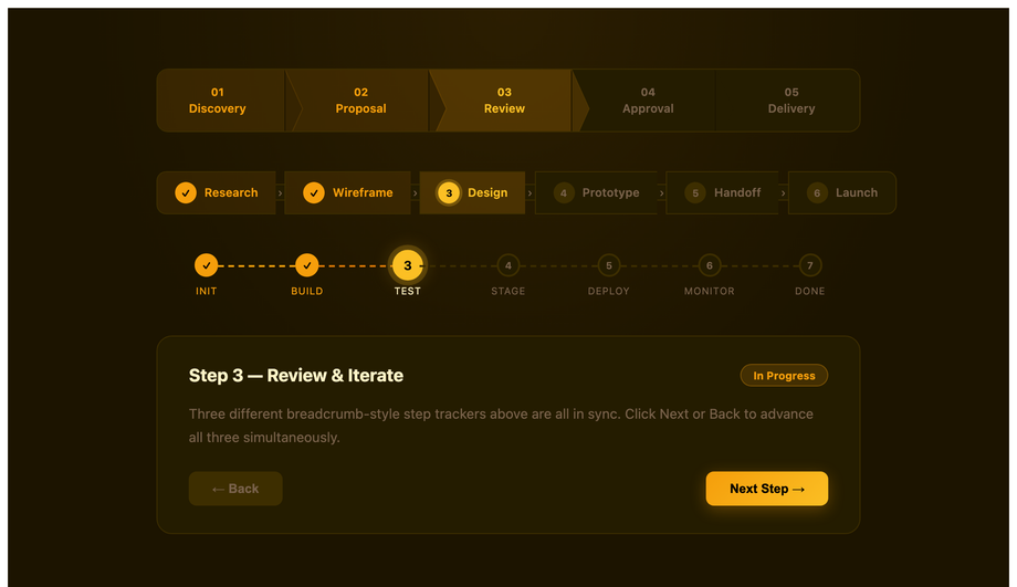
Three synced breadcrumb-style step tracker variants — chevron arrow tabs, a pill strip, and a dashed dot-connector row — all driven by one prev/next controller with an amber/gold colour scheme.
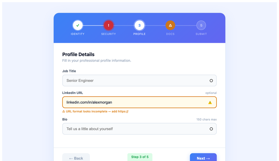
A blue/indigo form stepper where each step has live input validation — valid (green), error (red), and warning (amber) states — with per-field messages and a step-level badge that reflects the field result.
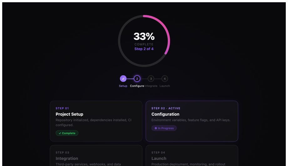
A centred SVG arc ring whose stroke-dashoffset advances per step, surrounded by a tile grid of clickable step cards — violet/purple accent on a near-black background ideal for dashboard headers.
Frosted-glass step cards layered over an animated aurora background, with backdrop-filter blur, cyan/teal accents, layered radial gradient orbs, and a multi-step panel flow inside the glass container.
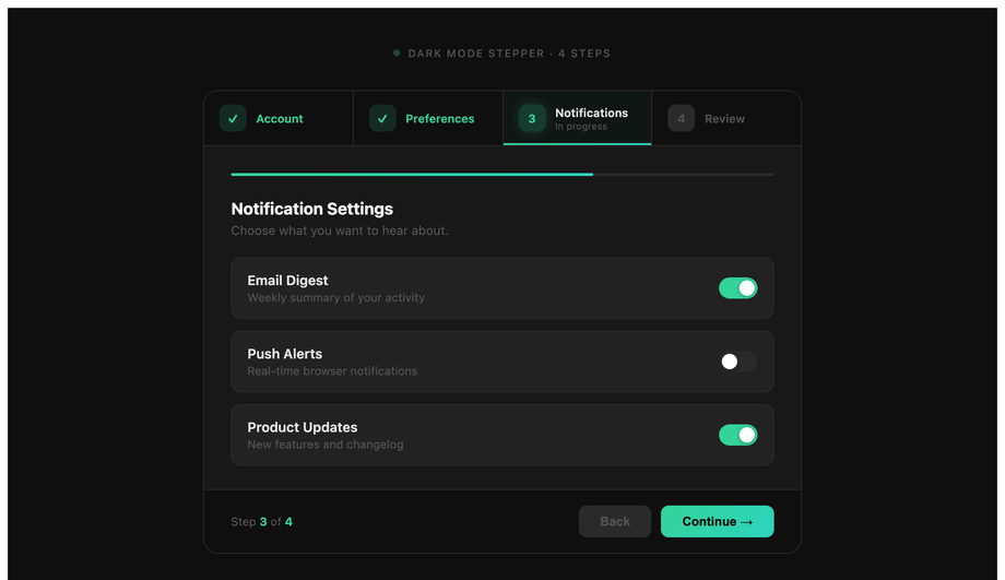
A dark green/teal step component with a tab rail showing step sublabels, a mini progress bar beneath the rail, a light/dark theme toggle, and a completion summary panel at the final step.
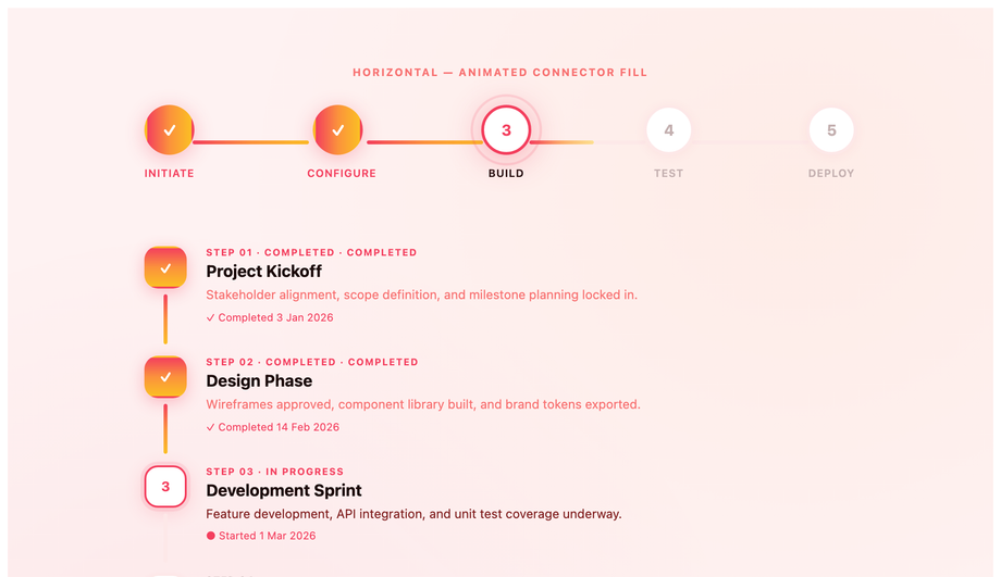
Animated fill connector lines in both horizontal and vertical layouts — a shimmer sweep runs along the line as each step completes, with ripple ring bursts on the active node and a rose/orange/amber gradient palette.
What is a stepper UI component and when should I use one?
A stepper is a UI component that breaks a long task into smaller numbered steps, visually showing the user where they are, what is done, and what is still ahead. Use a stepper when: <strong>(1)</strong> the task has 3+ discrete sequential phases (checkout: cart → address → payment → review); <strong>(2)</strong> each step has its own validation or decision point (the user can't skip ahead); <strong>(3)</strong> the cognitive load of all fields on one screen would feel overwhelming (signup with 12 fields → 3 steps of 4 fields each). Don't use a stepper when: the task is fewer than 3 steps (just use a single form with section headers); the steps can be completed in any order (use tabs instead); or when users frequently want to jump between steps (steppers imply linear progression — for non-linear flows use tabs or a sidebar nav). The 12 demos in this collection cover the main use cases: form wizard (Demo 01), checkout (03), vertical timeline (04), onboarding (06), breadcrumb tracker (07), validation states (08), and circular progress (09).
Should I build with Material UI's Stepper or vanilla CSS?
Material UI's <code><Stepper></code> component is excellent if you're ALREADY on React + MUI — it ships with the rest of the MUI bundle (~95kb gzipped) so the marginal cost is zero. <strong>If you're NOT on React+MUI</strong> (Astro, Vue, Svelte, Rails ERB, plain HTML, WordPress) — installing MUI just for a stepper adds 95kb to your bundle for one component. This collection's 12 steppers drop in as semantic HTML + scoped CSS with zero framework dependencies. The 11 JS-enhanced demos use ~30-50 lines of vanilla JavaScript each — no library imports, no React/Vue/Angular tie-in. Aesthetically, the multi-step form (Demo 01), checkout (03), and circular progress (09) match MUI's production polish without the framework lock-in. <strong>Tailwind UI's stepper</strong> costs $300+ and ships as React JSX. <strong>Ant Design's <code><Steps></code></strong>, <strong>Chakra UI's stepper</strong>, <strong>react-step-wizard</strong>, <strong>react-stepper-horizontal</strong> all add 8-50kb to your bundle. MIT-licensed, free, modify-and-resell allowed.
How do I build a checkout stepper (Stripe / Shopify style)?
Demo 03 (CSS Checkout Stepper UI Component) ships the canonical e-commerce pattern. The pattern: <strong>(1)</strong> A horizontal tab rail at the top with 3-5 numbered steps (Cart → Address → Payment → Review), each with a number icon + label. Completed steps swap the number for a checkmark + green background tint. The active step has a 2px gradient underline. <strong>(2)</strong> A two-column body: left column is the active step's form fields (~60% width); right column is a sticky order summary sidebar with product line items, subtotals, taxes, and total. <strong>(3)</strong> Navigation buttons at the bottom: a secondary "Back" button and a primary "Continue" (relabeled "Place Order" on the final step). Three production-grade details most checkout tutorials skip: (a) <strong>Save state across steps</strong> so refreshing doesn't lose data — use <code>sessionStorage</code> with the step data serialised as JSON. (b) <strong>Disable the active-tab click handler</strong> for FUTURE steps so users can't skip validation. (c) <strong>Show validation errors per step</strong>, not on the final review screen — the user lost context by then. ~50 lines of JS, fully framework-neutral.
How do I add validation states to a stepper (success / error / warning)?
Demo 08 (CSS Stepper With Validation States) ships the pattern most stepper libraries skip — distinct visual states for <code>.is-done</code>, <code>.is-error</code>, <code>.is-warning</code>, and <code>.is-active</code>. The standard "done / active / inactive" tri-state most steppers ship loses information when validation fails. Production-grade implementation: <strong>Done</strong> = green circle with white checkmark (✓), green connector line ahead; <strong>Error</strong> = red circle with white X mark (✕), red connector line to the next step, red helper text below the step label; <strong>Warning</strong> = amber circle with exclamation mark (!), amber connector, "some fields need review" text; <strong>Active</strong> = blue ring with the step number, gradient connector ahead in muted color; <strong>Inactive</strong> = gray circle with number, gray connector. JavaScript validates each step on "Continue" click and adds the appropriate class to the step element. Screen reader support: use <code>aria-invalid="true"</code> on error steps and <code>aria-describedby</code> pointing to the helper text. ~40 lines of JS.
What's the difference between vertical and horizontal stepper layouts?
Use <strong>horizontal</strong> when you have 3-6 steps with short labels (one or two words each) and the user typically completes one step at a time before moving to the next — <strong>checkout, signup wizards, surveys, configuration wizards</strong>. The horizontal rail saves vertical screen space and the visual emphasis is on "which step am I on". Use <strong>vertical</strong> when steps have longer descriptions, status text, or sub-content beneath them — <strong>order tracking, package delivery status, application processing, onboarding tutorials with text per step</strong>. Vertical layouts (Demo 04 — Vertical Timeline Stepper) work like a timeline: each step is a row with a marker on the left, title in bold, and optional description text below. The visual emphasis is on "what happened at each step". On mobile, even horizontal steppers often collapse to vertical because the limited width can't fit 5 numbered steps side-by-side — Demo 01 handles this with a CSS media query at 640px that switches <code>flex-direction</code> from row to column. Most stepper libraries default to horizontal-only; vertical is the gap.
How do I build an accessible stepper (keyboard navigation + screen readers)?
Four accessibility considerations matter for steppers, and the 12 demos in this collection address all of them. <strong>(1) Semantic HTML.</strong> Use <code><nav aria-label="Steps"></code> as the outer wrapper, <code><ol></code> for the step list, <code><li></code> per step. Don't use divs styled as buttons — use real <code><button></code> elements so keyboard activation works automatically. <strong>(2) <code>aria-current="step"</code></strong> on the active step. Screen readers announce "current step" alongside the step label so users know where they are without seeing the visual highlight. <strong>(3) <code>aria-valuenow</code> / <code>aria-valuemax</code></strong> on the outer container — turns the stepper into a programmatic progress bar. For visitors using a screen reader, this announces "Step 3 of 5" as they navigate. <strong>(4) Keyboard arrow navigation.</strong> Left/Right arrow keys move between sibling steps; Enter activates. Tab order keeps the next/back buttons reachable. Focus management: when the active step changes, move focus to the new step's first focusable field — visitors using a keyboard never lose their place. Common mistake most tutorials make: relying purely on visual color difference (green checkmark) without text labels — colorblind users can't distinguish done from active. Always pair color with a glyph (✓ vs number) or aria-label text.
How do I build a circular SVG progress stepper without a library?
Demo 09 (CSS Circular Step Progress Indicator) ships the pure-SVG implementation. The pattern: two stacked SVG <code><circle></code> elements at the same center+radius. The first (background) draws a full circle in a muted gray. The second (progress) has <code>stroke-dasharray="circumference"</code> (e.g. 188 for r=30) and <code>stroke-dashoffset</code> initially set to the full circumference (no visible stroke). JavaScript calculates current progress as <code>(currentStep / totalSteps) * circumference</code> and updates <code>stroke-dashoffset = circumference - progress</code>. The progress stroke fills clockwise as steps complete. Inside the circle, an <code><text></code> element shows "3/5" or a percentage. Cost comparison: <strong>react-circular-progressbar</strong> ships ~5kb minified + requires React. <strong>This demo's approach</strong>: ~30 lines of CSS + ~20 lines of vanilla JS, no library. The CSS <code>transition: stroke-dashoffset 0.6s ease-out</code> animates smoothly between step changes. Add <code>transform-origin: center</code> + <code>transform: rotate(-90deg)</code> on the progress circle so the stroke starts from the top (12 o'clock) instead of the right (3 o'clock default).
How do I build an onboarding stepper (Notion / Linear / Vercel style)?
Demo 06 (CSS Onboarding Stepper Flow) ships the SaaS-onboarding pattern that Notion, Linear, Vercel, Cal.com, and Figma all use for first-time user setup. The pattern: <strong>(1)</strong> Full-screen welcome layout with a centered card (max-width ~520px) containing the step indicator, current step's content, and navigation buttons. <strong>(2)</strong> Step indicator is minimal — just 4-6 dots or short bars with the active one elongated/colored. NOT the heavy numbered tab rail you'd use for checkout. The minimalism reduces visual noise so the visitor focuses on the question being asked. <strong>(3)</strong> Each step asks ONE question: "What's your team size?" → "How will you use Linear?" → "Invite teammates" → "You're all set". Each step has 2-4 answer options as large clickable cards or a single input field. <strong>(4)</strong> The final step is a celebration — confetti animation, "You're ready" message, primary CTA to the dashboard. Three production-grade details: (a) <strong>Skip option</strong> on every step except the last — never force users through onboarding. (b) <strong>Smart defaults</strong> based on previous answers — if they picked "Solo", skip the teammate-invite step. (c) <strong>Save state on every step</strong> so closing and reopening picks up where they left off. ~60 lines of JS.
Will animating connector lines / step transitions hurt my Core Web Vitals INP score?
Not if you follow the same rule as all other animations: <strong>animate <code>transform</code> and <code>opacity</code> only.</strong> All 12 demos in this collection follow this — connector line growth (Demo 12) uses <code>transform: scaleX(0) → scaleX(1)</code> with <code>transform-origin: left</code>, not <code>width: 0% → 100%</code>. Scaling is GPU-accelerated on the compositor thread; animating width forces layout recalculation on every frame, costing 4-16ms per frame and tanking <strong>INP (Interaction to Next Paint)</strong>, the Core Web Vital that replaced FID in March 2024. Two production gotchas specific to steppers: (a) <strong>SVG stroke-dashoffset animation</strong> (Demo 09 circular progress) IS expensive — each frame recalculates the stroke path. Mitigate by setting <code>will-change: stroke-dashoffset</code> on the progress circle so the browser promotes it to a GPU layer. (b) <strong>Animating background-color on step state change</strong> (gray → green when step completes) is a paint cost (~2-4ms per frame). Acceptable for one-off step transitions; would tank INP if you animated all 5 steps simultaneously. Demos in this collection sequence step state changes serially, not in parallel. Lighthouse mobile-profile scores: 95+ Performance on all 12 demos on a mid-tier Pixel 5 baseline.
Which stepper should I use for my project?
Quick decision guide for all 12 demos. <strong>E-commerce checkout</strong>: Demo 03 (CSS Checkout Stepper) — horizontal tab rail + sidebar order summary, the Stripe/Shopify pattern. <strong>Generic multi-step form (signup, application, survey)</strong>: Demo 01 (Multi-Step Form Wizard) — clean form-focused layout with progress indicator. <strong>Order tracking / delivery status</strong>: Demo 04 (Vertical Timeline Stepper) — vertical layout with timestamps + status text per step. <strong>SaaS user onboarding</strong>: Demo 06 (Onboarding Stepper Flow) — minimal dot indicator, one question per step, the Notion/Linear/Vercel pattern. <strong>Article reading / tutorial progress</strong>: Demo 07 (Breadcrumb Style Step Tracker) — horizontal breadcrumb with arrow separators. <strong>Form with field-level validation per step</strong>: Demo 08 (Stepper With Validation States) — distinct error/warning/success visual states. <strong>Profile completion / setup wizard</strong>: Demo 09 (Circular Step Progress Indicator) — single circular progress ring with X/Y count inside. <strong>Premium / design-forward brand</strong>: Demo 10 (Glassmorphism Stepper) for frosted aesthetic; Demo 11 (Dark Mode Stepper) for technical/developer brand. <strong>With visual emphasis on transitions between steps</strong>: Demo 12 (Connector Line Animation) — animated lines connecting steps as the user progresses. <strong>Icon-driven steps (account, address, payment)</strong>: Demo 05 (Animated Step Indicator With Icons). <strong>Static display only (no JS interaction)</strong>: Demo 02 (Step Progress Bar With Numbers) or Demo 03 in static mode. All 12 demos use semantic HTML with <code>aria-current="step"</code> + <code>aria-valuenow</code>, respect prefers-reduced-motion, MIT-licensed.