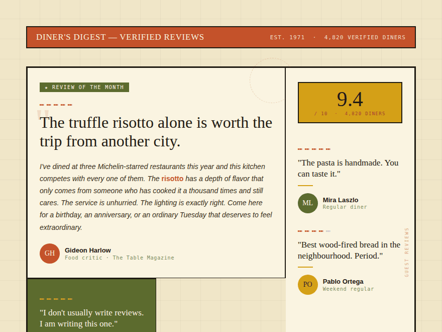
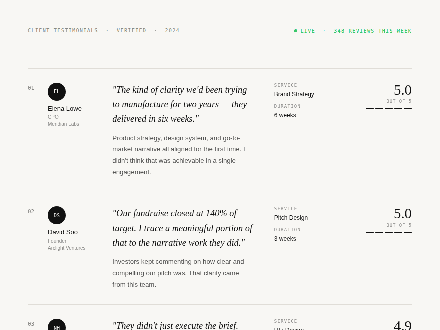
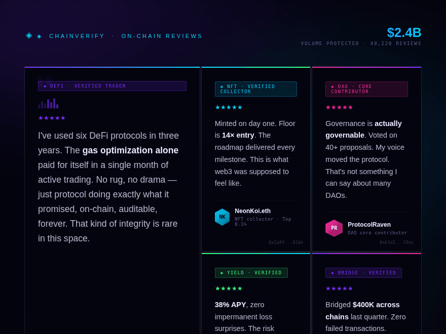
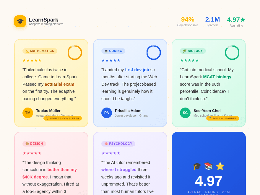
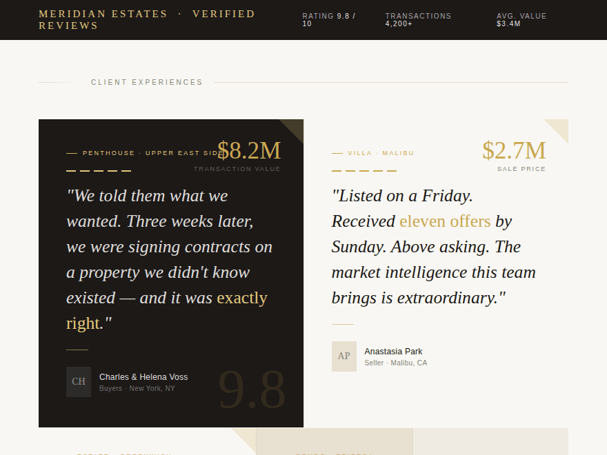
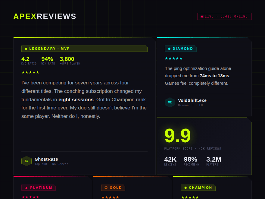
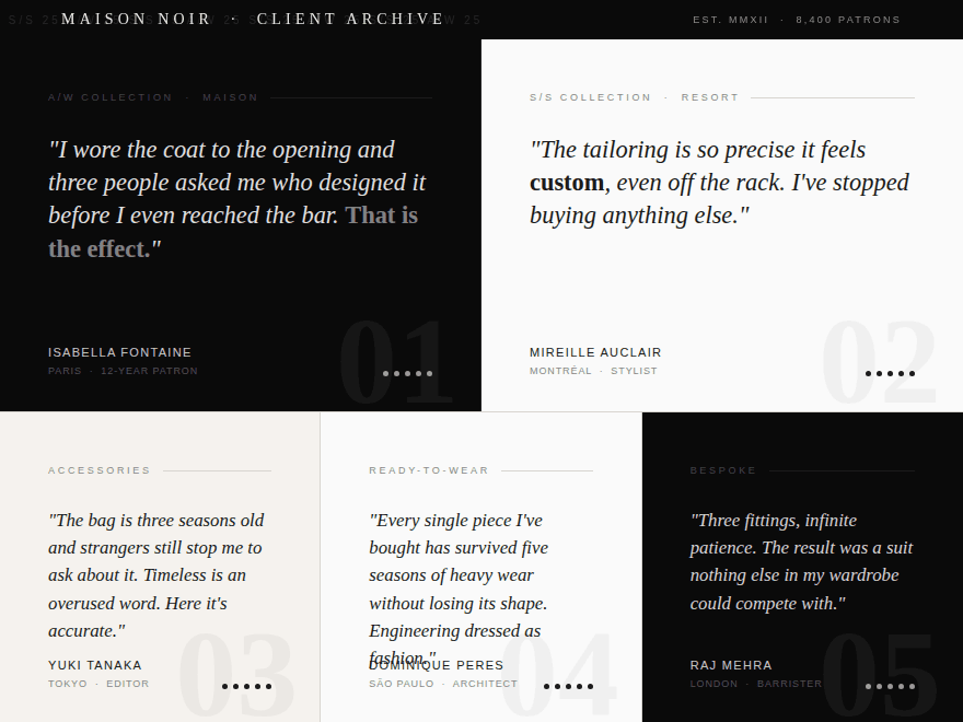
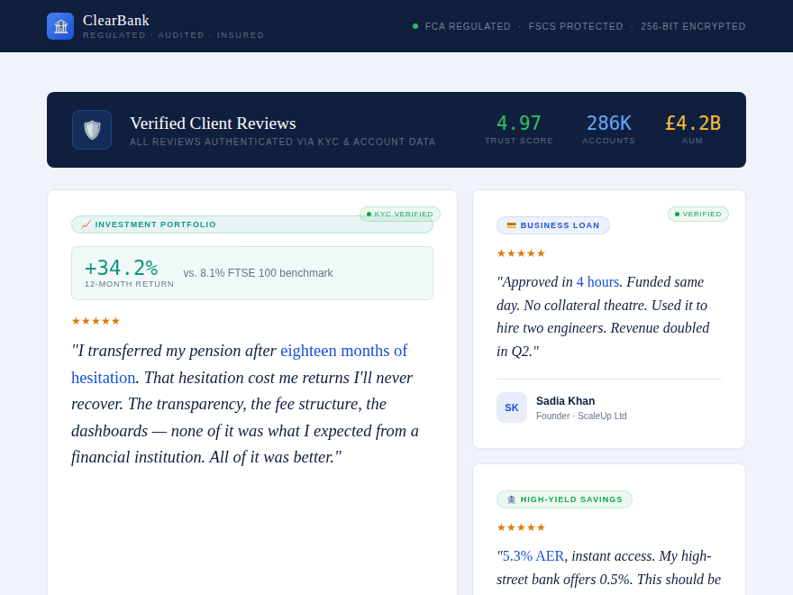
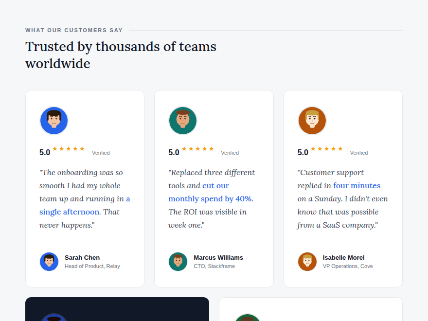
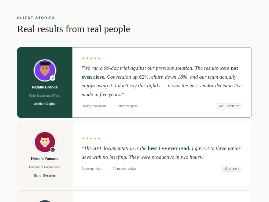
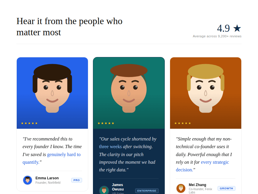
15 CSS Testimonials & Reviews

Advertisement

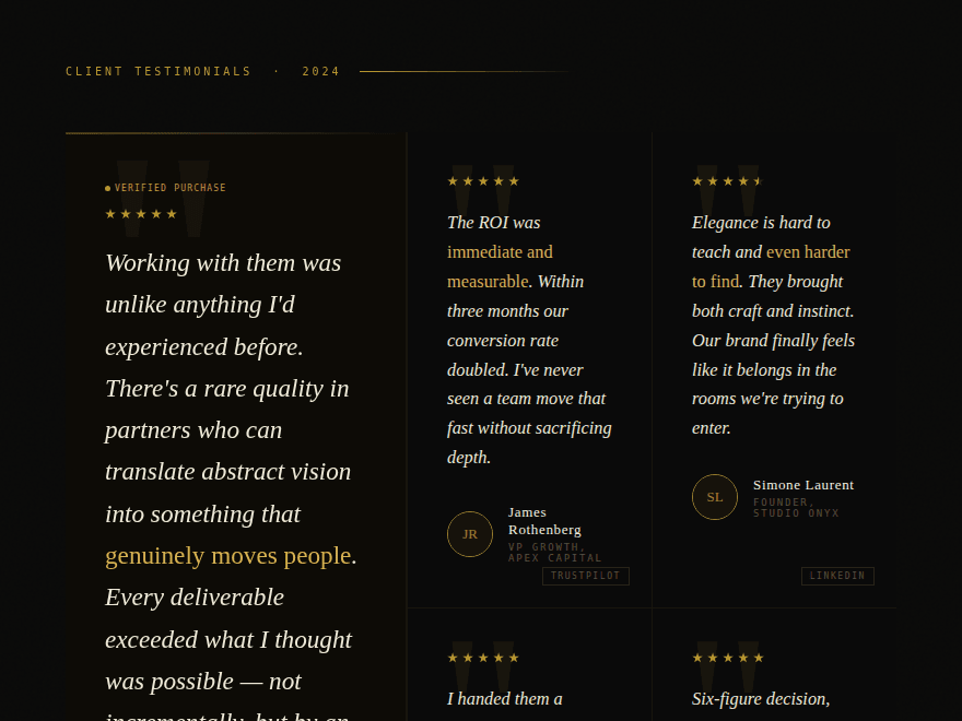
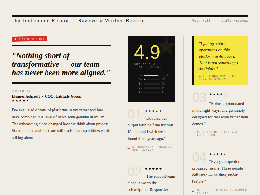
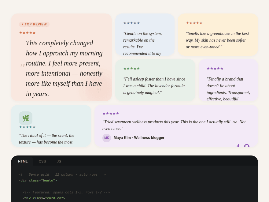
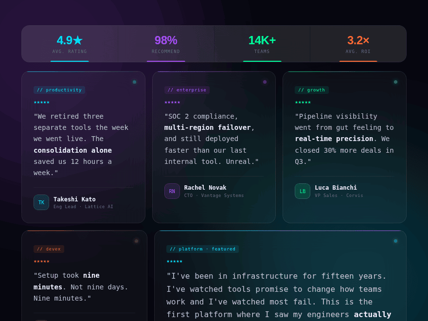
Testimonials are the highest-conversion block on a landing page — visitors arrive skeptical, the testimonial section is where doubt becomes momentum. These 15 hand-coded layouts span editorial, brutalist, bento, neon, retro, minimal, crypto, edtech, luxury real estate, gaming, high fashion, fintech, SaaS minimal, horizontal profile, and portrait-led aesthetics. Find one that fits your brand voice, drop in your real quotes, ship.

15 unique testimonials 15 Pure CSS 0 dependencies 100% copy-paste ready Published
01 / 15
Obsidian Editorial
Pure CSS
Obsidian Editorial — preview
A dark editorial spread with a featured testimonial spanning two rows and four secondary cards in a 3-column grid. Gold accent lines reveal on hover, large opacity-7% quote glyphs sit behind each quote, and pulsing "Verified" dots signal authenticity. Playfair Display for names + glyphs, Cormorant Garamond italic for the quotes — the magazine-cover treatment.
02 / 15
Brutalist Press
Pure CSS
Brutalist Press — preview
Newspaper-column layout with a bold pull quote, animated star-rating bars, red editor's stamp, and numbered micro-reviews. Use case: B2B software or enterprise product. IBM Plex Serif for headlines, Bebas Neue for big numbers, IBM Plex Mono for metadata.
03 / 15
Blossom Bento
Pure CSS
Blossom Bento — preview
12-column bento grid with soft pastel cards, spring-bounce hover animations, and a stat panel. Use case: wellness, beauty, or lifestyle brand. Fraunces serif for the featured pull-quote, Instrument Sans for everything else, six color-coded star palettes per card slot.
04 / 15
Neon Glass SaaS
Pure CSS
Neon Glass SaaS — preview
Dark glassmorphism with ambient orb drift, per-card neon accents, pulsing status dots, and a metrics strip. Use case: SaaS, developer tools, or tech platform. Syne for the metric numbers, JetBrains Mono for tags, four neon accent palettes (cyan/purple/green/orange).
05 / 15
Retro Food Review
Pure CSS
Retro Food Review — preview
Graph-paper background, terracotta/olive/mustard palette, fork ratings, a stamped score box, and vintage editorial layout. Use case: restaurant, food brand, or hospitality. Abril Fatface for the pull quote, Courier Prime for stamps and monospace meta.
06 / 15
Agency Minimal
Pure CSS
Agency Minimal — preview
Clean 5-column table-style list with full-bleed hover, slide-in row animations, a live-pulse "reviews this week" indicator, and a summary stat bar. Use case: design / consulting agency or professional services. Libre Baskerville italic for the pull quotes, Space Mono for metadata.
07 / 15
Crypto Aurora
Pure CSS
Crypto Aurora — preview
Deep-space aurora mesh background with animated gradient bands, hexagon clip-path avatars, holographic shimmer card borders on hover, volume bars, on-chain wallet hashes, and neon-per-chain color accents. Use case: DeFi / Web3 protocol. Oxanium for headings, Space Mono for hash addresses.
08 / 15
EdTech Bright
Pure CSS
EdTech Bright — preview
Confetti-dot background, SVG circular progress rings per card, spring-bounce hover, color-coded subject badges (math/code/bio/design/psych), achievement chips, and a dark "career switch" featured card. Use case: online learning platform. Nunito for headings, DM Sans for body.
09 / 15
Luxury Real Estate
Pure CSS
Luxury Real Estate — preview
Ultra-refined with 1px seam grid, Cormorant Garamond serif quotes, gold dash ratings instead of stars, property transaction values, corner triangle decorations, and a warm hover wash. Use case: premium property agency.
10 / 15
Gaming Esports
Pure CSS
Gaming Esports — preview
Black with lime/cyan/pink/orange neon per rank, angular clip-path cards with blade-in entrance animation, scanline overlay, KD ratio / win rate stats, scoreboard-style score card, and rank badges. Use case: gaming coaching / esports platform. Barlow Condensed for headlines, Share Tech Mono for stats.
11 / 15
High Fashion
Pure CSS
High Fashion — preview
Bodoni Moda editorial serif, marquee season ticker, ghost watermark numbers, 5-dot rating instead of stars, seam-line borders, alternating dark/warm/white cells, minimal Montserrat body text. Use case: luxury fashion house.
12 / 15
Fintech Trust
Pure CSS
Fintech Trust — preview
Navy trust banner with KYC-verified badges, pulsing live status dot, ROI callout box, FCA/FSCS compliance strip, product-tagged reviews (investment/loan/savings/trading), and a trust-score footer. Use case: regulated fintech / banking. Instrument Serif for italic pull quotes, Inter for UI.
Advertisement
13 / 15
Minimal White Cards
Pure CSS
Minimal White Cards — preview
Clean 3-column card grid on a soft grey background. Each card has a circular portrait at the top, a Lora italic serif quote with blue emphasis, and an author row with a smaller portrait + name + role. One dark navy featured card breaks the rhythm. Lora + Inter typography. Use case: SaaS / B2B platform.
14 / 15
Horizontal Cards
Pure CSS
Horizontal Cards — preview
Full-width stacked horizontal cards split into a sand-toned portrait panel (left) and a quote + meta panel (right). Each reviewer has a verified SVG checkmark badge, portrait, name, title, company, and a source tag (G2, Capterra, etc). The featured card flips to a deep forest green. Playfair Display + Mulish. Use case: consulting / agency / professional services.
15 / 15
Portrait Grid
Pure CSS
Portrait Grid — preview
3-column masonry-style grid where a full square portrait leads each card. Stars float directly on the portrait with a gradient overlay. On hover the portrait subtly zooms. Alternates between white, dark navy, and warm sand backgrounds for visual rhythm. DM Serif Display + DM Sans. Use case: product / startup / general-purpose.
Advertisement
FAQ

Frequently asked questions

Why are testimonials the highest-conversion block on a landing page?
Visitors arrive with skepticism — they want proof that other real people got value from your product before they spend money or time. A well-designed testimonials section short-circuits that doubt by showing names, faces, roles, and specific outcomes. Generic 'Great product!' quotes don't move the needle; what works is specificity ('our conversion rate doubled', 'closed in nine minutes', 'paid for itself in sixty-four days') combined with credible attribution (real names, real roles, recognisable companies).
Should testimonials use real photos or initial avatars?
Real photos win when they're high-quality and authentic — they signal humanity. Stock photos or AI-generated faces are worse than no photo at all because savvy visitors detect them and trust collapses. Initial avatars (the colored circles with two letters) are a great fallback when you don't have permission to use photos. Several demos in this collection use initial avatars precisely for that reason — they read as design choices, not as missing assets.
How many testimonials should a landing page show?
Three to twelve. Below three, the section reads as 'we could only find this many'. Above twelve and visitors tune out. The sweet spot for most landing pages is 5–7 — enough to show variety (different industries, use cases, geographies) without overwhelming. Heavy commercial pages can run 12+ if structured as a grid with a 'show more' interaction. The featured-plus-grid layout in several demos here (one big quote, four smaller ones) is the most reliable pattern.
Should I include star ratings?
Yes if the testimonials came from a review platform (G2, Trustpilot, Capterra, LinkedIn) that issues a score. The star row is a recognisable trust signal that reads in under a second. If the testimonial was a direct quote from a customer email or interview, skip the stars — fabricated ratings damage credibility if they ever get audited. Several demos here include source badges ('G2 · Verified', 'Trustpilot', 'Clutch') alongside the stars so the rating's provenance is unambiguous.
How do I make testimonials scannable without losing their impact?
Three techniques. (1) Pull-quote a short phrase from each testimonial into bigger type — visitors scan the pull quote first, then read the rest if they want detail. (2) Highlight key phrases inline (the <em> tag in most demos here) so even a half-second glance picks up the outcome. (3) Use a featured layout where one testimonial gets 2–3× the space of the others — the eye lands on it first, and the smaller ones provide breadth. The 'asymmetric grid with featured spotlight' pattern across most demos here implements all three.
Are these testimonials accessible?
Yes. Every demo uses semantic HTML — <section aria-label='Testimonials'> wraps the block, <article> wraps each individual testimonial, <blockquote> wraps the quote, <figcaption> wraps the attribution, <cite> wraps the author name. Star icons use aria-label='4 out of 5 stars'; decorative glyphs and avatars use aria-hidden='true'. Animations respect prefers-reduced-motion. Color contrast on copy meets WCAG AA across every palette.

Search CodeFronts

Loading…