"How do I center a div?" is the most-searched CSS question of the past decade — 90,000 monthly searches and counting. The honest answer in 2026: use Flexbox (display: flex; align-items: center; justify-content: center) for almost every case. For the remaining 5% — absolutely-positioned overlays, legacy IE-compatible code, and inline element centering — pick from the four other techniques below. These 5 interactive demos walk through every production centering method side-by-side with visible axis crosshairs so you can see exactly where each technique lands the element. All 100% pure CSS, MIT-licensed, with copy-paste-ready code and explanations of which method to use when.
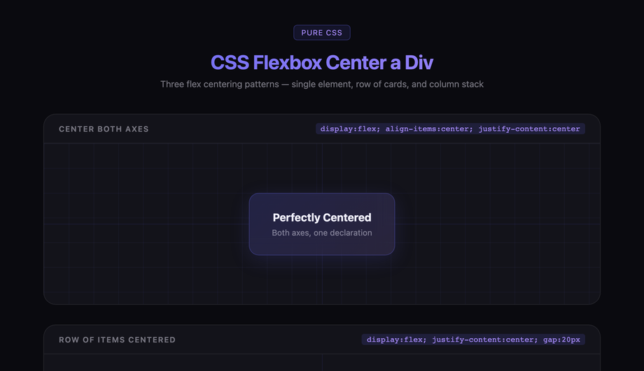
Three flex centering patterns showing how display:flex with align-items and justify-content centers a div both horizontally and vertically, as a row, and as a stacked column.
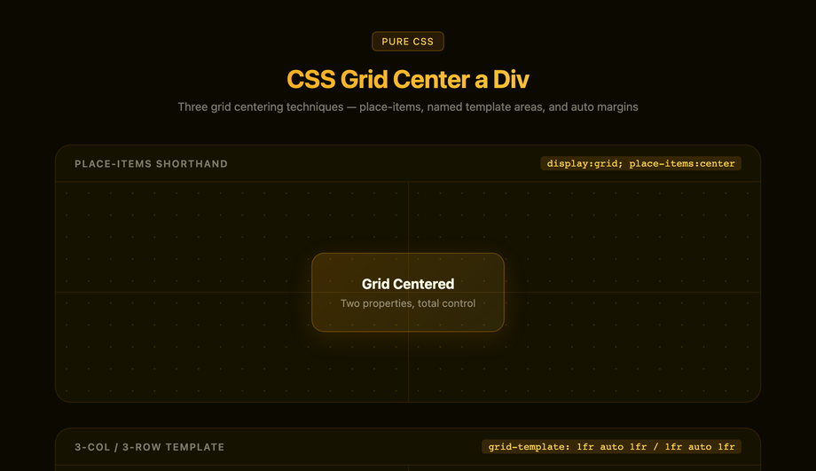
Three CSS Grid centering techniques — place-items shorthand, a 3×3 named template that puts the child at column 2/row 2, and the grid-absorbs-free-space margin:auto pattern.
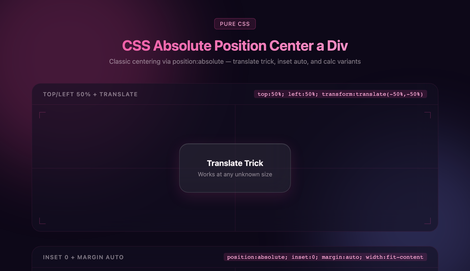
Three absolute-positioning centering methods demonstrated inside a glassmorphism UI — the classic top/left 50% + translate trick, inset:0 with margin:auto, and known-size calc offset.
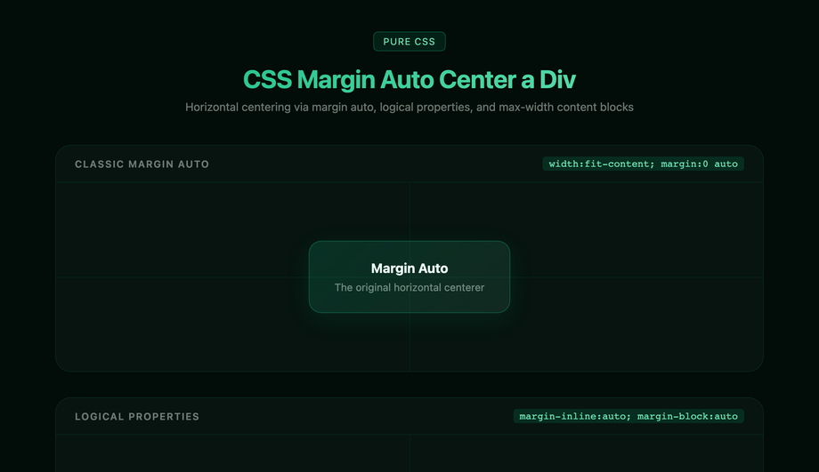
Horizontal and block centering via the classic margin:0 auto, the modern logical margin-inline:auto equivalent, and the real-world max-width + margin-inline:auto content-column pattern.
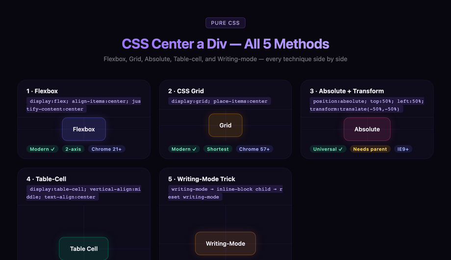
Side-by-side comparison of every major CSS centering technique — Flexbox, Grid, Absolute+Transform, Table-cell, and the Writing-mode trick — each in its own live tile with browser support chips.
What is the simplest way to center a div in CSS in 2026?
Use <strong>Flexbox</strong> on the parent. Two lines:<br><br><code>.parent { display: flex; align-items: center; justify-content: center; }</code><br><br>That's it. Any direct child of <code>.parent</code> — regardless of its width, height, content, or display type — will be centered both horizontally and vertically. Add <code>min-height: 100vh</code> to <code>.parent</code> if you want full-viewport centering (the classic "center this on the screen" use case). Flexbox is supported in 99.9% of browsers (Chrome 21+, Safari 6.1+, Firefox 28+, Edge 12+ — universally supported since 2014). <strong>Demo 01 (CSS Flexbox Center a Div)</strong> shows this technique with visible axis crosshairs so you can see exactly where the child lands. Why Flexbox over the alternatives: (1) two lines vs four for absolute positioning, (2) handles unknown child dimensions automatically, (3) handles multiple children automatically (just add <code>gap: 12px</code>), (4) responsive by default, (5) doesn't break flow / require <code>position: absolute</code>. The only reasons to use a different method: you need to support IE10/IE11 (extinct in 2026), the child is absolutely positioned for layering reasons, or you want a one-line CSS Grid version (also valid — see Demo 02).
What's the difference between Flexbox center and Grid place-items center?
Functionally identical for single-child centering. Different syntax, same result. <strong>Flexbox</strong>: <code>display: flex; align-items: center; justify-content: center;</code> (three properties, or two if you skip the display shorthand). <strong>Grid</strong>: <code>display: grid; place-items: center;</code> (two properties, since <code>place-items</code> is shorthand for <code>align-items + justify-items</code>). When to use which: <strong>Use Grid place-items when</strong> centering a single element with no other layout concerns — it's the shortest possible centering CSS, just two lines. <strong>Use Flexbox when</strong> you need to ALSO add siblings (a row of items, a header + content layout, navigation), respond to <code>flex-wrap</code> overflow, or distribute space with <code>justify-content: space-between</code>. Flexbox is the one-dimensional layout primitive; Grid is the two-dimensional one. For pure single-element centering they're equivalent. <strong>Demos 01 and 02</strong> render the same content using both methods so you can see they produce identical results. Performance: both are layout-engine-native (zero JS, GPU-accelerated where applicable), zero measurable difference for single-element centering.
When should I use absolute positioning + transform translate(-50%, -50%) instead of Flexbox?
Three scenarios. <strong>(1) Modals and overlay popups</strong> that should sit on top of the page content without affecting its layout. The absolutely-positioned modal is centered with <code>top: 50%; left: 50%; transform: translate(-50%, -50%)</code> while the page underneath continues to flow normally. Setting <code>display: flex</code> on the body to center a modal would force the body into a flex layout, breaking unrelated stacking. <strong>(2) Centering a loader / spinner</strong> over a card that's loading content — same overlay-without-affecting-layout requirement. <strong>(3) Absolute children inside a positioned ancestor</strong> when the ancestor isn't already a flex/grid container and you don't want to make it one (this preserves the existing layout). Why the <code>translate(-50%, -50%)</code> trick: <code>top: 50%; left: 50%</code> alone positions the TOP-LEFT corner of the element at the parent's center — the element extends down and right. The <code>transform: translate(-50%, -50%)</code> shifts the element back up by half its width + half its height, so its CENTER lands on the parent's center. Works with any element size, including elements whose size you don't know in advance. <strong>Demo 03 (CSS Absolute Position Center a Div)</strong> shows this technique with the offset chain visualized.
Why doesn't margin: auto work to center my div vertically?
Because <code>margin: 0 auto</code> only centers a BLOCK element HORIZONTALLY within its parent, and only when the element has a defined <code>width</code> less than the parent's width. It does NOT center vertically — that requires either Flexbox, Grid, or absolute positioning with <code>inset: 0</code>. The reason is historical: <code>margin: auto</code> was designed in CSS 2.1 (1998) for horizontal centering of fixed-width blocks (the classic <code><div style="width:800px; margin:0 auto"></code> page-content container), and vertical auto margins on block elements compute to 0, not to auto-fill. <strong>How to make margin auto center vertically</strong>: combine with <code>position: absolute</code> + <code>inset: 0</code> (the modern alternative to <code>top: 0; right: 0; bottom: 0; left: 0</code>) on the child element. With all four sides anchored, <code>margin: auto</code> evaluates to "divide the remaining space equally on all sides" and the element centers in both directions. <strong>Demo 04 (CSS Margin Auto Center a Div)</strong> shows both patterns: the classic <code>margin: 0 auto</code> for horizontal centering and the modern <code>position: absolute; inset: 0; margin: auto</code> for full centering. Use case for the latter: centering a known-size element inside a positioned ancestor without using Flexbox/Grid (e.g. in a CSS-in-JS context where you want to apply centering as an additive override without restructuring the layout).
How do I center text inside a div?
Three different scenarios, three different answers. <strong>(1) Horizontal centering of text only</strong>: <code>text-align: center</code> on the element containing the text. This is the simplest case — works for any inline content (text, links, images set to <code>display: inline</code>). <code>text-align</code> doesn't affect block elements. <strong>(2) Vertical centering of a single line of text inside a fixed-height container</strong>: set <code>line-height</code> equal to the container's height. <code>height: 48px; line-height: 48px;</code> centers a single line of text vertically. Works perfectly for buttons, badges, single-line labels. Don't use this for multi-line text — line-height applies per line, so the first line is centered and subsequent lines extend below. <strong>(3) Vertical AND horizontal centering of multi-line text inside a container</strong>: use Flexbox or Grid on the container — <code>display: flex; align-items: center; justify-content: center; text-align: center;</code> (the <code>text-align</code> is still needed because Flexbox centers the text BLOCK as a whole; <code>text-align</code> centers individual lines of text inside that block). For badges and pill-shaped elements: combine <code>display: inline-flex; align-items: center;</code> with explicit horizontal padding — that's the canonical "centered text inside a pill" pattern.
How do I center an image inside a div?
An image is an inline-block element by default, so the same techniques as text-centering apply, plus one shortcut. <strong>The shortcut (most common case)</strong>: on the parent div, set <code>text-align: center</code> — the image (being inline) centers horizontally. To also center vertically, add <code>display: flex; align-items: center; justify-content: center</code> on the parent and skip text-align (Flexbox handles both). <strong>If you want the image as a block-level element</strong> (e.g., for <code>margin: 0 auto</code> centering): add <code>display: block</code> to the image, then <code>margin: 0 auto</code> on it. <code><img style="display: block; margin: 0 auto" /></code> centers horizontally within its containing block. <strong>For a hero image that fills its parent</strong>: use <code>display: grid; place-items: center</code> on the parent + <code>object-fit: cover; width: 100%; height: 100%</code> on the image. The image fills the container; if the aspect ratio doesn't match, object-fit crops it cleanly while keeping the center pixel anchored. <strong>For a background image that's centered</strong>: use the <code>background-image</code> property on the parent with <code>background-position: center; background-size: cover</code>. The image is a CSS background, not an <img> element, so it doesn't affect document flow.
Why is my div not centering? Most common bugs.
Five fixes for 95% of "my div isn't centering" bugs. <strong>(1) The parent has no height.</strong> Flexbox centers the child within the PARENT's box. If the parent's height collapses to fit its content (i.e., to the child's height), "vertically centered" looks identical to "top-aligned" because there's no vertical space to distribute. Fix: set <code>min-height: 100vh</code> (full viewport) or <code>min-height: 400px</code> (fixed) on the parent. <strong>(2) The child has <code>margin: auto</code> but no explicit width.</strong> <code>margin: 0 auto</code> centers horizontally ONLY if the block element has a width less than the parent's width. Block elements default to 100% width — they're already as wide as the parent, so there's no horizontal space to distribute. Fix: add <code>width: 400px</code> (or some explicit value) to the child. <strong>(3) The child is inline.</strong> If the child is an <img>, <span>, <a>, or has <code>display: inline</code>, <code>margin: auto</code> doesn't work — auto margins are ignored on inline elements. Fix: add <code>display: block</code> to the child, OR use Flexbox on the parent (which works for any child display type). <strong>(4) Conflicting <code>position</code> declarations.</strong> If the child has <code>position: absolute</code> or <code>fixed</code>, Flexbox/Grid centering on the parent doesn't apply to it (absolutely-positioned children are taken out of the flex/grid flow). Fix: either remove the <code>position</code> property from the child, or use the <code>top: 50%; left: 50%; transform: translate(-50%, -50%)</code> pattern (Demo 03). <strong>(5) The flex container has <code>flex-direction: column</code> but you're using <code>justify-content</code> expecting horizontal centering.</strong> In a column-direction flex container, <code>justify-content</code> controls VERTICAL alignment and <code>align-items</code> controls HORIZONTAL alignment — the axes swap. Fix: in column-flex, use <code>align-items: center</code> for horizontal, <code>justify-content: center</code> for vertical.
How do I center a div in Tailwind CSS?
Tailwind has utility classes that map 1:1 to the underlying CSS techniques: <strong>(1) Flexbox center (most common)</strong>: <code><div class="flex items-center justify-center"></code>. Add <code>min-h-screen</code> for full-viewport centering. This is identical to <code>display: flex; align-items: center; justify-content: center; min-height: 100vh</code> in vanilla CSS — same browser support, same result. <strong>(2) Grid center (shortest)</strong>: <code><div class="grid place-items-center"></code>. Equivalent to <code>display: grid; place-items: center</code>. <strong>(3) Absolute center (for modals/overlays)</strong>: <code><div class="absolute top-1/2 left-1/2 -translate-x-1/2 -translate-y-1/2"></code>. Equivalent to the <code>top: 50%; left: 50%; transform: translate(-50%, -50%)</code> trick. <strong>(4) Margin auto horizontal</strong>: <code><div class="mx-auto w-96"></code>. Equivalent to <code>margin-left: auto; margin-right: auto; width: 24rem</code>. The Tailwind classes compile to the same CSS as the vanilla techniques — there's no performance or bundle-size difference between writing <code>flex items-center justify-center</code> in Tailwind vs writing the equivalent in a .css file. Pick Tailwind if you prefer utility-first styling; pick vanilla CSS if you prefer separation of concerns. Both work, both are equally fast.
How do I center a modal / popup / overlay?
Use absolute positioning + transform translate, NOT Flexbox/Grid on the body. The reason: a modal should sit on TOP of the page content (z-index layering) without affecting the page's existing layout. Setting <code>display: flex; align-items: center; justify-content: center</code> on the <body> forces the body into a flex layout, which can break unrelated layout decisions (sticky headers, sidebar columns, etc.). <strong>The canonical modal centering pattern</strong>:<br><br><code>.modal-backdrop {<br> position: fixed;<br> inset: 0;<br> background: rgba(0,0,0,0.5);<br> z-index: 50;<br>}<br>.modal {<br> position: fixed;<br> top: 50%;<br> left: 50%;<br> transform: translate(-50%, -50%);<br> z-index: 51;<br>}</code><br><br>The backdrop covers the entire viewport with a semi-transparent overlay (and catches click-to-dismiss events). The modal sits above the backdrop, centered both axes via the translate-50 trick. Modern alternative: use the native <code><dialog></code> element with <code>dialog.showModal()</code> — the browser handles backdrop, focus trap, ESC-to-close, scroll lock automatically. <strong>Demo 03 (CSS Absolute Position Center a Div)</strong> shows the centering technique used in modals.
Which centering method should I use? Decision tree.
Quick decision guide for all 5 demos. <strong>You want the modern default (works for 95% of cases)</strong>: Demo 01 (Flexbox) — <code>display: flex; align-items: center; justify-content: center;</code>. Use this unless you have a specific reason not to. <strong>You want the shortest possible CSS</strong>: Demo 02 (Grid place-items) — just <code>display: grid; place-items: center;</code>, two lines. Same result as Flexbox for single-child centering. <strong>You're centering a modal, popup, loader, or overlay that should layer on top of existing content</strong>: Demo 03 (Absolute position + transform) — <code>position: absolute; top: 50%; left: 50%; transform: translate(-50%, -50%);</code>. Doesn't affect the layout of surrounding content. <strong>You're centering a known-width block element horizontally only</strong> (e.g., the classic <code><div style="width:1200px; margin:0 auto"></code> page-content container): Demo 04 (Margin auto) — <code>margin: 0 auto;</code> with explicit width. <strong>You want to see all four techniques side-by-side and understand the differences</strong>: Demo 05 (All methods compared) — renders the same content using each method with visible axis crosshairs. Useful for learning, picking the right technique for a specific edge case, or as a reference page bookmark. <strong>Edge cases</strong>: For inline text centering use <code>text-align: center</code> (not in this demo set — it's a different mechanic). For single-line text centering inside a fixed-height container use <code>line-height: container-height</code>. For multi-line text centering inside a container use Flexbox + <code>text-align: center</code> together. All 5 demos in this collection: 100% Pure CSS, MIT-licensed, copy-paste ready.