A CSS feature section is the second band of a landing page where you turn the hero pitch into 4–8 concrete reasons to keep reading. These 10 hand-coded sections are full-bleed marketing-page starters — find-and-replace the headline, swap the icon strings, paste your stat numbers, ship. 7 of 10 are pure CSS (drop into any stack: Astro, Vue, Rails, plain HTML); 3 use a small IntersectionObserver or mousemove handler that degrades gracefully if JS is disabled.
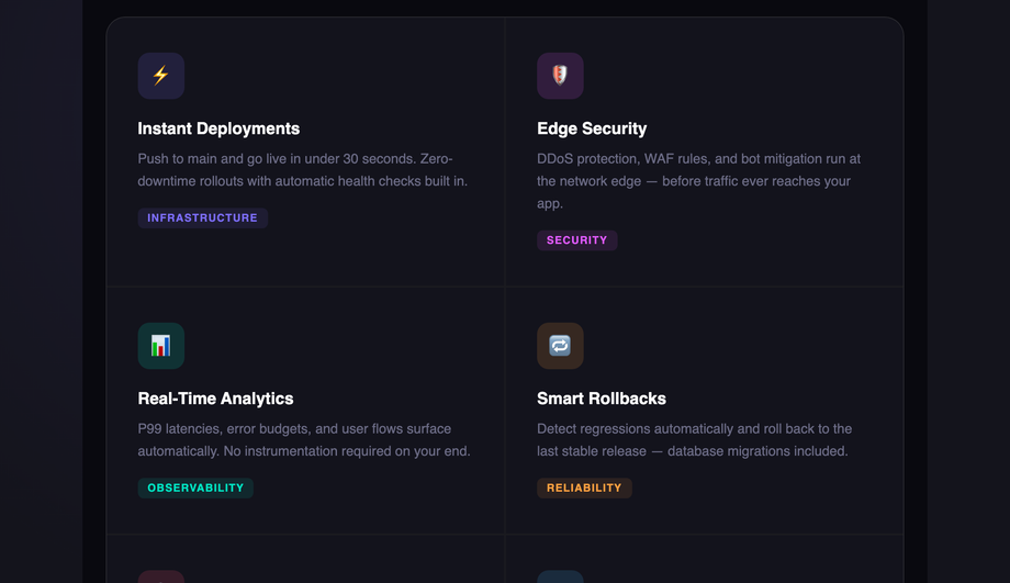
A dark-mode icon-grid platform feature section — six cards on a `#09090f` background, each with a coloured icon badge, per-card radial glow on hover, and a stats strip with 99.99% uptime, 300+ nodes, and <30s deploy time. Syne display + Inter body.
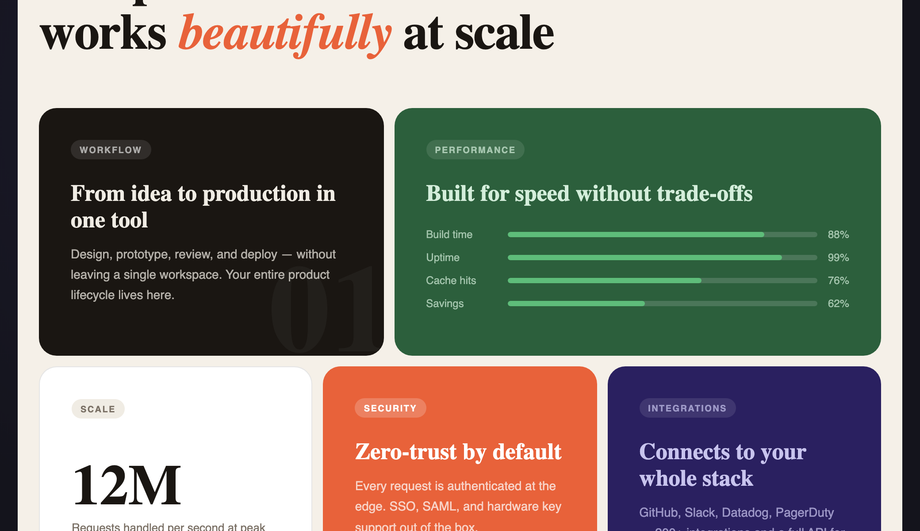
A warm-cream bento-grid layout with five asymmetric CSS Grid cells (dark ink, forest green, white, terracotta, and deep navy) showcasing animated bar meters, a large metric number, and an orbiting dot animation.
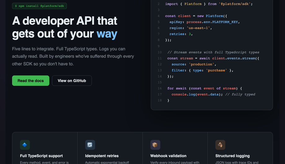
A GitHub-dark developer SDK feature section: a tabbed code window with full JetBrains Mono syntax highlighting (keywords, strings, comments, numbers) and a four-column feature-tile grid below.
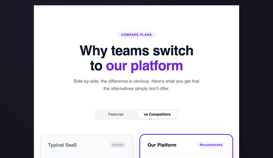
A side-by-side feature comparison table: “Typical SaaS” vs “Our Platform” with ✓/✕/~ check indicators, a purple recommended column with extra border+shadow, and two pricing cards at the bottom.
A full SaaS hero with animated mesh-gradient background, shimmer-gradient headline, live-pulse “Now in beta” ticker, G2/Capterra social proof strip, and three alternating feature rows with abstract stat mockups.
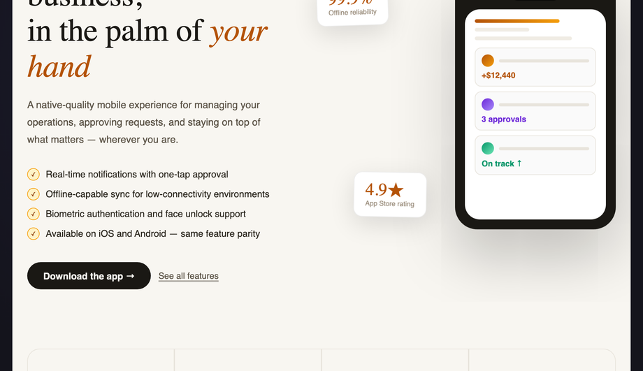
Warm parchment background with a CSS-animated floating phone mockup (bob keyframe), two counterphased floating metric cards, a serif italic headline, and a 4-tile bottom grid.
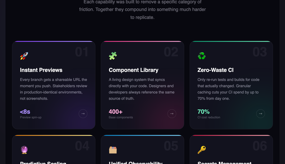
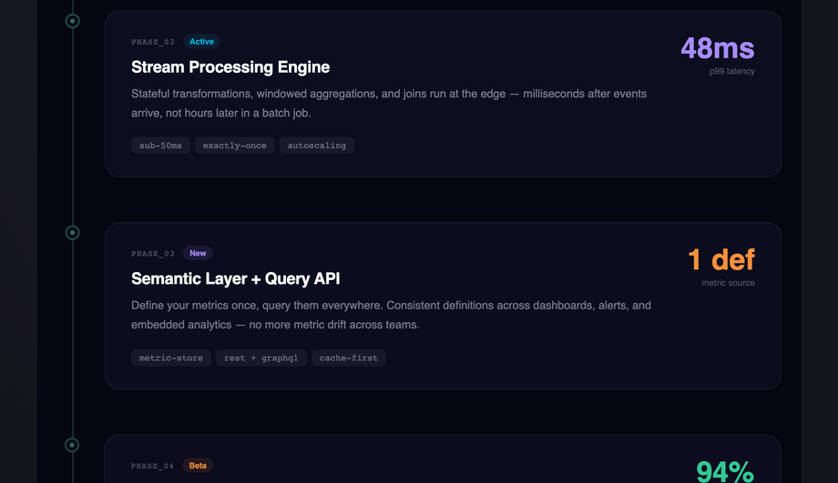
Midnight `#060612` background with a vertical timeline: an animated traveling-glow line, five staggered IntersectionObserver-reveal phase cards with status badges (Live/Active/New/Beta/Coming), JetBrains Mono labels, and per-phase accent colours.
A feature section is the second band of a landing page — the one directly below the hero — where you convert the headline pitch into 4–8 concrete reasons to keep reading. Typical contents: an eyebrow tag ("Platform capabilities"), a section headline that re-states the value prop in product terms, 3–8 individual feature cells each with an icon + title + body + optional tag, and usually a closing CTA or stats strip. The feature section is the highest-leverage block after the hero because it's where visitors decide whether to scroll further or bounce. All 10 demos in this collection ship as full-bleed `<section>` elements you can drop in immediately after your hero — find-and-replace the headline and 6 feature card bodies, paste your icon strings, and ship.
Should I use a Tailwind UI feature section or build with pure CSS?
Tailwind UI's feature sections are excellent designs but cost ~$300+ for the lifetime license and ship as React JSX, so you're locked into React + Tailwind + their utility-class conventions. <strong>If you're already on that stack, buy them.</strong> If you're NOT — Astro + plain HTML, Vue, Svelte, Rails ERB, plain WordPress, anywhere outside the React+Tailwind orbit — this collection's 10 sections drop in as semantic HTML + scoped CSS with zero framework dependencies. The 3 JS-enhanced demos (scroll-reveal IntersectionObserver, 3D mousemove tilt, timeline traveling-glow) use vanilla JavaScript with no library imports. Aesthetically, the dark glassmorphism (Demo 03), bento grid (Demo 02), and SaaS gradient hero (Demo 07) match the production polish of Tailwind UI's marketing templates without the framework lock-in. MIT-licensed, free, modify-and-resell allowed.
What's the difference between an icon grid feature section and a bento grid layout?
<strong>Icon grid (Demo 01)</strong> is the traditional 3×2 or 4×2 layout where every feature card has the same dimensions, the same icon size, and the same body length — visual uniformity creates scannability. Best for: SaaS marketing pages where you want visitors to skim 6 features quickly without one dominating. <strong>Bento grid (Demo 02)</strong> is the asymmetric pattern Apple's iOS 16 Settings page popularized in 2022 and that has dominated SaaS marketing pages since 2024 (Notion, Linear, Vercel, Cal.com all use it). Cells have different sizes — a big hero cell with an animated chart, two medium cells with stat numbers, three small cells with one-line copy. CSS Grid's `grid-template-areas` makes the asymmetry trivial. Best for: showing depth and variety in a single visual gesture, signaling "premium" or "design-forward" brand. The bento pattern is more visually striking but requires more design taste to balance — Demo 02 ships a known-good 5-cell composition you can adapt.
How do I do scroll-reveal feature cards without AOS.js or Framer Motion?
Demo 04 (CSS Animated Feature Cards Scroll Reveal) ships ~15 lines of vanilla JavaScript using <code>IntersectionObserver</code> — no library required. The pattern: each `.fs04__row` starts with <code>opacity: 0; transform: translateY(40px)</code>. A single `IntersectionObserver` watches all rows; when one enters the viewport, it adds an <code>.is-visible</code> class. The CSS <code>.is-visible</code> rule transitions opacity to 1 and transform to 0 over 0.7s. Compare costs: <strong>AOS.js</strong> ships ~22kb minified for this same effect. <strong>Framer Motion's `<motion.div whileInView>`</strong> requires React + ~140kb of motion library bundled. <strong>This demo's approach</strong>: 15 lines of JS, ~600 bytes, no dependencies, works in every framework or no framework. Plus the `prefers-reduced-motion` query disables the transform entirely for visitors who need reduced motion. Most "scroll reveal CSS" tutorials online still recommend AOS.js — a real competitor gap if you care about bundle size.
How do I do 3D card tilt on mousemove without it breaking on touch / when combined with hover transitions?
Demo 08 (CSS Feature Section 3D Perspective Cards) ships the production-grade implementation. The card uses <code>transform: perspective(800px) rotateX(0) rotateY(0)</code> at rest. On <code>mousemove</code> within the card bounds, JS calculates the cursor's offset from the card center as a -1 to +1 value on each axis, then applies <code>rotateY(cursorX * 10deg) rotateX(-cursorY * 10deg)</code>. Three gotchas most tutorials miss: (1) <strong>Always reset on mouseleave</strong> with a 0.4s cubic-bezier transition — without this the card stays tilted after the cursor leaves the card boundary. (2) <strong>Skip on touch devices</strong> via <code>matchMedia('(hover: none)')</code> — mousemove fires erratically on touchscreens and creates a janky tap experience. (3) <strong>Compose transforms, don't overwrite</strong> — if you also have a CSS <code>transform: translateY(-2px)</code> hover state, the JS-applied inline transform will clobber it. Solution: write the inline transform as <code>perspective(800px) translateY(-2px) rotateX(...) rotateY(...)</code> so all values coexist. Demo 08 handles all three correctly.
How do I do a feature comparison table ("Typical SaaS vs Our Platform") in pure CSS?
Demo 06 (CSS Feature Comparison Section) is the side-by-side pattern every B2B pricing page needs but most template libraries skip. Two columns: left "Typical SaaS" with mostly ✕ marks and a few ✓; right "Our Platform" with mostly ✓ marks, an accent border, and a `box-shadow` that signals "recommended." Rows alternate background colours for scannability. Each row's check indicator is a small rounded badge with the ✓/✕/~ glyph and a colour matching the cell's value (green/red/yellow). Below the table: two CTA pricing cards (Standard + Premium) with a small `popular` ribbon on the recommended one. The trick to making this read as "comparison" not "two random columns": align the row labels in a third hidden column that establishes the row height, then position the value columns absolutely or via subgrid. Demo 06 uses CSS Grid <code>grid-template-columns: 1fr auto auto</code> with semantic <code><dl></code> rows for accessibility. Pure CSS, no JS.
How do I render a feature section with syntax-highlighted code preview without bundling Prism or Highlight.js?
Demo 05 (CSS Feature Section with Code Preview) ships a full JetBrains Mono dark theme via inline <code><span></code> colorization — no JS syntax highlighter required. The pattern: write the code as plain HTML, wrap each token in semantic spans (<code><span class="k">const</span></code> for keywords, <code>.s</code> for strings, <code>.c</code> for comments, <code>.n</code> for numbers, <code>.f</code> for function names), and style them in CSS with the GitHub Dark palette. Cost comparison: <strong>Prism.js</strong> ships 4-25kb depending on languages, runs JS to tokenize on every page load. <strong>Highlight.js</strong> is 30-50kb minified. <strong>Demo 05's approach</strong>: 0 JS bytes, no FOUC (no flash of unhighlighted code), works at build time. Trade-off: you write the markup manually instead of pasting raw code. For marketing-page code previews showing 10–20 lines of "how easy is our SDK" code, this is the right call. For developer documentation with hundreds of code blocks, use a build-time highlighter like Shiki (server-side, zero client JS) instead.
How do I build a Linear-style product roadmap timeline as a CSS feature section?
Demo 10 (CSS Feature Section Timeline Layout) ships the vertical timeline pattern Linear's marketing pages popularized — a single vertical line with staggered phase cards (Live / Active / New / Beta / Coming) alternating left-right of the line, each with a status badge in a brand colour. Three production-grade details most timeline tutorials skip: (1) <strong>Traveling glow animation on the line itself</strong> — a small bright `<div>` does <code>animation: travel 8s infinite</code> sliding from top to bottom, giving the timeline a "living" feel without being distracting. (2) <strong>Per-phase staggered reveal</strong> via IntersectionObserver — cards fade in with a 100ms delay per index so they cascade as the visitor scrolls. (3) <strong>Status badge color semantics</strong> — green for Live, blue for Active, purple for New, amber for Beta, gray for Coming — visitors map the visual quickly because the convention matches Linear/GitHub/Notion. Best for: product roadmap pages, changelog pages, "what we shipped this quarter" announcements. Pairs naturally with Demo 06 (comparison table) on the same pricing/about page.
Which feature section should I use for my project?
Quick decision guide. <strong>SaaS marketing landing page</strong>: Demo 07 (SaaS Features Section 2025) for the full mesh-gradient + social-proof + alternating-rows treatment; Demo 01 (Icon Grid) for a more restrained presentation. <strong>Premium / design-forward brand (Notion, Linear, Vercel style)</strong>: Demo 02 (Bento Grid) — asymmetric cells signal taste. <strong>Dark-mode developer or DevTools product</strong>: Demo 03 (Dark Glassmorphism) — frosted-glass cards with animated blob ambient lighting. <strong>Developer SDK or API product</strong>: Demo 05 (Code Preview) — show actual code, not abstract icons. <strong>B2B SaaS with paid competitors</strong>: Demo 06 (Comparison Table) — direct "us vs them" feature matrix. <strong>Editorial / portfolio / agency site</strong>: Demo 04 (Scroll Reveal Alternating Rows) — long-form copy on one side, abstract mockup on the other. <strong>E-commerce / mobile-first product</strong>: Demo 09 (Floating Phone Mockup) — animated iPhone with metric callouts. <strong>Product roadmap or changelog page</strong>: Demo 10 (Timeline Layout) — vertical phases with status badges. <strong>3D / interactive feel for a portfolio</strong>: Demo 08 (3D Perspective Cards) — mousemove tilt. All 10 demos respect prefers-reduced-motion, are MIT-licensed, use scoped <code>.fsNN__*</code> class names so multiple can coexist on the same project without collision.