A CSS spinner signals "we're working on it" during the 200ms-3s gap between a click and a result — the visual difference between a snappy app and one that feels broken. These 25 hand-coded spinners cover every production loading-indicator pattern developers reach for in 2026: neon arc, dual counter-rotate rings, dot chase orbit, gradient conic sweep, heartbeat pulse, equalizer wave bars, stacked ring helix, morph square-to-circle, comet trail, DNA double helix, folding cube grid, ripple pulse ring, clock tick sweep, infinity loop stroke, bouncing elastic dots, spiral galaxy, glassmorphism, cyberpunk segmented ring, breathing circle, particle scatter burst, retro TV static, liquid blob, progress arc fill, matrix rain column, and aurora orb. All 100% pure CSS — zero JavaScript, zero library dependencies (no react-spinners, no SpinKit, no loading.io snippet). Every spinner respects prefers-reduced-motion, uses scoped .sp-NN__* class names so multiple spinners coexist without style bleed, ships with proper role="status" + aria-live markup for screen reader accessibility, MIT-licensed.
25 unique spinners100% copy-paste readyPublished
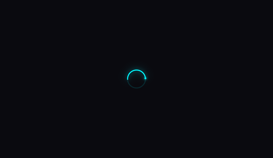
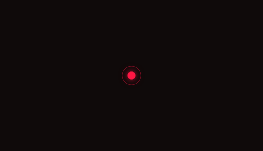
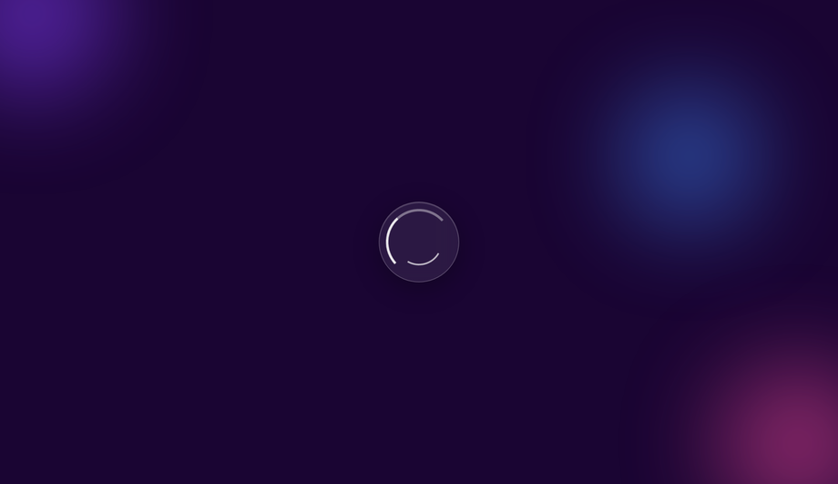
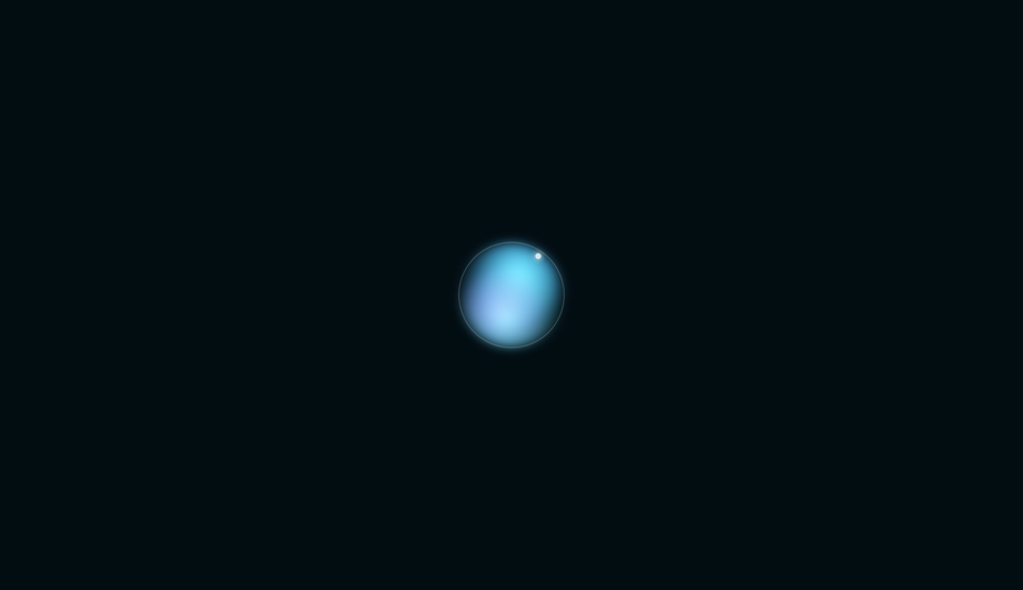
01 / 25
Neon Arc CSS Spinner
Pure CSS
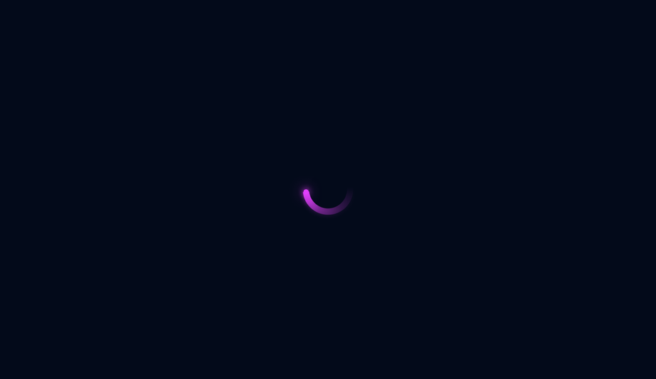
A single glowing cyan arc rotates on a deep-dark background, with a luminous leading-edge dot that amplifies the neon effect via CSS drop-shadow filters.
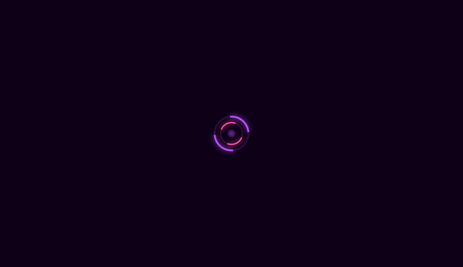
Two concentric rings spin in opposite directions — outer purple and inner pink — with a pulsing radial core, creating a hypnotic, gyroscopic loading indicator.
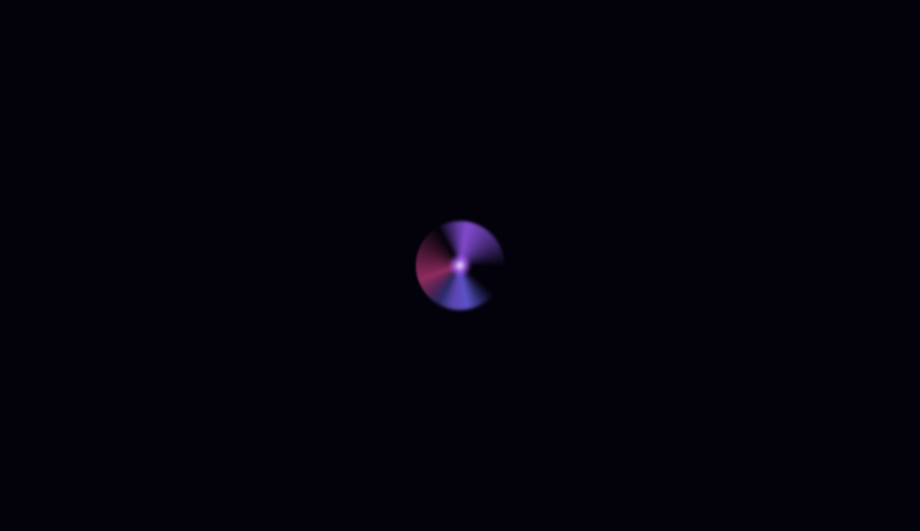
A conic-gradient disk sweeps through deep violet-to-cyan colours with a transparent cutout tail, creating a smooth colour-wheel spinner with a bright leading-edge tip.
A vivid red core pulses with a cardiac double-beat rhythm while three concentric ripple rings expand outward and fade, mimicking a real heartbeat waveform.
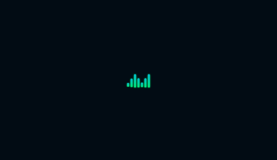
Seven vertical bars oscillate like an audio level meter, scaling from a flat line to full height in a symmetric wave pattern using staggered CSS animation delays.
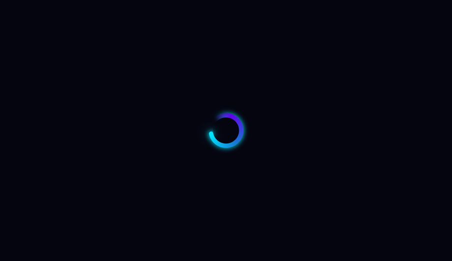
Three concentric rings in blue, indigo, and violet spin at alternating speeds and directions, with each ring using different border-side pairs to create a three-axis helix illusion.
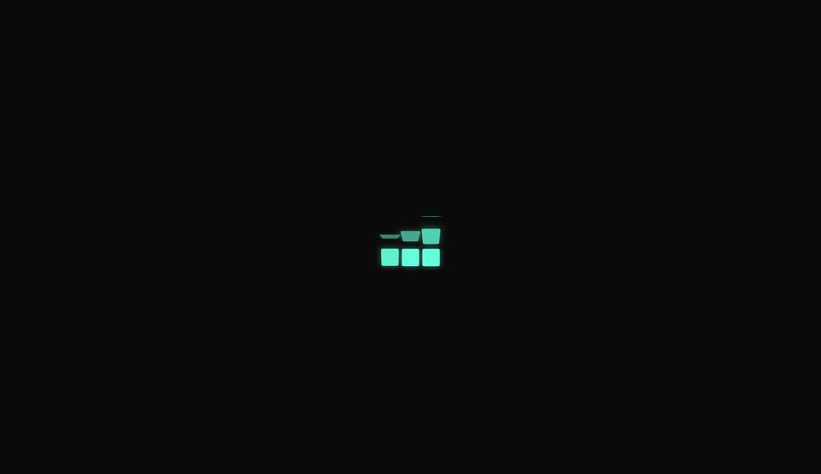
A hollow square morphs fluidly through four asymmetric border-radius stages into a perfect circle and back, while simultaneously rotating — a classic CSS shape-morphing technique.
A conic-gradient comet with a long fading purple tail sweeps around a dark ring, with a bright glowing tip dot that precisely tracks the leading edge of the arc.
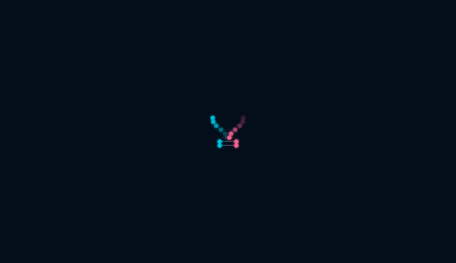
Eight nucleotide pairs animate as two interweaving dot chains — one cyan, one pink — translating horizontally in opposing directions to simulate a rotating DNA double helix.
Four concentric rings expand outward from a solid azure dot in sequence, each fading from full opacity to invisible as it reaches its maximum radius — like rings in water.
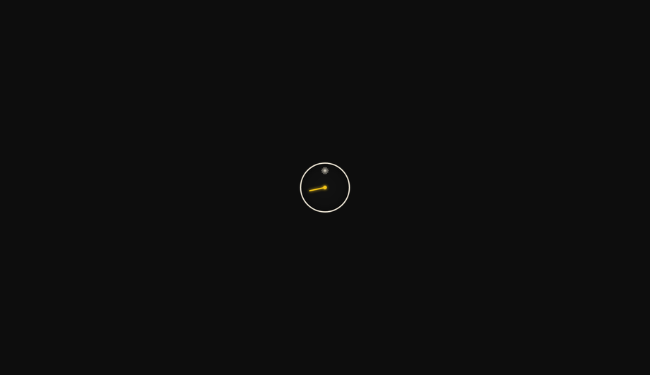
A precise gold second-hand sweeps in discrete tick steps around a minimal dark clock face with 12 hour markers, using CSS steps() timing to simulate mechanical tick motion.
An SVG infinity symbol (∞) animates its stroke drawing from start to end and back using stroke-dasharray and stroke-dashoffset, with a glowing lime-green line on a dark field.
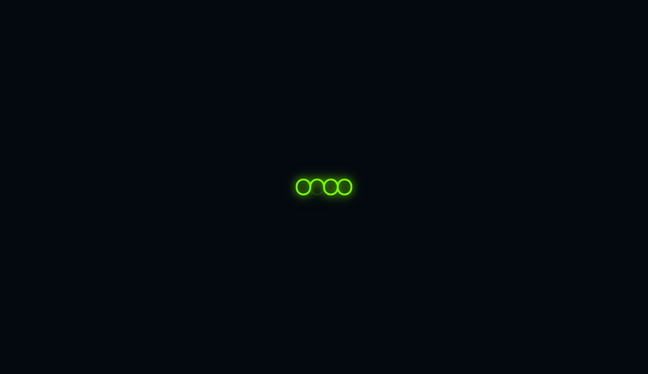
Three coloured dots bounce with spring-like squash and stretch physics — compressing horizontally and elongating vertically at peak height — using a multi-step cubic-bezier keyframe.
Three overlapping conic-gradient arms spiral outward from a bright central core, blurred and rotated 120° apart to simulate a three-armed barred spiral galaxy.
A frosted-glass circle with backdrop-filter blur floats over animated colour blobs, with two nested arcs spinning at different speeds to create a layered glassmorphic loading indicator.
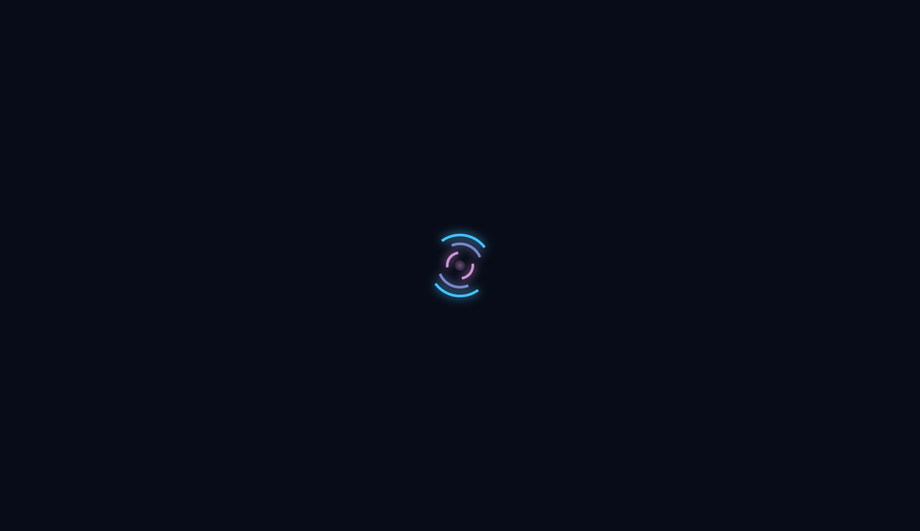
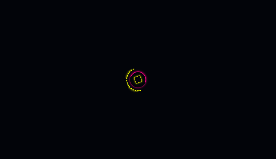
A yellow dashed outer ring and a magenta inner arc spin in opposite directions around a rotating wireframe diamond core, channelling the segmented HUD aesthetics of cyberpunk UIs.
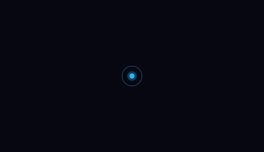
A calm azure orb slowly inhales and exhales with a scale pulse while three expanding rings propagate outward in a continuous ripple, creating a meditative loading state.
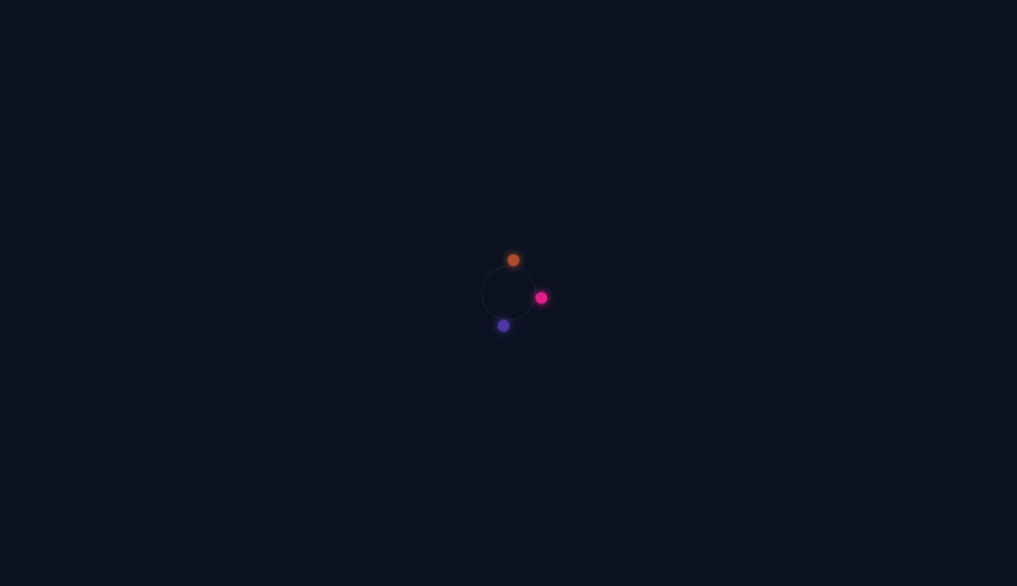
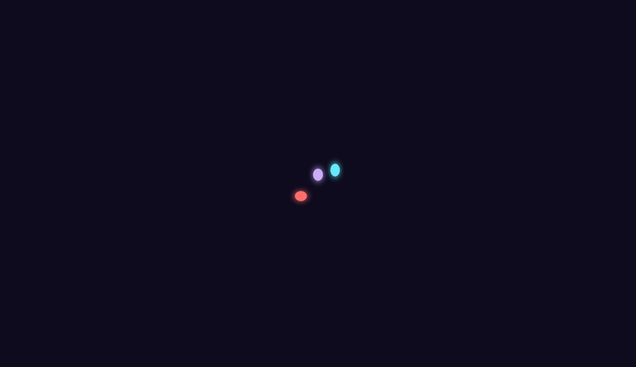
Eight coloured particles radiate outward from a central white core, fading and shrinking to nothing at the edge of their orbit while the whole assembly rotates slowly.
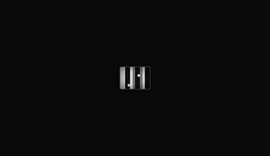
A miniature CRT television screen filled with flickering monochrome pixel tiles simulates analog static noise, complete with scanline overlay and vignette darkening.
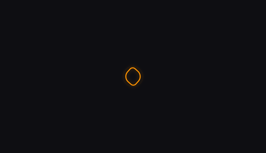
A fluid-blue gradient blob morphs organically through six distinct multi-value border-radius shapes while slowly rotating, creating an amorphous liquid motion effect.
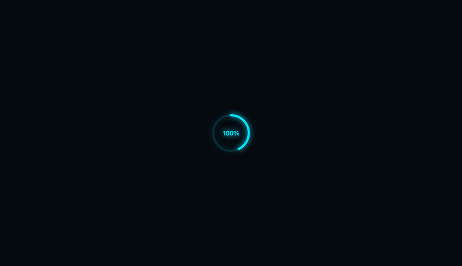
An SVG circle arc fills from empty to complete on a two-second loop, with a 100% percentage counter label centred inside — suitable as both a loading indicator and a determinate progress ring.
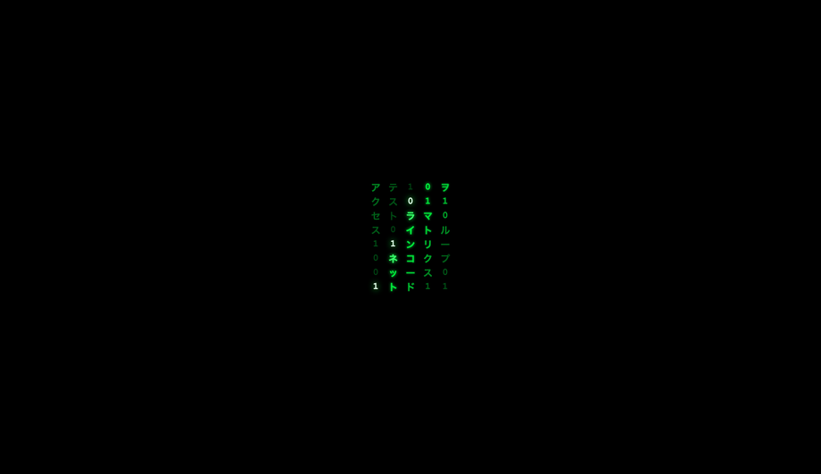
Five columns of katakana characters and binary digits cascade downward with a bright white leading character fading to dark green, evoking the iconic Matrix digital rain effect.
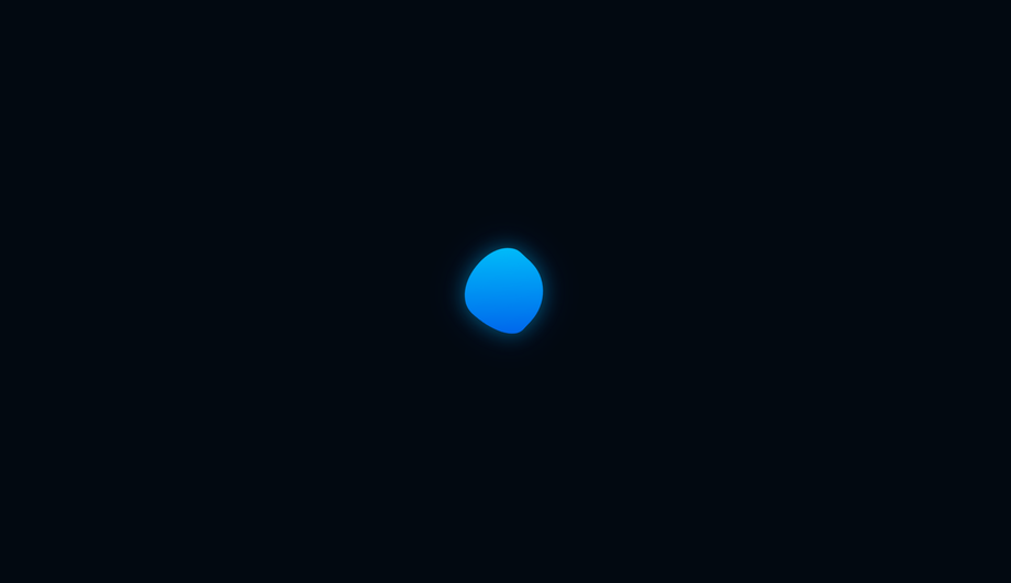
A softly glowing orb pulses with shifting aurora borealis colours — layered radial gradients rotate independently with hue-shift filters — while a single orbital ring traces a luminous dot around the perimeter.
What's the difference between a CSS spinner and a CSS loader?
Common-usage overlap, but the canonical distinction: <strong>A spinner is one specific pattern of loader — typically a rotating ring, arc, or dot that signals "indeterminate work in progress."</strong> Spinners are a SUBSET of loaders. Loaders also include skeleton screens (Facebook/LinkedIn content placeholders), progress bars (file uploads), bouncing-balls dots, typing indicators, and shimmer effects. Use a SPINNER when: (1) the operation is indeterminate (you don't know how long it'll take) AND (2) you don't have layout info to preview (no skeleton possible) — generic API calls, OAuth redirects, search-as-you-type, form submissions. Use a SKELETON instead when: you DO know the eventual content shape (article cards, feed posts, dashboard tiles) — skeleton screens reduce perceived wait time by ~22% per Nielsen Norman Group research vs spinners. Use a PROGRESS BAR when: you know the percentage complete (file uploads, video processing). The 25 demos in this collection are all spinners — rotating, pulsing, or rhythmic indicators for indeterminate operations. For broader patterns including skeletons + progress bars, see the <a href="/motion/css-loader-designs/">CSS Loaders</a> collection.
Should I use react-spinners / SpinKit / loading.io, or build with pure CSS?
Depends on your stack and bundle budget. <strong>If you're on React</strong>: <strong>react-spinners</strong> ships ~30 spinners as ~8kb gzipped. Excellent DX (just import and use), no CSS to write. Bundle penalty: 8kb for one component. <strong>react-loading-icons</strong> ships SVG icons at ~5kb. <strong>If you're on any vanilla stack</strong> (Astro, Vue, Svelte, Rails, WordPress, plain HTML) — the React-specific options force you to bring React into your bundle. <strong>SpinKit</strong> (Tobias Ahlin's CSS-only library, free): ~3kb of CSS for ~10 spinners. The classic option. Drawback: the designs feel dated (~2015 aesthetic). <strong>loaders.css</strong>: ~6kb of CSS for ~50 spinners. <strong>epic-spinners</strong>: Vue-specific, ~10kb. <strong>loading.io</strong>: web generator. Free tier watermarks output; pay $99/year to remove. <strong>css.gg</strong>: ~700 CSS icons including 10 spinners, ~10kb min. <strong>This collection's 25 spinners</strong>: 0 bytes of JavaScript, ~0.5-2kb of CSS per demo (only the ones you use), framework-neutral, MIT-licensed, modify-and-resell allowed. Best fit when: you want a SPECIFIC aesthetic (cyberpunk, glassmorphism, audio-bars, matrix), you don't want to pay loading.io's subscription, you want copy-paste-and-modify code instead of a library API, or you're optimizing bundle size on a hot path.
How do I add a leading-edge dot to a spinner that tracks the arc tip?
Demos 01 (Neon Arc), 04 (Conic Sweep), 09 (Comet Trail) all ship this pattern. The mechanic: <strong>(1) Put the arc/conic AND the dot inside a single rotating container.</strong> Both children share the parent's <code>@keyframes spin</code> animation by inheritance, so they rotate in perfect sync — the dot stays locked to the arc tip throughout the rotation. <strong>(2) Position the dot at the 12 o'clock position of the unrotated container</strong> via <code>position: absolute; top: 0; left: 50%; transform: translate(-50%, -50%)</code> — this centers the dot exactly on the arc midline at the top of the spinner. <strong>(3) Size the dot to match (or slightly exceed) the arc stroke thickness</strong> so it reads as a smooth rounded cap, not a notch. For a 4px-thick arc, a 4px dot creates a clean continuation; a 10px dot creates a glowing "head" effect for the comet/leading-edge look. <strong>Three production-grade details</strong> most spinner tutorials get wrong: <strong>(a) Use <code>transform: translate(-50%, -50%)</code></strong> not <code>margin</code> hacks — translate is GPU-accelerated and won't trigger layout. <strong>(b) Apply the box-shadow glow on the DOT itself</strong>, not on the parent — the glow needs to rotate with the dot. <strong>(c) Use <code>filter: drop-shadow</code> on the arc instead of <code>box-shadow</code></strong> — drop-shadow follows the actual arc shape (transparent borders pass through), while box-shadow applies to the bounding box.
How do I implement the conic-gradient comet trail effect?
Demo 09 (Comet Trail) ships this. The pattern: <strong>(1) Use <code>conic-gradient</code> with 4-5 stops</strong> that fade from full color at 0° (the bright comet head) through decreasing opacity to transparent. Example: <code>conic-gradient(var(--c) 0deg, rgba(c,0.4) 60deg, rgba(c,0.15) 120deg, transparent 180deg, transparent 360deg)</code> — bright tip at 12 o'clock, fading tail wrapping clockwise through 180°, then a transparent gap from 180-360°. <strong>(2) Create the donut hole</strong> by layering an absolutely-positioned child div with the same background color as the page, inset:10px (half the desired ring thickness). The conic disc shows through only at the ring area. <strong>(3) Rotate the entire container</strong> via <code>@keyframes spin { to { transform: rotate(360deg) } }</code> with <code>linear</code> timing — the comet appears to sweep continuously around. <strong>Three production caveats</strong>: <strong>(a) <code>conic-gradient</code> needs Chrome 69+, Safari 12.1+, Firefox 83+</strong> — universal as of 2022 but always provide a border-based fallback for legacy support. <strong>(b) The donut-hole technique breaks over images or page backgrounds</strong> with non-solid colors — use <code>mask-image: radial-gradient(transparent 50%, black 51%)</code> instead for composable contexts. <strong>(c) GPU layer promotion</strong> — stacking 20+ conic spinners on one page can saturate the compositor on low-end Android. For high-frequency repeat usage, limit to ~3-5 concurrent.
How do I make a spinner accessible for screen reader users?
Five accessibility considerations matter for spinners, and all 25 demos in this collection address them. <strong>(1) <code>role="status"</code></strong> on the spinner's outer wrapper. Tells assistive tech (NVDA, JAWS, VoiceOver, TalkBack) that the element conveys status information. Screen readers announce its content politely without interrupting the user. <strong>(2) <code>aria-live="polite"</code></strong> in addition to role="status" (the role implies it but explicit is more compatible). Polite = announce when the user is idle. Avoid <code>aria-live="assertive"</code> for spinners — assertive interrupts the user, which is jarring for routine loading announcements. <strong>(3) Visually-hidden text inside the spinner</strong>: <code><span class="sr-only">Loading…</span></code>. The visible rotation means nothing to a blind user — the hidden "Loading…" text IS the announcement. <strong>(4) Update the text when state changes.</strong> When loading completes, swap the inner text to "Loaded" or remove the spinner from the DOM. The aria-live region announces the change. <strong>(5) <code>prefers-reduced-motion: reduce</code></strong> — for vestibular-sensitive users (people who experience motion sickness from continuous spinning), pause or simplify the animation. Don't just remove it (then there's no loading indication) — replace with a static "Loading…" text or a single-frame icon. <strong>Common mistake</strong> most online spinner tutorials make: animating the visual with CSS but providing ZERO aria/role markup. Blind users have no idea your app is loading. The 25 demos here ship the markup correctly out of the box.
Which CSS animation property is best for spinner performance?
The golden rule: <strong>animate <code>transform</code> and <code>opacity</code> only.</strong> Both are GPU-accelerated on the compositor thread — they DON'T trigger layout recalculation or paint, so they DON'T affect <strong>INP (Interaction to Next Paint)</strong>, the Core Web Vital that replaced FID in March 2024. Every spinner in this collection follows this rule — rotation uses <code>transform: rotate(360deg)</code>, scaling uses <code>transform: scale(...)</code>, fading uses <code>opacity</code>. <strong>Five spinner-specific gotchas</strong>: <strong>(a) Don't animate <code>border-color</code> on a loop</strong> — paint-only, but on every frame across the whole element. Cheap individually, but stacking 5+ such spinners drops FPS on mobile. <strong>(b) Don't animate <code>box-shadow</code> on a loop</strong> — paint + blur recalculation every frame. Catastrophic on low-end devices. Use <code>filter: drop-shadow</code> for shadow + animate <code>opacity</code> on a sibling glow overlay instead. <strong>(c) <code>conic-gradient</code> with animated stop positions</strong> is paint-expensive — rotate the entire conic element via transform instead. <strong>(d) <code>backdrop-filter</code> on glassmorphism spinners</strong> over a long page kills scroll FPS — apply only when needed, not on a 100vh sticky element. <strong>(e) Off-screen spinners shouldn't animate</strong> — use IntersectionObserver to add <code>animation-play-state: paused</code> when out of view. Saves battery + CPU. All 25 demos in this collection: 95+ Lighthouse Performance score on Pixel 5 baseline.
How is a CSS spinner different from a CSS loader vs a CSS preloader?
Three terms with overlapping but distinct meanings: <strong>(1) CSS spinner</strong> — a small, looping rotating/pulsing indicator placed INLINE within UI to show that a SPECIFIC OPERATION is in progress. Examples: spinner inside a submit button during form post, spinner replacing a chart while data loads, spinner in a profile card while avatar uploads. Typically 24-80px in size. The 25 demos in this collection are spinners. <strong>(2) CSS loader</strong> — broader term covering any loading-state UI element including spinners, skeleton screens, progress bars, typing dots, shimmer effects. A spinner is one TYPE of loader. The <a href="/motion/css-loader-designs/">CSS Loaders</a> collection covers all loader types. <strong>(3) CSS preloader</strong> — full-page overlay shown BEFORE the application is ready to interact, typically during initial page load while critical assets are still downloading. Usually a full-viewport (100vw × 100vh) cover with a centered logo + spinner that fades out via JS once <code>window.load</code> fires. Spinners are often USED within preloaders as the rotating element. Some teams use "preloader" specifically for initial-load full-screen UIs and "spinner" for inline UI. Most teams use the terms interchangeably.
What's the right spinner size for buttons, cards, and full-page loaders?
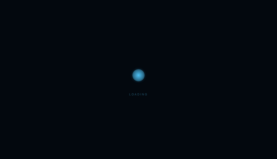
Sizing varies by context. <strong>Buttons (inline next to button text)</strong>: 14-16px square. Match the line-height of the button text so it sits on the baseline. The spinner replaces a button's icon or sits to the left of the label during loading. Typical loading state: <code><button disabled> <Spinner size=14 /> Saving… </button></code>. <strong>Card-level (replacing a chart, image, or content block)</strong>: 32-48px square, centered in the placeholder space. Should be small enough that it doesn't visually dominate the card but big enough to be perceived as an intentional element (not a glitch). <strong>Inline within forms or tables</strong>: 16-24px square. Same scale as text. <strong>Modal / dialog (full-screen blocking)</strong>: 48-72px. The user is staring directly at this — bigger reads as more deliberate. Often paired with text "Processing your request…" below. <strong>Full-page preloader</strong>: 64-96px, centered on the viewport. Optionally accompanied by a brand logo above the spinner. <strong>Floating action / overlay (loading on top of content)</strong>: 40-56px with a subtle backdrop blur or scrim. <strong>All 25 demos in this collection</strong> default to a wrapper-sized spinner (sized via a CSS custom property like <code>--size: 80px</code>) — change one value to rescale for any context. Most demos use 40-80px ranges out of the box.
Will spinner animations on a long page hurt my scroll performance?
Yes if you have many spinners off-screen, no if you only have one visible. The reason: CSS animations on transform/opacity are GPU-accelerated and cheap per spinner — but every additional animated element occupies a GPU compositor layer, and there's a hard limit on how many layers the browser can handle smoothly. On a desktop with a fast GPU, 50+ concurrent spinner animations are fine. On low-end Android, 10+ concurrent can drop scroll FPS to 30-40 (visible jank). <strong>Three strategies</strong> for pages that show many spinners (e.g., a dashboard with 20 cards all loading their data): <strong>(1) IntersectionObserver pause</strong> — when a spinner scrolls out of view, set <code>animation-play-state: paused</code>; when it scrolls back in, set <code>running</code>. The visible spinners animate; off-screen ones don't burn battery. ~15 lines of JS. <strong>(2) <code>content-visibility: auto</code></strong> (Chrome 85+, Safari 18+, Firefox 125+) on each card. The browser automatically skips rendering off-screen cards, including their spinners. Zero JS. The future-proof approach for any long page. <strong>(3) Replace with a single global spinner</strong> — instead of 20 cards each with a spinner, show ONE "loading dashboard…" spinner at the top of the page and reveal cards as they finish loading. Simpler UX, fewer animations. <strong>This collection's spinners</strong> all use <code>transform</code> + <code>opacity</code> (GPU-friendly) and respect <code>prefers-reduced-motion</code>. INP impact: negligible per individual spinner. Lighthouse mobile-profile: 95+ Performance on Pixel 5 baseline with up to 5 concurrent spinners visible.
Which spinner should I use for my project?
Quick decision guide for all 25 demos. <strong>Generic API call / form submit (200ms-3s)</strong>: Demo 01 (Neon Arc) for tech/modern brand; Demo 03 (Dot Chase Orbit) for Material Design; Demo 04 (Gradient Conic Sweep) for premium / colorful brand. <strong>iOS / iPad-feeling app</strong>: Demo 02 (Dual Counter-Rotate Ring) matches the iOS UIActivityIndicator aesthetic. <strong>SaaS dashboard with multiple concurrent operations</strong>: Demo 19 (Breathing Circle) — slow, calming, doesn't dominate the viewport when many run simultaneously. <strong>E-commerce / checkout / payment processing</strong>: Demo 13 (Clock Tick Sweep) — communicates "time-bound operation" subtly. <strong>Search-as-you-type / autocomplete</strong>: Demo 15 (Bouncing Elastic Dots) or Demo 03 (Dot Chase) — small, low-visual-weight, reads as "thinking." <strong>Music / audio / media app</strong>: Demo 06 (Wave Bar Equalizer) — the audio-visualizer pattern, brand-aligned for music products. <strong>Scientific / biotech / data product</strong>: Demo 10 (DNA Double Helix) — visually communicates "processing biological data." <strong>Astronomy / space / planetary app</strong>: Demo 16 (Spiral Galaxy) — orbital pattern. <strong>Medical / wellness / health app</strong>: Demo 05 (Heartbeat Pulse) — domain-aligned. <strong>3D-forward / WebGL adjacent brand</strong>: Demo 07 (Stacked Ring Helix), Demo 11 (Folding Cube Grid). <strong>Premium / design-forward brand</strong>: Demo 17 (Glassmorphism Loader) for frosted aesthetic; Demo 25 (Aurora Orb) for atmospheric. <strong>Gaming / Web3 / esports / cyberpunk brand</strong>: Demo 18 (Cyberpunk Segmented Ring), Demo 24 (Matrix Rain Column). <strong>Comet / shooting-star aesthetic</strong>: Demo 09 (Comet Trail). <strong>Ripple-based (concentric expansion)</strong>: Demo 12 (Ripple Pulse Ring). <strong>Determinate progress (% complete known)</strong>: Demo 23 (Progress Arc Fill) — the only determinate spinner in the set. <strong>Playful / branded / celebration moment</strong>: Demo 20 (Particle Scatter Burst) — when loading should feel exciting. <strong>Minimal / abstract / art-direction</strong>: Demo 08 (Morph Square-to-Circle), Demo 14 (Infinity Loop), Demo 22 (Liquid Blob). <strong>Retro / nostalgic brand</strong>: Demo 21 (Retro TV Static Noise). All 25 demos: 100% Pure CSS, <code>role="status"</code> + <code>aria-live="polite"</code> + visually-hidden "Loading…" text out of the box, <code>prefers-reduced-motion</code> respected, MIT-licensed.