A floating action button (FAB) is a fixed-position button that surfaces the most important action on a screen. These 32 hand-coded designs are ready-to-ship FABs for chat windows, compose actions, scroll-to-top, and quick-add controls — copy the markup, wire your handler, and ship.
32 unique FABs21 Pure CSS11 CSS + JS100% copy-paste readyPublished
Updated · 16 new designs added
·
01 / 32
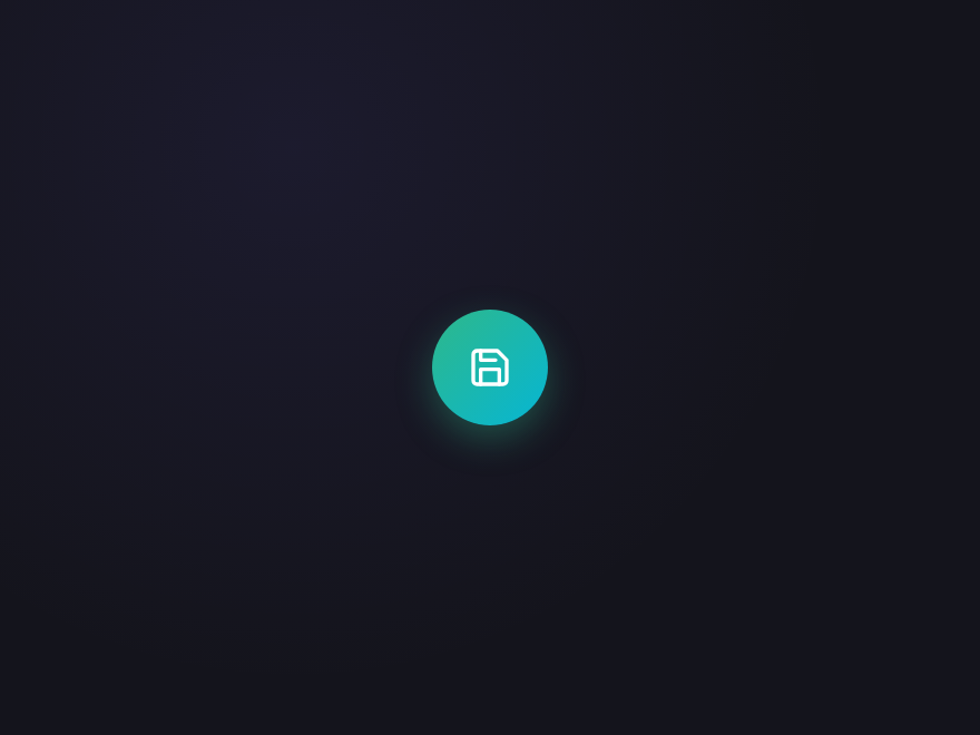
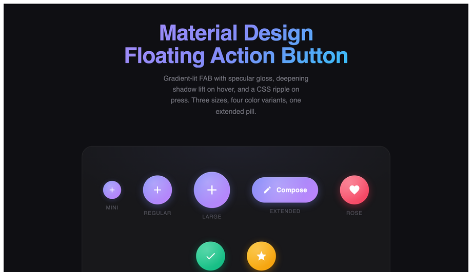
Material Gradient FAB
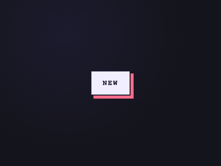
Pure CSS NEW
Material Design floating action button with gradient lift, ripple effect, 4 color variants, and 3 sizes including extended pill shape.
Click triggers a loading state — the icon swaps for a spinner, button is disabled, returns to ready after 1.5s. Demonstrates the async-action FAB pattern.
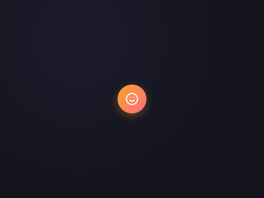
A floating action button is a circular or pill-shaped button positioned above the page content (usually pinned to the bottom-right corner) that surfaces the single most important action on the current screen. The pattern was popularised by Google's Material Design in 2014 and is now used across Android, iOS, web apps, and dashboards — Gmail's Compose button, Twitter's New post, Trello's Add card, Slack's New message all use the pattern. The defining characteristics: a single elevated button (shadow lift), persistent positioning (fixed/absolute, always visible), one primary action, optional secondary actions revealed via tap (speed dial / fan arc / morph expand patterns).
When should I use a FAB on my site?
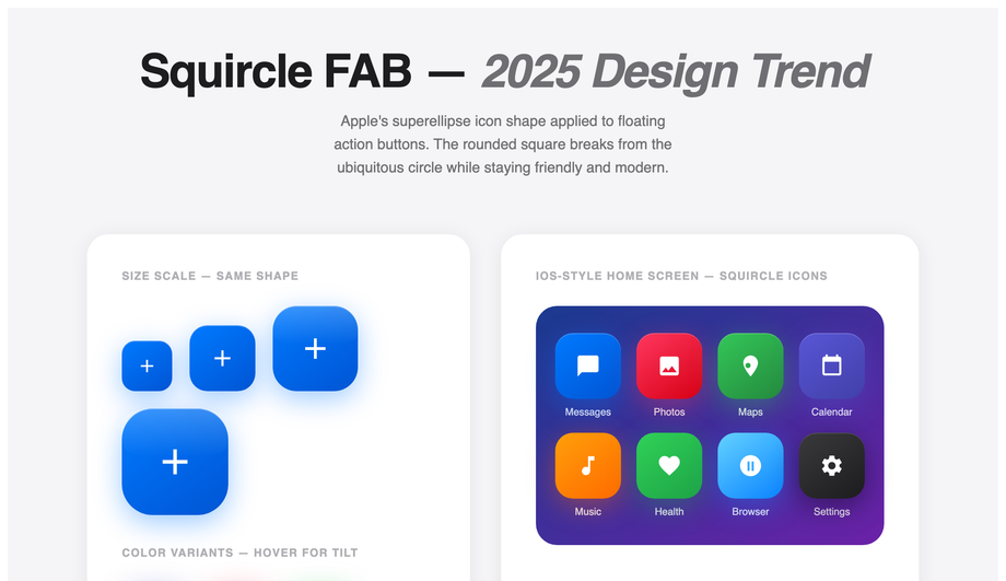
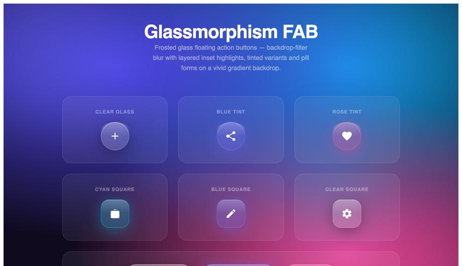
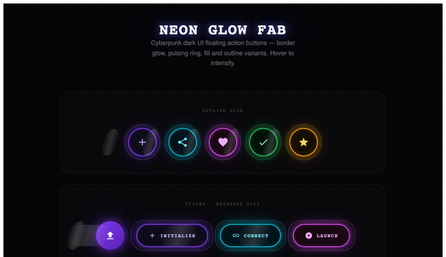
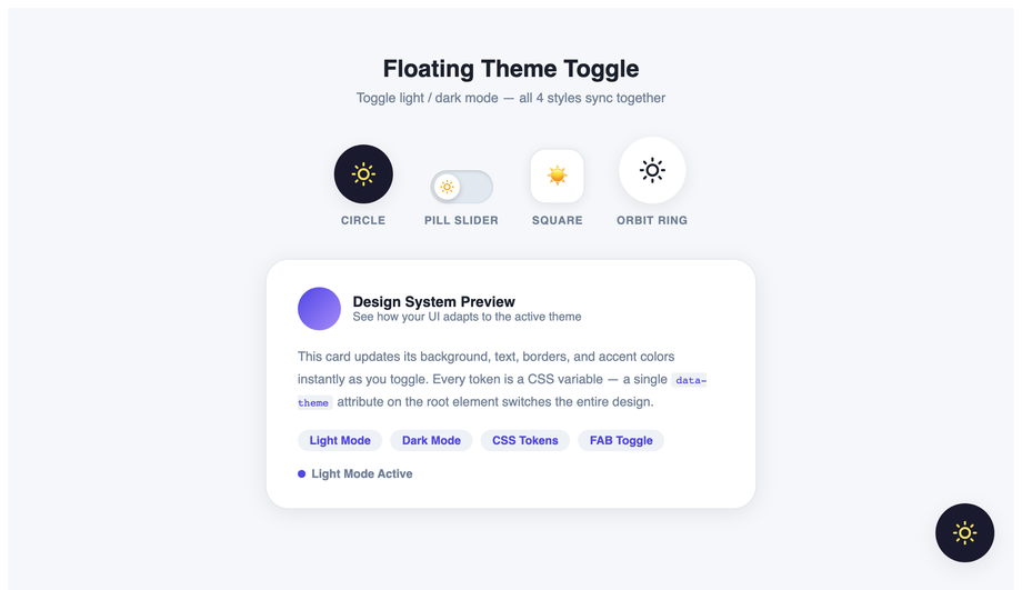
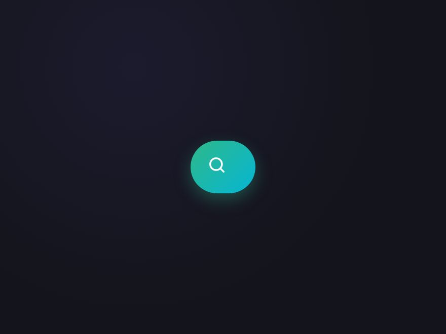
Use a FAB when there's exactly one primary action the user is most likely to take on the current screen — Compose in email, New post in social, Add task in to-do, Add to cart in e-commerce, Start chat in support. Don't use one when there are multiple equally-important actions (an inline button bar is clearer); when the action is secondary or destructive (FABs are visually high-emphasis); or when the screen has its own elevation-heavy components like floating modals (you'll create visual competition). The 32 demos in this collection cover the main use cases: simple primary action (Demo 01 Material Gradient, Demo 17 Classic Plus), action menu (Demo 02 Speed Dial, Demo 06 Fan Arc), specialized actions (Demo 04 Scroll-to-Top, Demo 05 Chat Widget, Demo 13 Notification Bell, Demo 14 Floating Cart, Demo 16 Theme Toggle), and brand-style variants (Demo 09 Glassmorphism, Demo 10 Neon Glow, Demo 25 Brutalist Stamp, Demo 30 Premium Aurora).
Should I build a FAB myself or use Tailwind UI / Material UI?
Tailwind UI's FAB components cost $300+ and ship as React JSX, locking you into React + Tailwind. Material UI (MUI) ships the FAB as part of its ~50kb gzipped component library — fine if you're already on React + MUI, overkill if you just need ONE button. <strong>If you're outside the React+Tailwind orbit</strong> (Astro, Vue, Svelte, Rails ERB, plain HTML, WordPress) — this collection's 32 FABs drop in as semantic HTML + scoped CSS with zero framework dependencies. The 13 JS-enhanced demos use vanilla JavaScript with no library imports. Aesthetically, the gradient lift on Demo 01 (Material Gradient FAB), the speed dial on Demo 02, and the glassmorphism on Demo 09 match Material UI's production polish without the framework lock-in. MIT-licensed, free, modify-and-resell allowed.
How do I create an expanding FAB menu (speed dial pattern)?
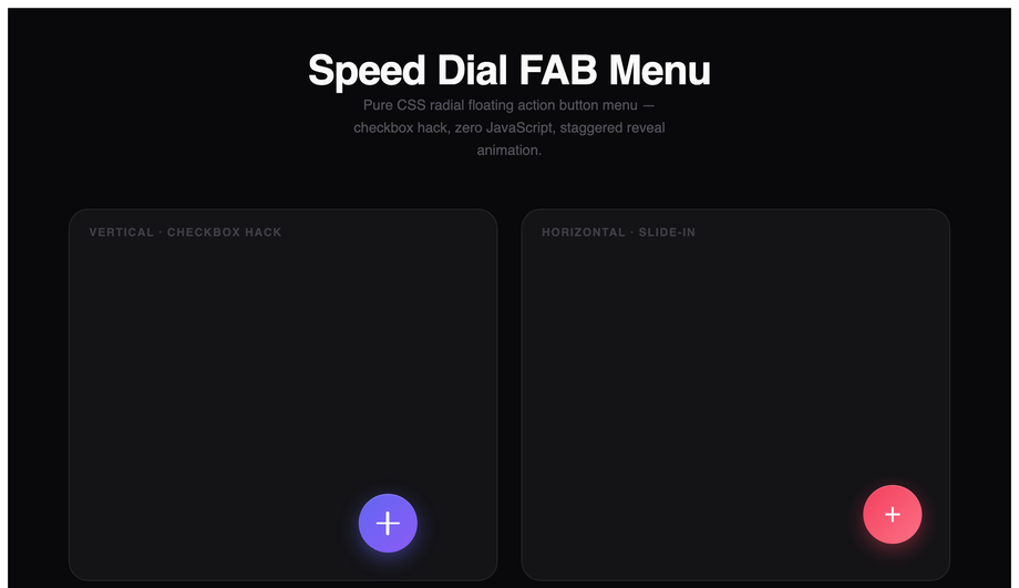
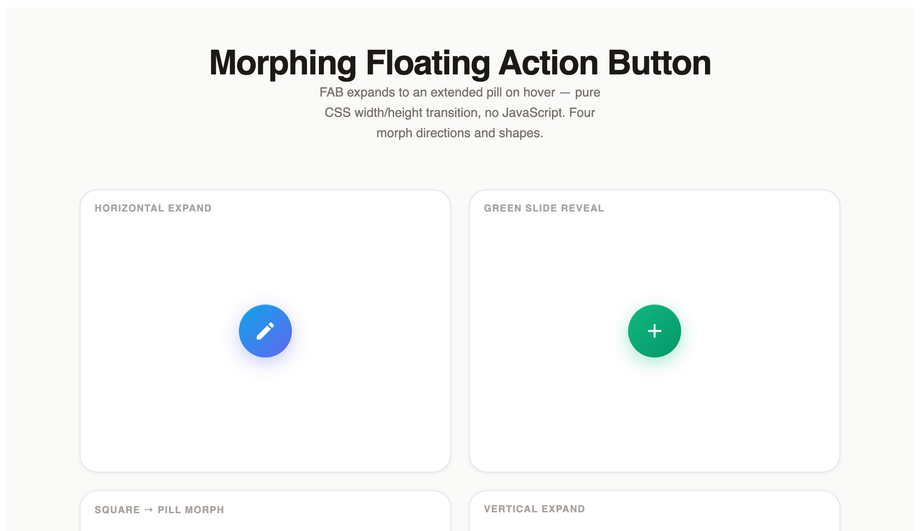
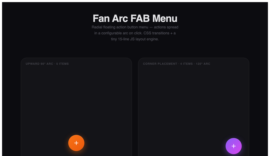
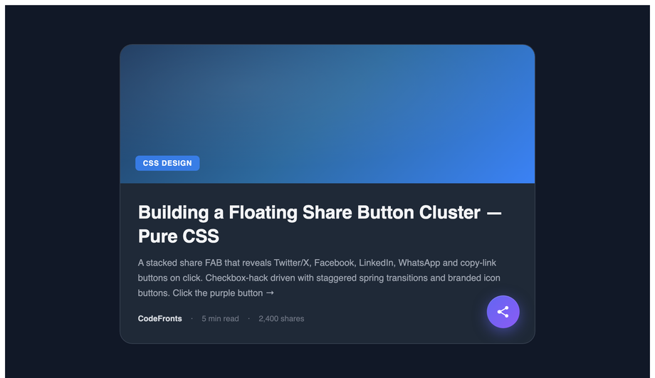
The speed dial pattern (Demo 02 Speed Dial FAB Menu, Demo 06 Fan Arc FAB Menu) reveals 3-5 secondary actions when the user taps the main FAB. The pure-CSS approach: use a hidden <code><input type="checkbox"></code> as the state holder, a <code><label></code> styled as the FAB body, and the <code>:checked</code> selector to toggle the visibility/transform of the child action buttons. <code>transform: translateY(0)</code> and <code>opacity: 1</code> when checked; <code>transform: translateY(20px); opacity: 0; pointer-events: none</code> when unchecked. Add per-button transition-delay values (0ms, 60ms, 120ms, …) for a cascading reveal. No JavaScript needed. The fan arc variant (Demo 06) is the same pattern but uses <code>transform: rotate(angle) translateY(distance)</code> per child so they spread radially instead of stacking vertically — needs ~10 lines of JS to position children dynamically based on the FAB's screen position.
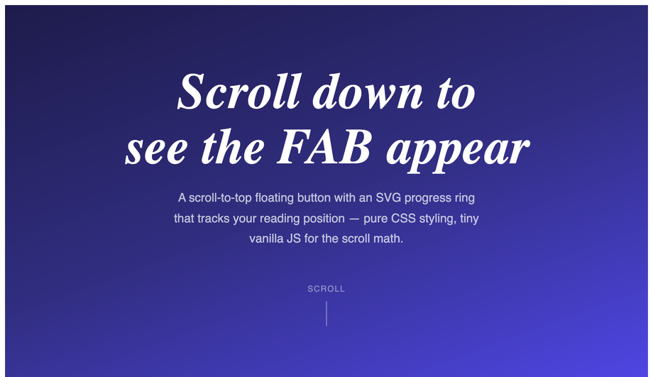
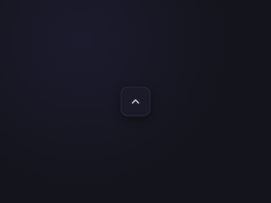
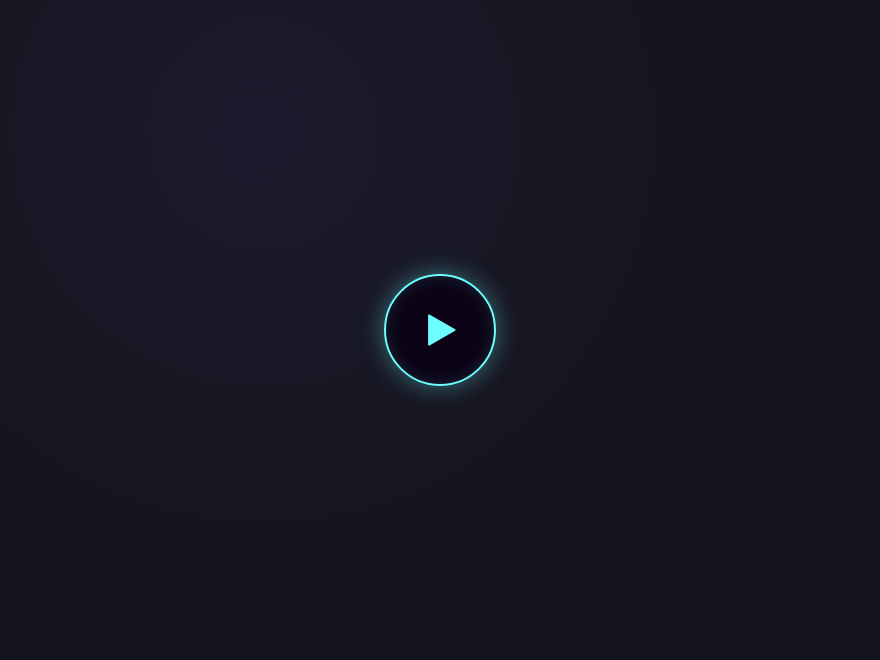
How do I make a scroll-to-top FAB with a progress ring?
Demo 04 (Scroll-to-Top Progress Ring) ships the canonical implementation. The FAB has two layered SVG circles: a background circle (the track) and a foreground circle with <code>stroke-dasharray</code> equal to its circumference. JavaScript reads <code>window.scrollY / (document.body.scrollHeight - window.innerHeight)</code> as a 0-to-1 progress value, then sets <code>strokeDashoffset = circumference * (1 - progress)</code> on the foreground circle — the stroke fills clockwise as the visitor scrolls down. The button only appears after scrolling past 200px (CSS <code>opacity</code> transition + JS <code>classList.toggle</code>). Click handler calls <code>window.scrollTo({ top: 0, behavior: 'smooth' })</code>. Total: ~25 lines of JS. Works in every modern browser; degrades to a hidden button if JS is off.
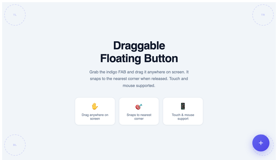
How do I build a draggable / movable FAB that the user can reposition?
Demo 12 (Draggable FAB) ships the production-grade implementation. Three production-grade details most tutorials miss: (1) <strong>Use Pointer Events not Mouse Events</strong> — <code>pointerdown</code>/<code>pointermove</code>/<code>pointerup</code> work uniformly across mouse + touch + pen. The Mouse Events API has a separate touch fallback that breaks on hybrid devices. (2) <strong>Constrain to viewport bounds</strong> — clamp the drag position to <code>[0, window.innerWidth - fabWidth]</code> on each axis, otherwise users drag the FAB off-screen and can't drag it back. (3) <strong>Snap to nearest edge on release</strong> — like Facebook Messenger Chat Heads, the FAB should snap to the nearest left/right edge of the viewport on <code>pointerup</code>. Use a CSS transition for the snap animation. The Demo 12 implementation also leaves a fading <code>.trail</code> dot animation during the drag for visual feedback. ~60 lines of JS.
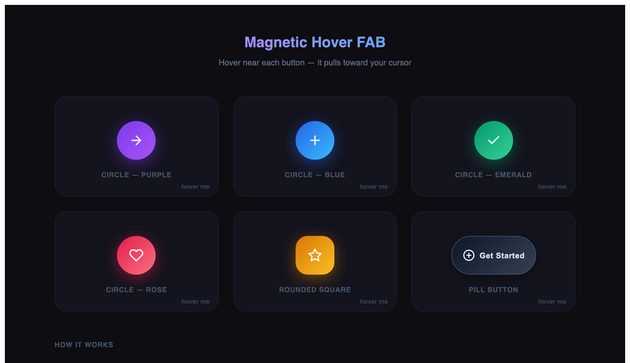
How do I make a magnetic-hover FAB (cursor attraction effect)?
Demo 15 (Magnetic Hover FAB) ships the cursor-attraction pattern made famous by Awwwards-winning sites and the Stripe Sigma landing page. The mechanic: on <code>mousemove</code> within a hover-detection radius (typically 100-150px around the button center), JS calculates the offset between the cursor and the button center, then applies <code>transform: translate(cursorOffsetX * strength, cursorOffsetY * strength)</code> on the button — where strength is ~0.3 for a subtle pull. The button "reaches toward" the cursor as it approaches. On <code>mouseleave</code>, smoothly transition back to <code>translate(0, 0)</code> with a <code>cubic-bezier(.22,1,.36,1)</code> easing for the springy return. Two gotchas: (a) skip the effect on touch devices via <code>matchMedia('(hover: none)')</code> — magnetic hover doesn't translate to taps and creates janky pinch-zoom interference. (b) the inner icon should counter-translate at half strength so it stays roughly centered relative to its starting position, otherwise the icon flies off the button. ~30 lines of JS.
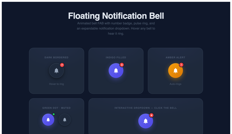
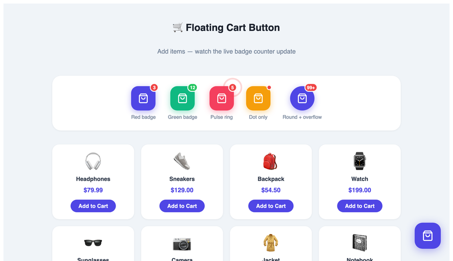
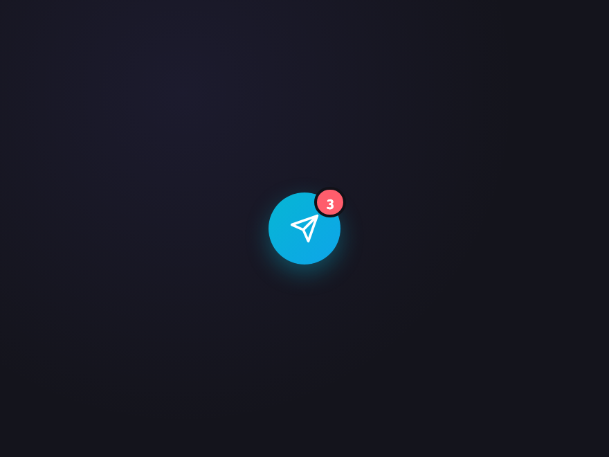
How do I add a notification badge to a FAB (count indicator)?
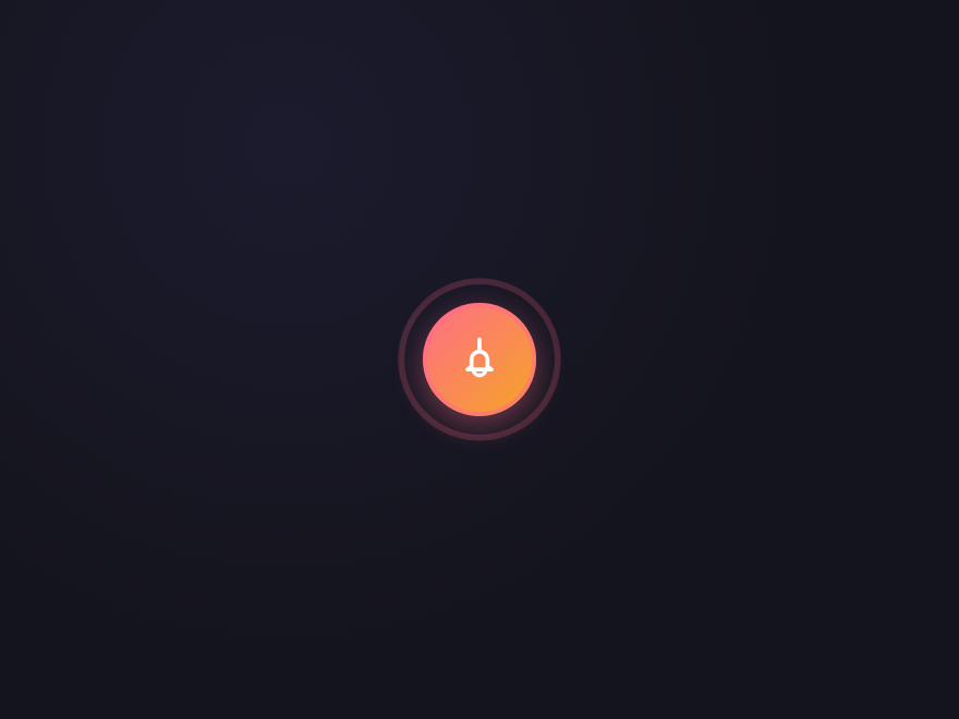
Two patterns. <strong>Demo 13 (Notification Bell FAB)</strong> ships the badge-with-pulse approach — a small absolutely-positioned circle in the top-right corner of the FAB, showing the count (1, 2, 9+) with a continuous CSS pulse animation to draw attention. The bell icon also tilts via <code>@keyframes ring</code> when a new notification arrives (triggered by JS adding a <code>.ringing</code> class). <strong>Demo 14 (Floating Cart Badge)</strong> ships the e-commerce pattern — a circular counter showing total cart items, increments with a tiny <code>scale(1) → scale(1.3) → scale(1)</code> bounce when items are added, and the FAB shows a slide-down list of recently added items on hover. Both demos respect prefers-reduced-motion: the pulse/ring/bounce animations freeze for visitors with the OS preference set. The badge text uses semantic HTML with an <code>aria-label="5 new notifications"</code> for screen reader support.
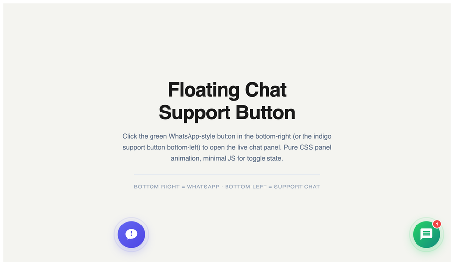
Can I build a floating chat widget (Intercom / Crisp / Drift style)?
Demo 05 (Floating Chat Widget) ships the bottom-right chat-launcher pattern that every SaaS marketing site uses (Intercom, Crisp, Drift, Tawk.to all use variations). The FAB shows a chat icon at rest; on click, it expands into a 320×400 chat panel with a header, an empty conversation area, and an input row. The expand animation uses <code>transform: scale(0) → scale(1)</code> + <code>transform-origin: bottom right</code> so it animates out from the FAB's position rather than dropping in. The icon morphs from chat-bubble to X (close) via two stacked SVGs cross-fading. The demo also includes a <code>setupChat(triggerId, panelId)</code> helper so the same UI can host WhatsApp/Telegram/email channels — pass different IDs, different greetings render. ~60 lines of JS. Easy to wire to a real backend (Pusher, Supabase Realtime, Firebase) by replacing the demo's send-message handler.
Are these FABs accessible? What about screen readers and keyboard navigation?
Every demo follows the accessibility checklist: (1) <strong>Real <code><button></code> elements</strong> — never divs styled as buttons. Browsers handle focus, Enter/Space activation, and screen reader semantics automatically. (2) <strong>Descriptive aria-label</strong> on every button — "Add new task", "Open chat", "Scroll to top", "Toggle dark mode" — never just "button" or the visible icon character. (3) <strong>Visible focus states</strong> — every FAB has a <code>:focus-visible</code> ring (typically <code>outline: 2px solid currentColor; outline-offset: 4px</code>). (4) <strong>44×44px minimum tap target</strong> — WCAG 2.5.5 Target Size (Enhanced). Even the "mini" size variants (Demo 01) have an invisible larger hit area via padding. (5) <strong>Continuous animations honour <code>prefers-reduced-motion</code></strong> — pulse, ring, ripple, magnetic-hover all freeze for visitors with the OS preference set. (6) <strong>Semantic state announced</strong> — speed dial uses <code>aria-expanded</code>, notification badges use <code>aria-live="polite"</code>, the cart counter has <code>aria-label="5 items in cart"</code>.
Should a FAB be position:fixed or position:absolute?
Use <code>position: fixed</code> with <code>bottom: 24px; right: 24px</code> for the standard "persistent FAB" pattern that stays in the bottom-right corner regardless of scroll position. Use <code>position: absolute</code> when the FAB belongs to a specific section/card and should scroll with it (rare). The 24px offset is the Material Design specification; iOS Human Interface Guidelines prefers 20px. On mobile, increase to <code>bottom: 80px</code> when the page has a bottom navigation bar so the FAB doesn't overlap. For pages with a footer, watch for FABs overlapping footer content — either auto-hide the FAB when the footer enters the viewport (IntersectionObserver) or use <code>position: sticky; bottom: 24px</code> on a wrapper element inside the main content area so the FAB stops at the footer boundary.
Which floating action button design should I use for my project?
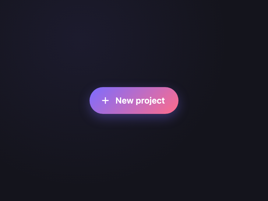
Quick decision guide. <strong>Generic primary action (Compose, Add, New)</strong>: Demo 01 (Material Gradient FAB) for SaaS; Demo 17 (Classic Plus) for minimal. <strong>Multiple secondary actions revealed by tap</strong>: Demo 02 (Speed Dial) for vertical stack; Demo 06 (Fan Arc) for radial spread. <strong>Scroll-to-top with progress</strong>: Demo 04 (Scroll-to-Top Progress Ring) — universal pattern. <strong>SaaS support / live chat</strong>: Demo 05 (Floating Chat Widget) — Intercom-style. <strong>Social sharing</strong>: Demo 08 (Social Share FAB) — slide-out network icons. <strong>Dark-mode / premium brand</strong>: Demo 09 (Glassmorphism FAB) for frosted; Demo 10 (Neon Glow FAB) for cyberpunk; Demo 30 (Premium Aurora) for editorial. <strong>Mobile app brutalism</strong>: Demo 25 (Brutalist Stamp) — black-on-yellow with hard shadow. <strong>Repositionable</strong>: Demo 12 (Draggable FAB) — Messenger-style chat heads. <strong>Notification awareness</strong>: Demo 13 (Notification Bell) — with badge pulse; Demo 26 (Notification Badge) — simpler variant. <strong>E-commerce</strong>: Demo 14 (Floating Cart Badge) — item counter + slide list. <strong>Awwwards-style interactive</strong>: Demo 15 (Magnetic Hover) — cursor-attraction effect. <strong>Theme switcher</strong>: Demo 16 (Theme Toggle) — sun/moon with smooth transition. All 32 demos respect prefers-reduced-motion, use scoped <code>.fbNN-*</code> or <code>.cfb-*</code> class names so multiple can coexist, ship semantic HTML with aria-labels, and are MIT-licensed.