A CSS flexbox layout uses native display: flex to arrange items along one axis with intelligent sizing, spacing, and alignment. These 15 hand-coded layouts are production-ready flexbox templates for the patterns developers ship every day — holy grail page shells, responsive card grids, sticky navbars, sidebar dashboards, pricing tables, sticky footers, kanban boards, chat interfaces and more. Copy the CSS, drop in your content, and ship.
15 unique layouts14 Pure CSS1 CSS + JS100% copy-paste readyPublished
01 / 15
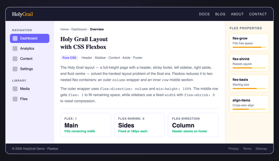
CSS Flexbox Holy Grail Layout
Pure CSS
A classic holy grail layout — fixed header, footer, left sidebar, right aside, and expanding main column — built entirely with nested flex containers and no CSS Grid.
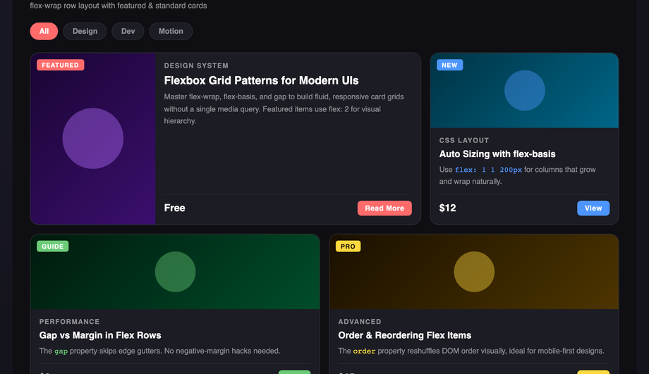
A responsive flex card grid with a featured wide card and uniform standard cards that wrap automatically — no media queries required for the basic reflow.
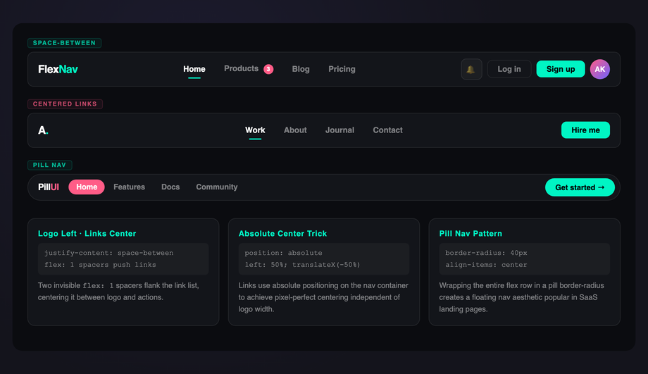
Three navigation bar variants — space-between spread, absolutely centered links with flex spacers, and a pill-style active-highlight nav — all built with flex alignment tricks.
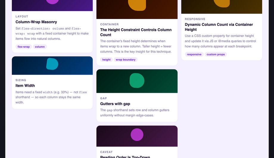
A multi-column masonry-style card waterfall using <code>flex-direction: column</code> and <code>flex-wrap: wrap</code> with a fixed container height — no JavaScript required.
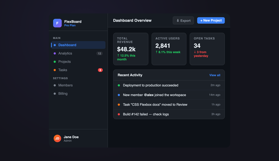
A full app-shell dashboard with a fixed-width flex sidebar, collapsible nav groups, top header bar, stat cards row, and a main content area — all wired with flexbox.
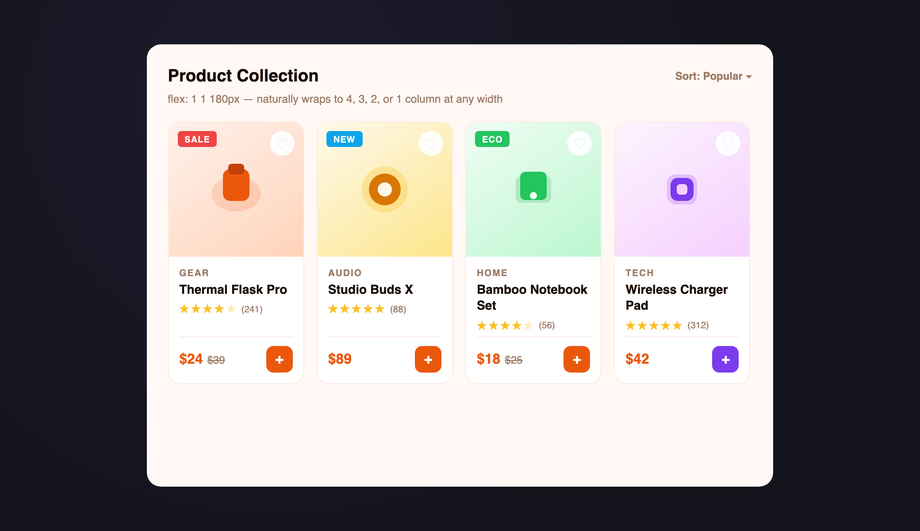
An e-commerce product card grid using <code>flex: 1 1 180px</code> with a max-width cap — cards reflow from four columns to one with no JavaScript or media queries.
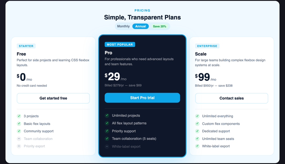
A three-tier pricing table with equal-height columns, a scaled featured plan, and flex-driven feature lists — all columns stretch to identical height without JavaScript.
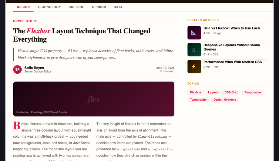
A classic editorial magazine layout with a two-thirds article column, one-third sidebar, drop cap, pull quotes, and a multi-column body text — built with flex and CSS columns.
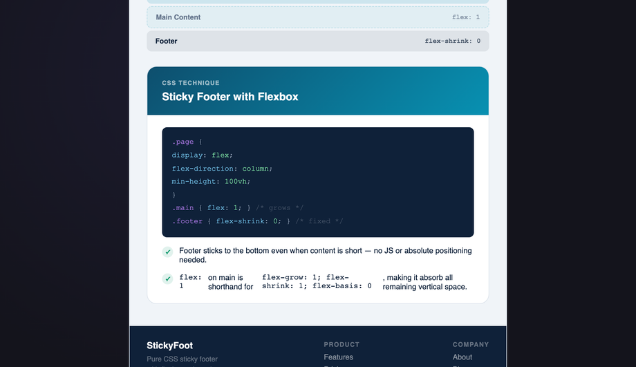
The definitive flexbox sticky footer pattern — a column flex wrapper with <code>min-height: 100%</code> and <code>flex: 1</code> on the main content pushes the footer to the bottom on any page length.
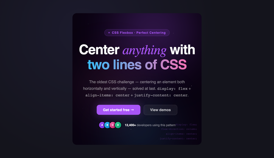
A full-bleed hero section with perfect flex centering, animated gradient orbs, a headline group, subtext, and a CTA button row — demonstrating multi-axis flex alignment.
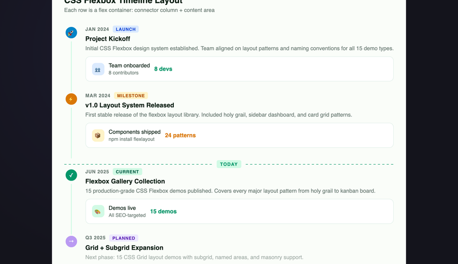
A vertical event timeline where each entry is a flex row — a narrow connector column with a dot and line, and an expanding content card — creating a clean left-rail chronology.
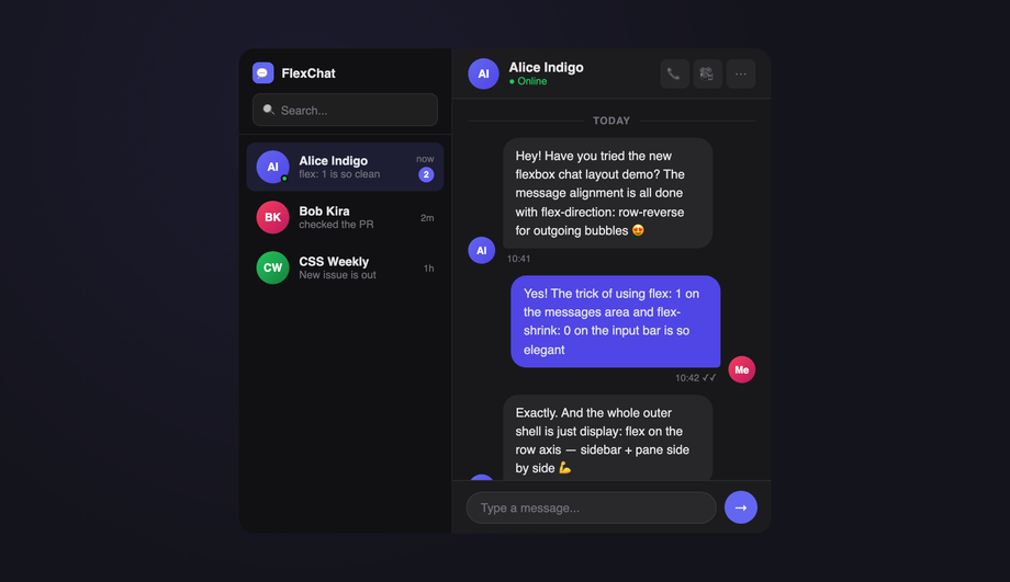
A messaging UI with a flex-row shell (contacts sidebar + message pane), scrollable message thread with pinned input bar, and live send interaction — all flex-driven.
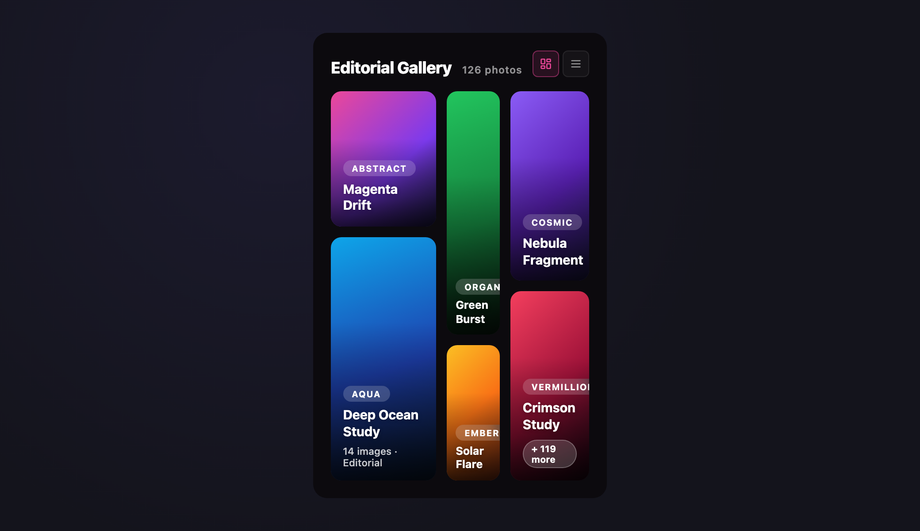
A photo mosaic gallery with three flex columns of varying weights (<code>flex: 2</code>, <code>flex: 1</code>, <code>flex: 1.5</code>) and variable-height tiles, each captioned with a category tag and title — creating an asymmetric editorial grid like Unsplash or Pinterest.
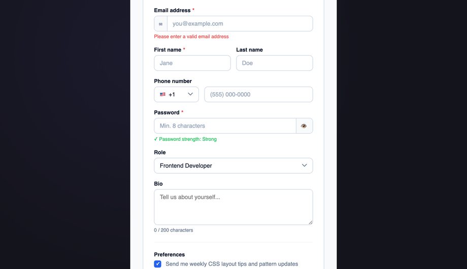
A structured form layout using flex for single-column fields, inline multi-column field rows, and input groups with prefix/suffix addons — all without tables or floats.
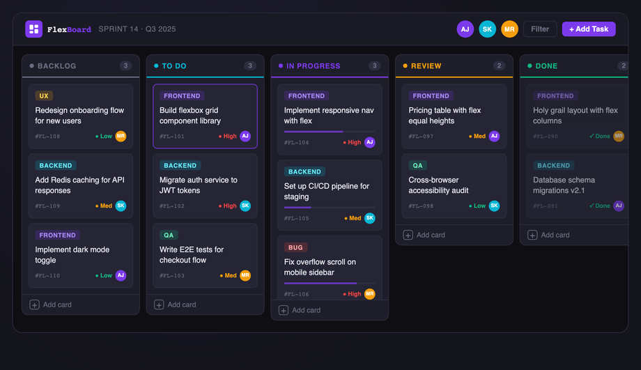
A dark-themed Kanban board with five status columns, draggable task cards, color-coded priority badges, avatar assignments, and a progress bar — built with a horizontal flex shell.
A CSS flexbox layout uses `display: flex` on a container so its children arrange themselves along one axis — horizontal (`flex-direction: row`, the default) or vertical (`flex-direction: column`). Flex children get intelligent sizing via `flex-grow` (fill remaining space), `flex-shrink` (give up space when crowded), and `flex-basis` (their starting size). Alignment along the main axis uses `justify-content`; along the cross axis uses `align-items`. Combined with `gap`, `flex-wrap`, and the `min-width: 0` trick for overflowing text, flexbox is the right tool for any single-axis arrangement: navbars, button rows, card lists, sidebar shells, chat bubbles, pricing columns, and kanban boards.
When should I use flexbox instead of CSS grid?
Use flexbox when items flow along **one axis** at a time — a navbar where logo + nav + actions sit in a row, a vertical sidebar of menu items, a row of pills, a stack of chat bubbles, a kanban board of vertical columns. Use [CSS grid](/layouts/css-grid-layouts/) when you need to control **both rows and columns at once** — a page shell with header / sidebar / main / footer arranged in named regions, a dashboard with cells that span multiple rows and columns, or a card gallery with explicit row and column tracks. The decision rule: if you're thinking 'arrange these in a line,' reach for flexbox; if you're thinking 'place these into a grid,' reach for grid. Both can be combined — a grid page shell with flex navbars inside it is the most common production pattern, and it's how 7 of the 15 demos in this collection are built.
How do I build a sticky footer with flexbox in 2026?
The modern pattern uses `min-block-size: 100dvh` on `body` (the dynamic viewport unit handles iOS Safari's address-bar resize correctly, unlike the legacy `100vh`), `display: flex`, `flex-direction: column` — then `flex: 1` on the `<main>` content area. The footer naturally sticks to the bottom because main grows to fill any remaining space. No `position: absolute`, no negative margins, no `calc(100vh - footerHeight)` hacks. Demo #09 (CSS Flexbox Sticky Footer Layout) ships the full snippet — copy it as-is and the footer sticks at any content length on any device. The pattern degrades gracefully to `100vh` for browsers that don't support `100dvh` (Safari < 15.4, Chrome < 108) via `min-block-size: 100vh; min-block-size: 100dvh;` stacked declarations.
Are these flexbox layouts WCAG-accessible?
Yes. Every layout uses semantic landmarks (`<header>`, `<nav>` with `aria-label`, `<main>`, `<aside>`, `<footer>`) so screen readers expose document structure. Interactive controls are real `<button>` and `<a>` elements with visible `:focus-visible` rings — the kanban demo (Demo #15) keeps focus inside its column when items reorder, and the chat demo (Demo #12) uses `aria-live="polite"` on the message list so new bubbles are announced. The navbar (Demo #03) and sidebar (Demo #05) both expose `aria-current="page"` on the active link. All demos meet WCAG 2.2 AA contrast (≥ 4.5:1 for body, ≥ 3:1 for UI components) and target Section 508 / EU EAA compliance — audit any of them with axe DevTools or Lighthouse's accessibility audit to verify the color and ARIA pass.
Why does my flexbox text overflow its container?
Flex items have an implicit `min-width: auto` that resolves to their intrinsic content size — so a long URL, an unbreakable word, or a `<code>` block inside a flex child can push the whole container wider than its parent and break the layout. The fix is one line: `min-width: 0` on the offending flex child. This unlocks the normal CSS overflow behavior (`overflow: hidden`, `text-overflow: ellipsis`, `white-space: nowrap` then work as expected). Pair it with `flex: 1 1 auto` for shrinkable text content and `flex-shrink: 0` for fixed-width siblings (icons, indicators). This is the single most common flexbox bug — every demo in this collection that has shrinkable text content (chat #12, navbar #03, magazine #08) applies the `min-width: 0` defensively so it never bites users who copy and adapt the code.
How do these flexbox layouts compare to Tailwind, Bootstrap, MUI, Chakra, and shadcn/ui?
**Tailwind CSS** ships utility classes that one-to-one map to flexbox properties: `flex` = `display: flex`, `flex-row` / `flex-col`, `justify-between` / `items-center` / `gap-4`, `flex-1` / `flex-shrink-0` / `min-w-0`. Each demo here translates directly — copy the structural decisions (which child gets `flex: 1`, which gets `min-width: 0`) into Tailwind utilities. **Bootstrap 5** uses similar tokens via its `d-flex` / `justify-content-between` / `align-items-center` / `flex-fill` / `flex-shrink-0` utilities — the grid module above is built on flexbox under the hood. **MUI** (Material UI) exposes flexbox via its `<Stack>` and `<Box>` props (`direction`, `spacing`, `justifyContent`). **Chakra UI** has `<Flex>`, `<HStack>`, `<VStack>` primitives. **shadcn/ui** components use Tailwind utilities directly so any pattern here works inside a shadcn project unchanged. The underlying CSS knowledge is portable across all five frameworks — these demos teach the pattern; the framework adds syntactic sugar. Want the converted utilities? Drop a demo's CSS into our [CSS to Tailwind converter](/tools/css-to-tailwind-converter/) to see the utility-class equivalent.
What's the right flexbox alternative to CSS masonry?
True CSS masonry (`grid-template-rows: masonry`) is still behind a flag in most browsers as of 2026 — it ships in Firefox but isn't in Chrome / Safari stable yet. The cleanest flexbox alternative uses `flex-direction: column` with multiple columns and a `column-count` fallback, or — more commonly — three or four vertical flex columns each containing items of varying height, items distributed in render order. Demo #04 (CSS Flexbox Masonry-Style Layout) ships this pattern: three columns side-by-side (`display: flex`), each column is itself a flex container (`flex-direction: column; gap`), and items are distributed across columns in render order. The visual result reads as a Pinterest-style masonry. The tradeoff: items aren't auto-balanced across columns (you may end up with one taller column), but it works in every browser today with no JavaScript. When `grid-template-rows: masonry` ships universally, swap the flex columns for a CSS grid container — the markup stays the same.
Are these CSS flexbox layouts free and how should I attribute them?
Yes — all 15 layouts are MIT licensed and free for personal and commercial use, including in client projects, SaaS products, and design systems. The MIT license requires only that you keep the copyright notice somewhere in your source if you redistribute the code as-is; in production HTML / CSS that you've adapted, no visible attribution is needed. If you ship one of these as part of an open-source UI library, include a one-line credit in your README pointing to https://codefronts.com — that helps the project and is appreciated but not legally required. The code panels show exactly what to copy: the HTML tab is your markup, the CSS tab is your stylesheet, and the JS tab (where present — Demo #15 kanban only) is the optional vanilla JavaScript handler. Every snippet is self-contained, framework-free, and works at any viewport from 320px (mobile) to 1440px+ (desktop wide) without modification.