21 CSS Pricing Sections
A CSS pricing section is the band on a landing page where visitors decide whether to buy. These 21 hand-coded layouts are full-featured pricing pages you can drop into a project today — find-and-replace your brand colors and ship.
01 / 21
Animated Border Cards
Pure CSS 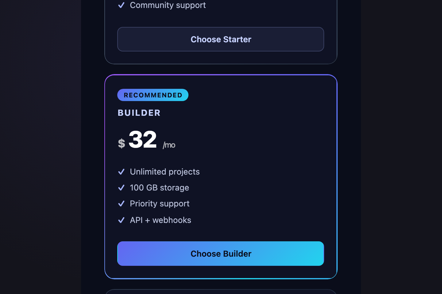
Three pricing cards with a conic-gradient border that rotates continuously using <code>@property</code> animatable angle.
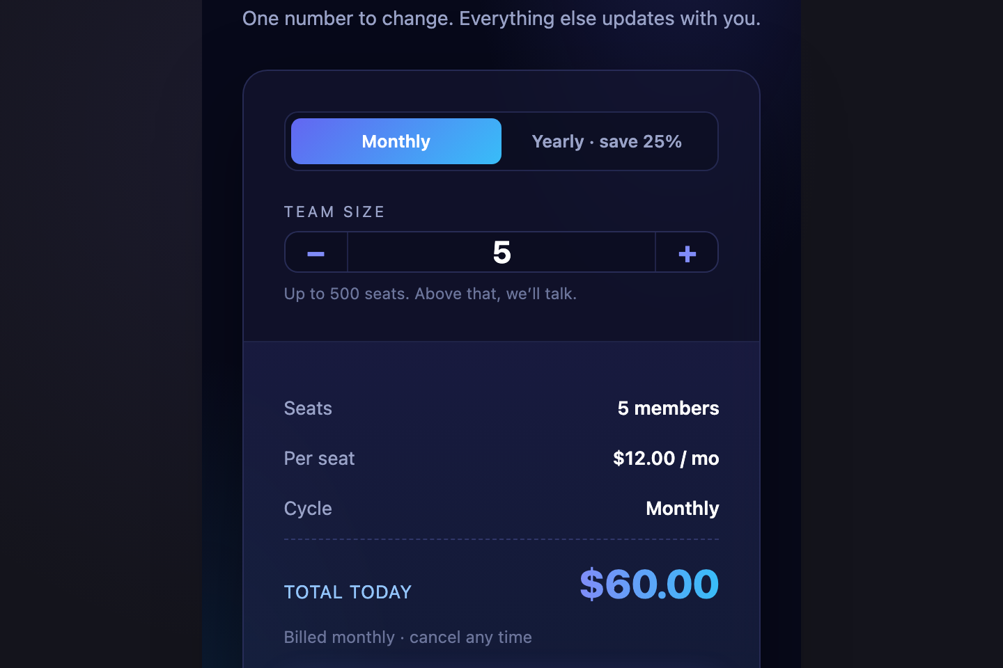
02 / 21
Editorial Two Column
Pure CSS 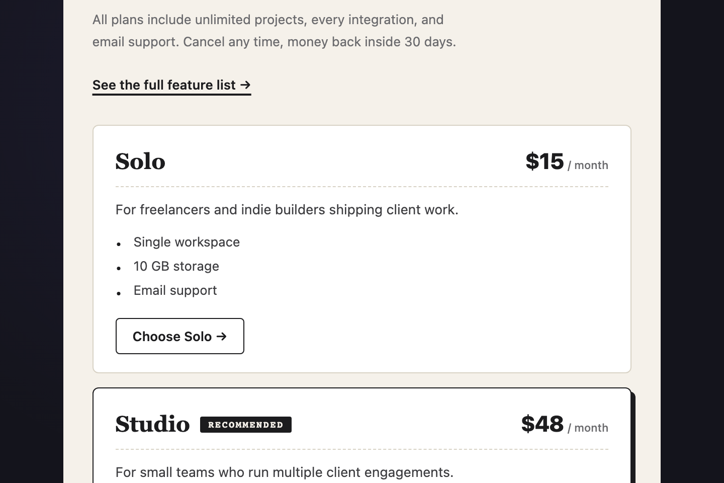
A dense editorial pricing layout — left column carries the value-prop copy, right column stacks two compact tier rows like a printed price list.
03 / 21
3D Tilt Cards
Pure CSS 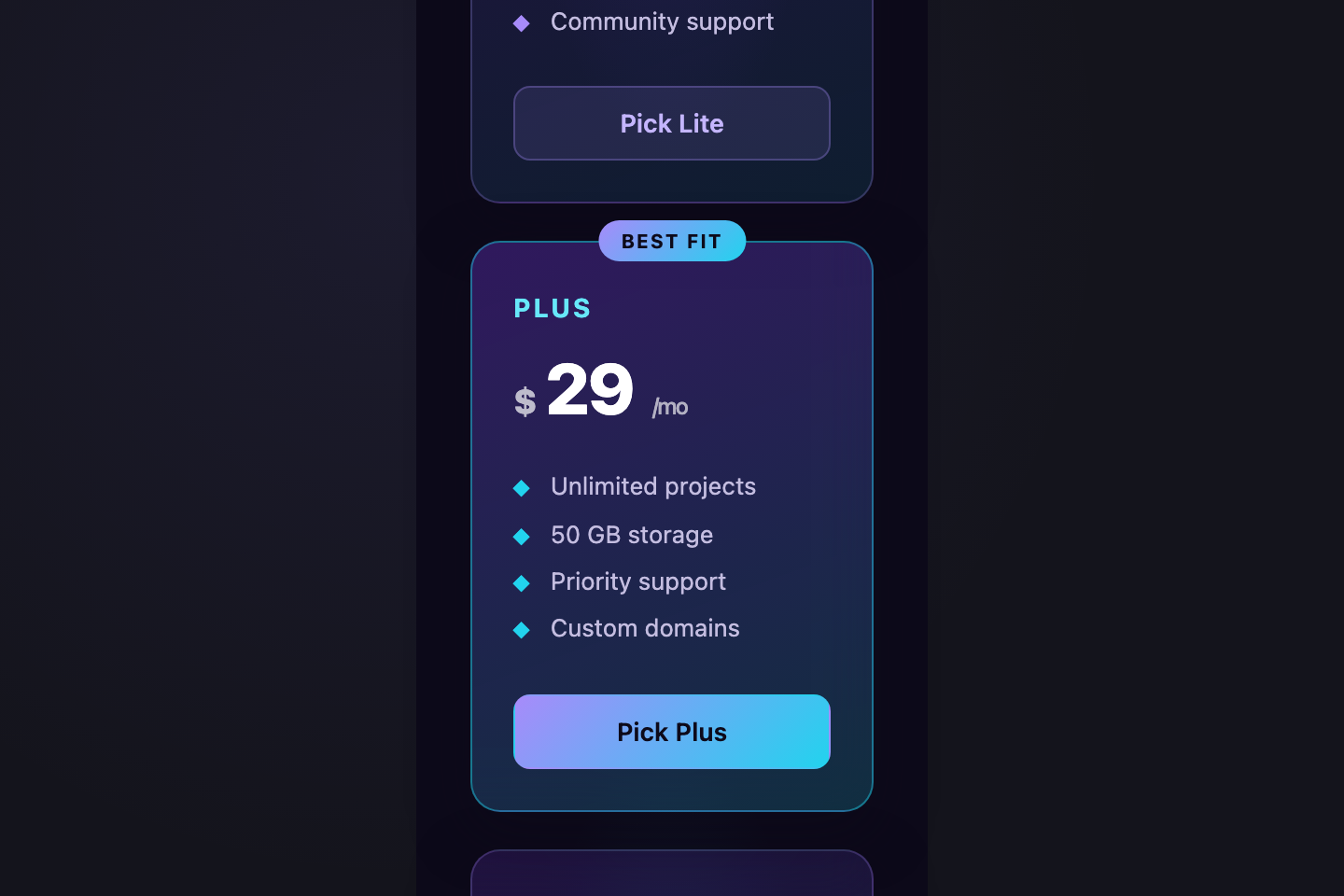
Three pricing cards in 3D perspective, tilting back when not hovered and snapping forward on hover.
04 / 21
Synthwave Neon
Pure CSS 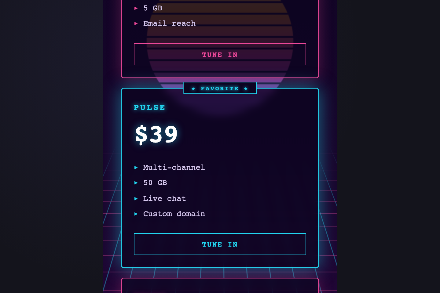
Retro 80s synthwave pricing — magenta and cyan neon over a perspective grid horizon, chrome heading reflection, sun gradient behind the cards.
05 / 21
Pay What You Want
Pure CSS 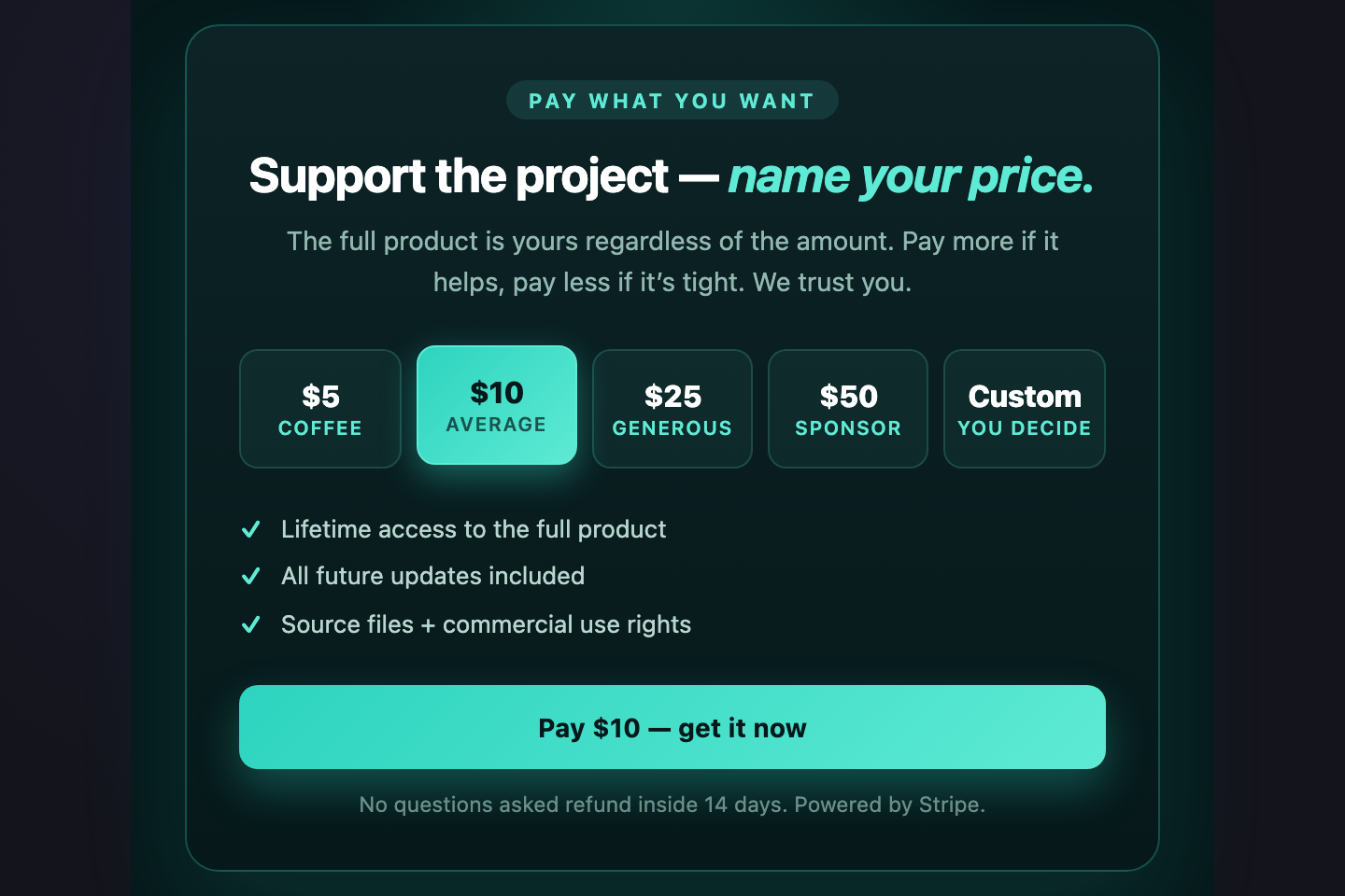
A pay-what-you-want layout with five preset chips ($5 / $10 / $25 / $50 / Custom) — selecting one updates the active state and the highlighted CTA via radio + <code>:has()</code>.
06 / 21
Currency Switcher
Pure CSS 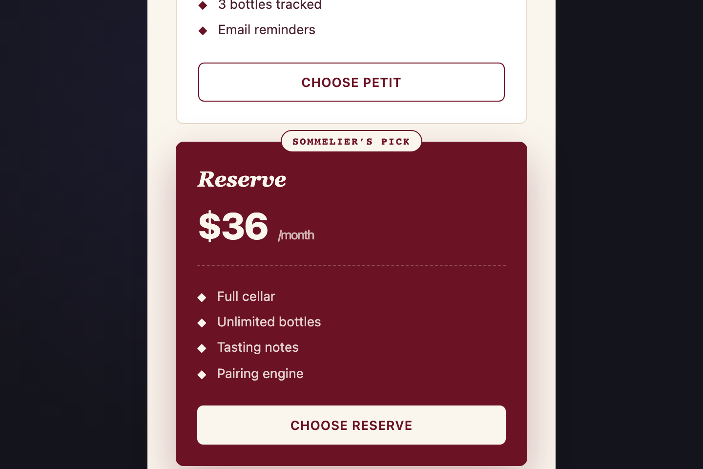
A pure-CSS currency switcher (USD / EUR / GBP) using hidden radios + <code>:has()</code> to swap every visible price across all three tiers.
07 / 21
Social Proof Pricing
Pure CSS 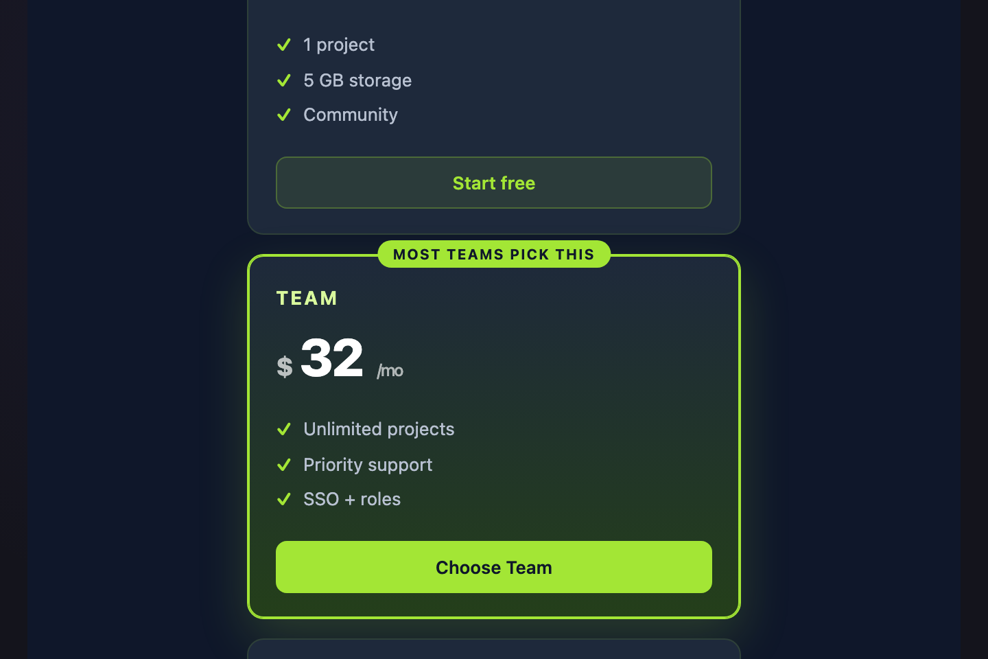
A scrolling logo wall above the pricing tiers — social proof first, decision second.
08 / 21
Feature Accordion Tiers
Pure CSS 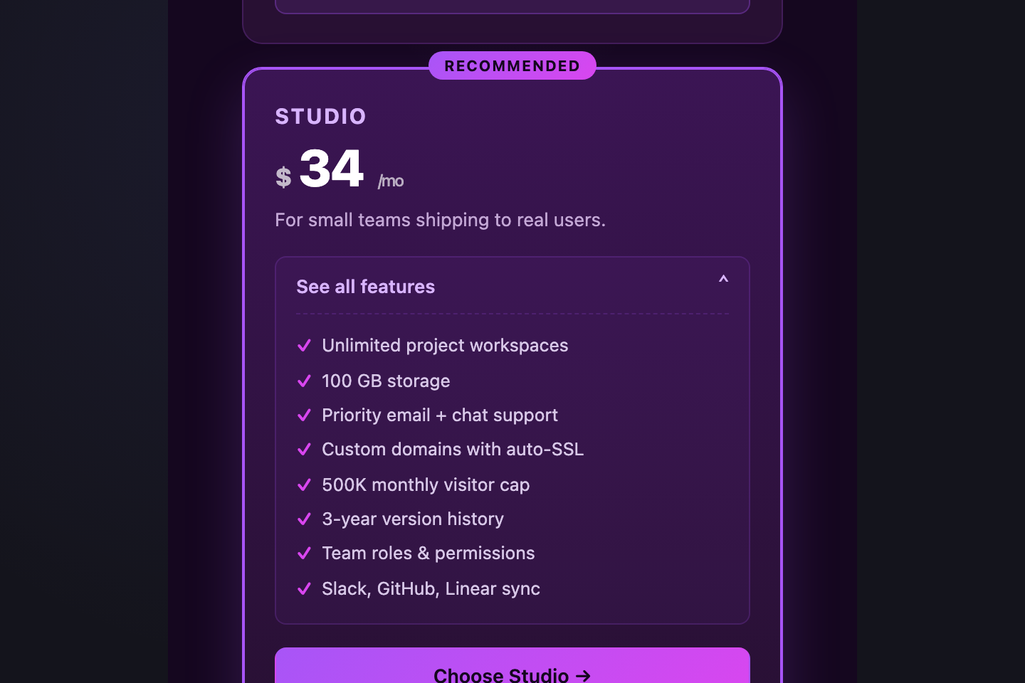
Three tier cards with native <code><details></code>/<code><summary></code> dropdowns that reveal the full feature list on click — keeps the page short and lets curious buyers dig in.
09 / 21
Spotlight Pricing
Light JS 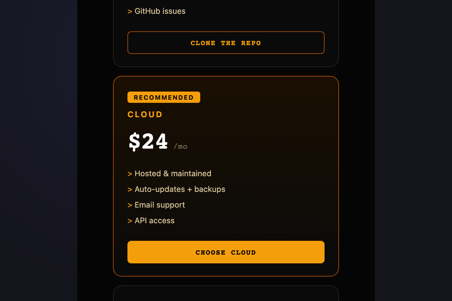
Cards illuminate where the cursor moves — a CSS variable carries pointer X/Y and a radial gradient renders the spotlight.
10 / 21
Annual Savings Stripe
Pure CSS 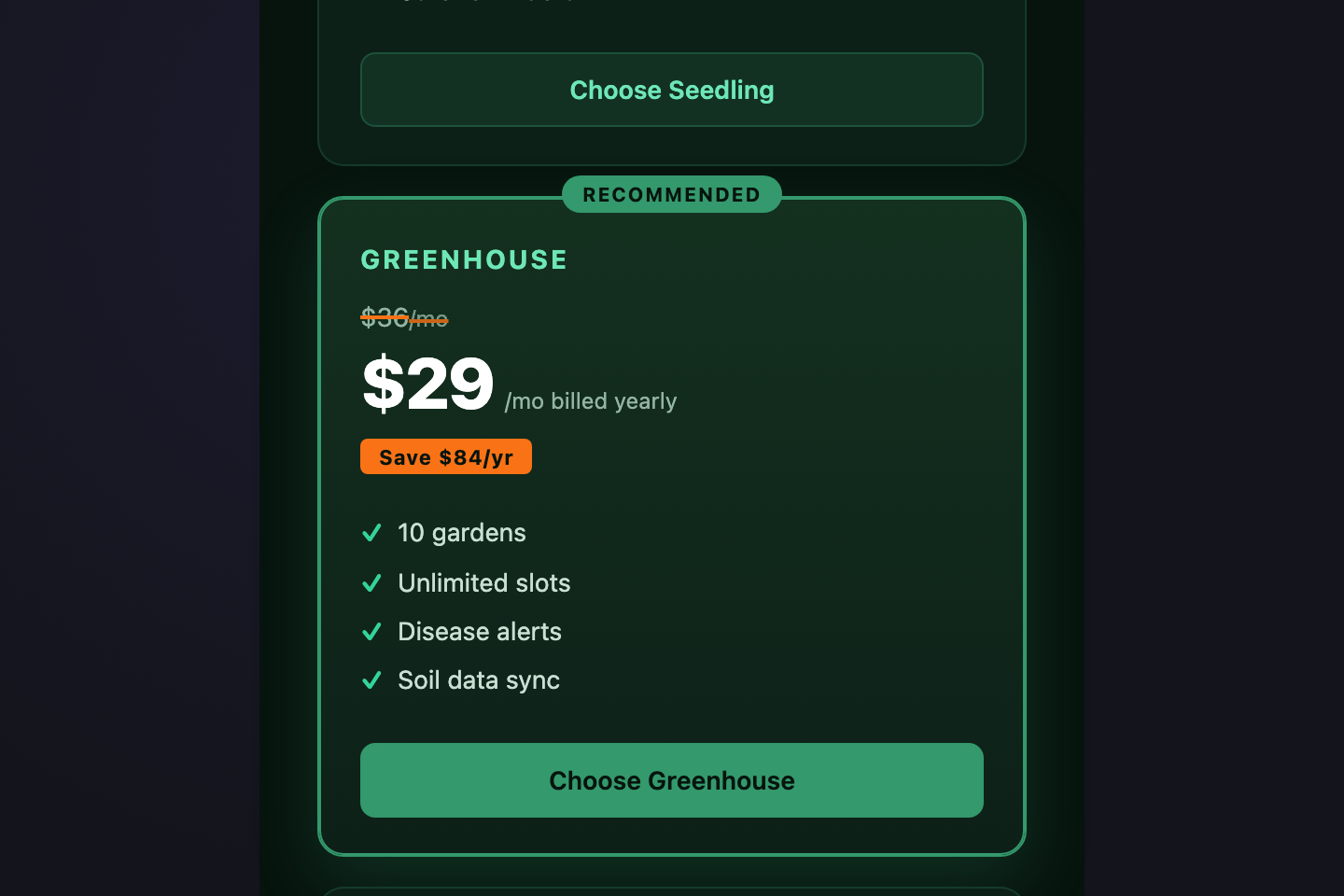
A pricing layout that makes the annual discount visible — monthly price struck through next to the discounted annual price, with a "Save $X/yr" pill underneath.
11 / 21
Classic Three Tier
Pure CSS 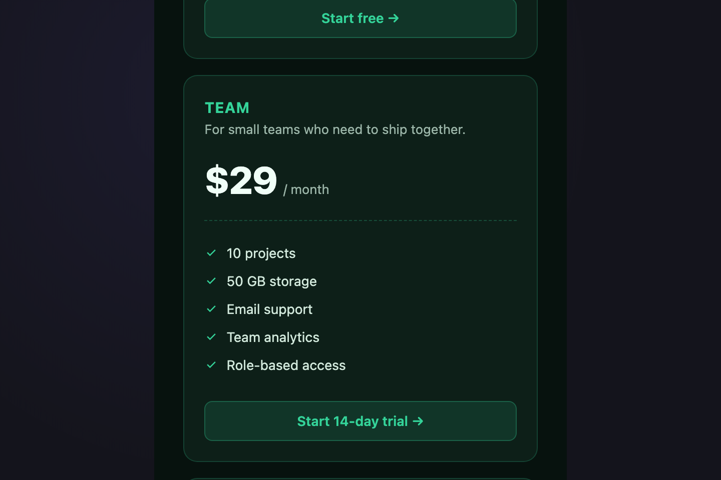
The canonical SaaS pricing layout — three equal tier cards (Starter / Team / Business) with emerald accent.
12 / 21
Highlighted Popular
Pure CSS 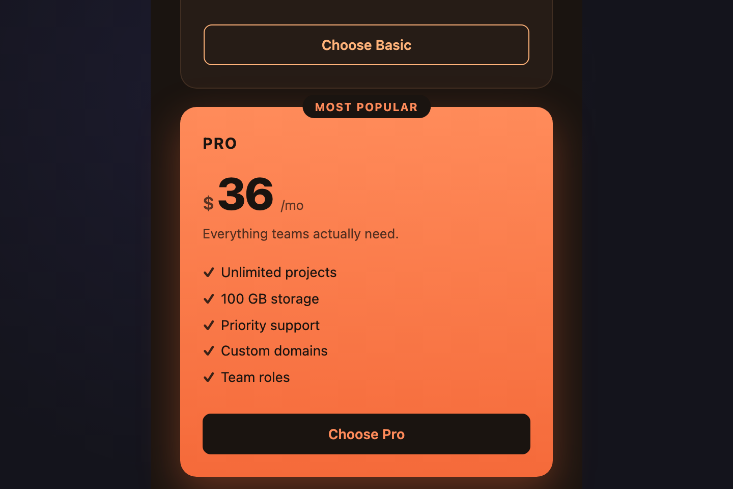
Three tiers with the middle "Pro" plan lifted, scaled, and ribboned with a "Most Popular" badge.
13 / 21
Feature Comparison Table
Pure CSS 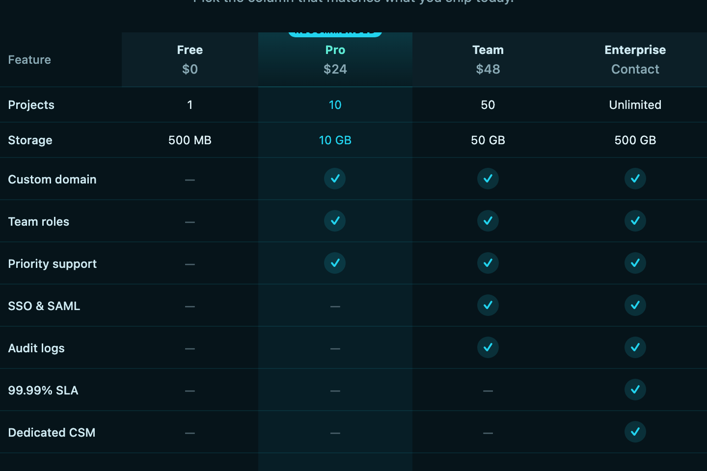
A real <code><table></code> with proper <code><th scope></code>, sticky header row, and check / dash cells comparing four plans across nine features.
14 / 21
Monthly Yearly Toggle
Pure CSS 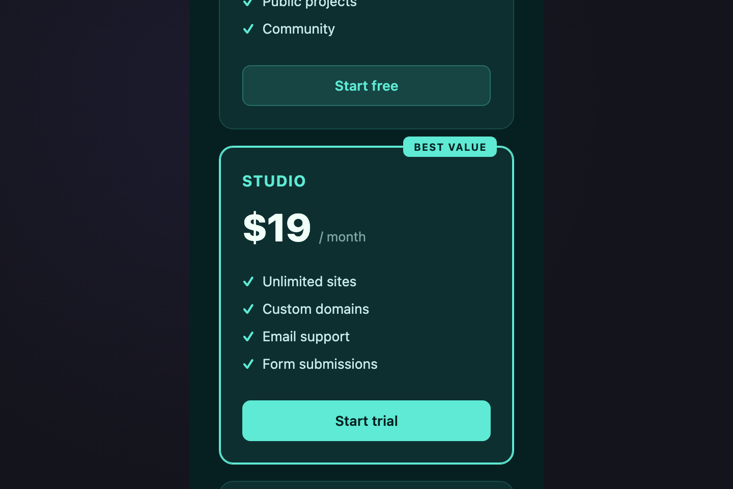
A pure-CSS billing-cycle switch using two hidden radios + <code>:has()</code>.
15 / 21
Usage Slider
Light JS 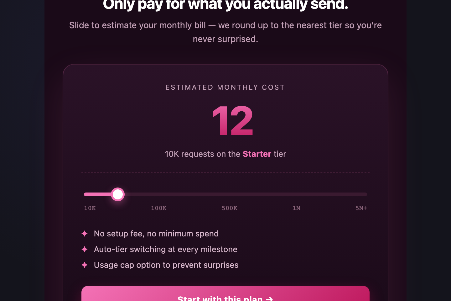
Native <code><input type="range"></code> drives a live monthly estimate.
16 / 21
Single Premium Card
Pure CSS 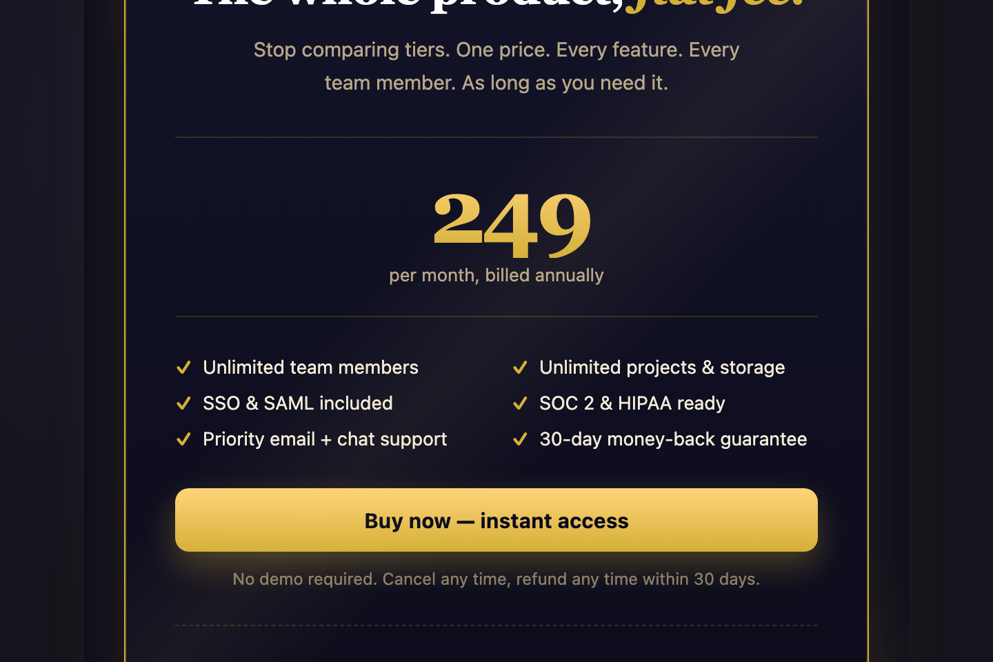
A single-tier pricing layout for one-product brands — premium gold / brass treatment over deep navy, oversized price block, six feature checkmarks in two columns, anchor testimonial below.
17 / 21
Bento Pricing Grid
Pure CSS 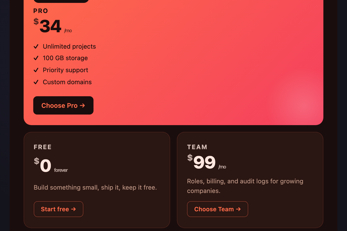
Apple-style bento layout — the recommended Pro tile dominates one large quadrant, with stat / quote / pill cells fanning out.
18 / 21
Vertical Tier Timeline
Pure CSS 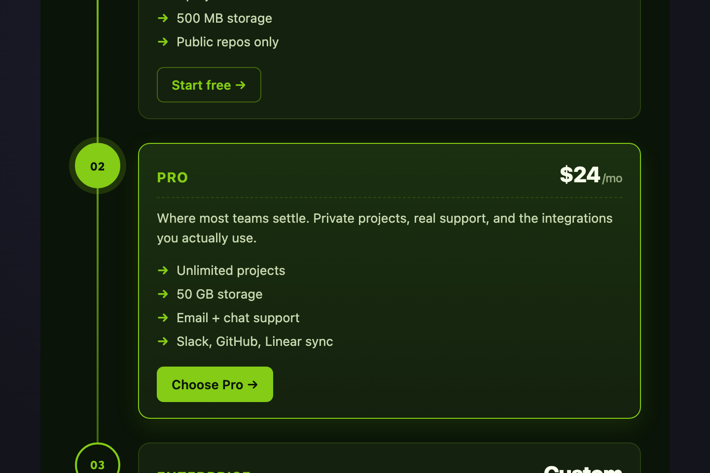
Tiers presented as a vertical roadmap — Free → Pro → Enterprise — connected by a glowing lime spine.
19 / 21
Brutalist Print
Pure CSS 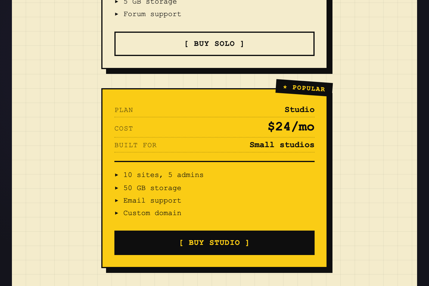
Print-zine pricing — black on cream, hard offset shadows, mono type, intentionally raw.
20 / 21
Glass Aurora
Pure CSS 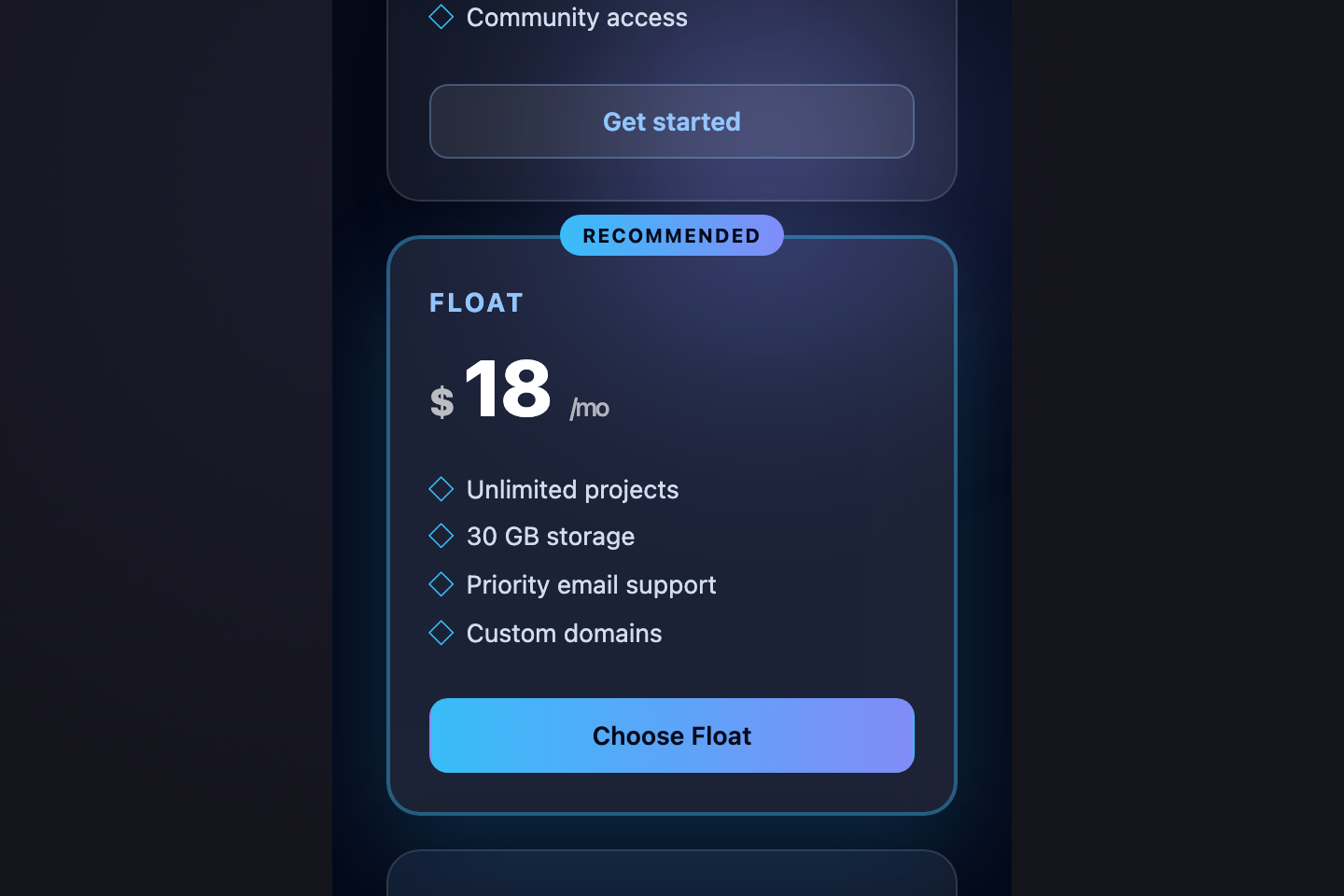
Frosted-glass pricing cards floating over a slow-drifting aurora gradient — radial blobs that orbit behind the cards.
Build your own
Tweak the exact look in our visual generators — no signup, instant copy-paste.
FAQ
Frequently asked questions
What is a CSS pricing section?
A pricing section is the band on a landing page where visitors decide whether to buy. Typical patterns are three-tier card rows, comparison tables, billing-cycle toggles, and usage calculators. It's the highest-stakes block on a SaaS page — every other section exists to drive visitors to it.
Should the middle tier be highlighted?
Almost always yes. The 'most popular' lift on the middle tier is the single most reliable conversion booster on a pricing page — it shifts choice from a three-way comparison to an anchor-and-decide motion. Use a scaled card, contrasting background, and a 'Most popular' or 'Recommended' pill above the tier name.
How do I let users compare features without overwhelming them?
Two strategies. Either (a) keep the three-tier card layout and only show the 4–6 highest-value features per tier — visitors who want full detail click through, or (b) use a real semantic


