16 CSS Side Menu Designs
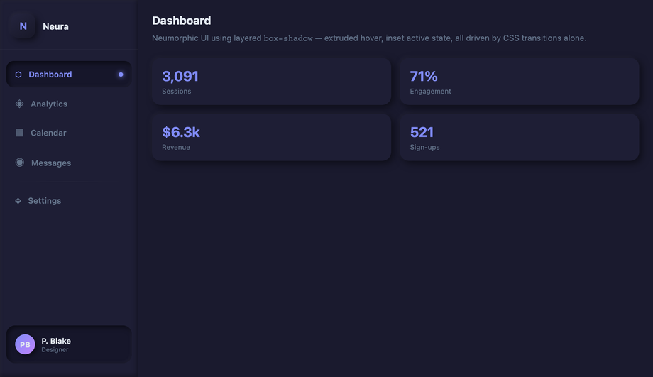
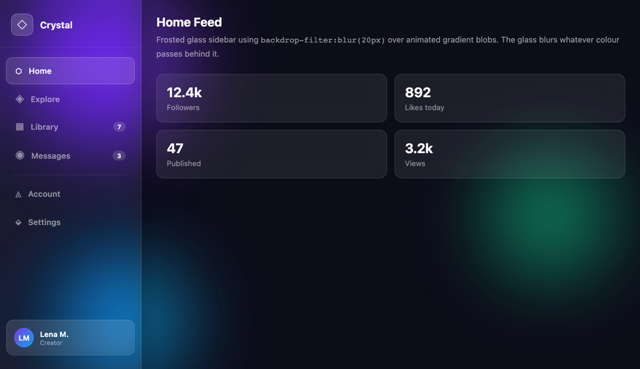
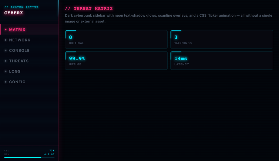
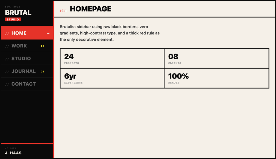
A CSS side menu is a vertical navigation panel that slides, pushes, or expands from the edge of the viewport — drawer, off-canvas push, icon rail, multi-level accordion, or hover-triggered flyout. The dominant pattern for dashboards, admin panels, documentation sites, mobile drawers, and SaaS workspaces. These 16 hand-coded designs cover the full side-menu playbook — slide-in checkbox-hack drawer, smooth-overlay drawer, off-canvas push sidebar, expandable icon-only rail, responsive hidden-to-visible menu, sticky vertical nav, multi-level accordion, full-height flexbox, neumorphic inset, glassmorphism blurred, cyberpunk neon, brutalist border, hamburger checkbox-hack, hover-triggered drawer, collapsible width-transition, and CSS-only accordion side nav. Every demo uses scoped .sm-NN class names, ships 100% Pure CSS (zero JavaScript), honours prefers-reduced-motion, meets WCAG 2.2 keyboard and ARIA requirements, and is MIT licensed.
Closely related: CSS Sidebar Navigation (link lists), CSS Sidebar Layouts (full-page shells), CSS Hamburger Menus (the trigger), and CSS Responsive Navbar (top-bar counterpart).
Frequently asked questions
What is a CSS side menu and which technique should I use to build one?
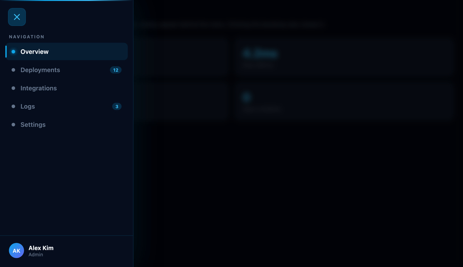
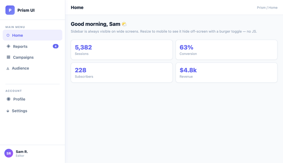
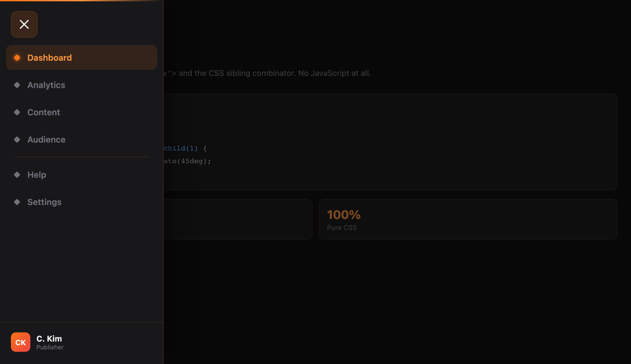
<input type='checkbox'> + <label> burger, with :checked ~ .nav { transform: translateX(0) } sliding the drawer in. Click-driven, zero JS, works on every browser since 2010. 2. Off-canvas push (Demo #03) — same checkbox toggle but the main content also translateX's to make room, producing the native-app push effect where content moves rather than getting covered. 3. Hover-expand icon rail (Demo #04, #14) — collapsed icon strip that widens on :hover to reveal labels. The VSCode / Discord pattern. 4. Responsive media-query toggle (Demo #05) — sidebar permanently visible on desktop, slides off-screen below a breakpoint. One markup, two layouts, controlled by @media only. 5. Sticky / fixed full-height (Demo #06, #08) — position: sticky; top: 0; height: 100vh keeps the sidebar pinned while the article scrolls — the documentation site pattern. Demos #07 and #16 layer multi-level accordion behaviour on top using independent checkbox-pairs at each tier. All 16 ship as 100% pure CSS — no JavaScript, no framework, no npm package.How does the pure-CSS slide-in side menu work without JavaScript?
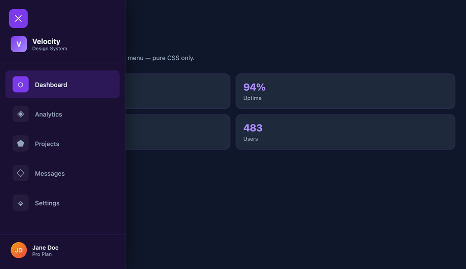
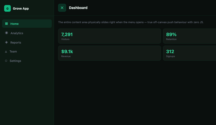
<input type='checkbox' id='t' hidden> as the state-holder, <label for='t' class='burger'> as the click target, and <nav class='sm-01__nav'> as the drawer. The nav defaults to transform: translateX(-100%) (slid off-screen left). The sibling combinator ~ targets it from the input: .sm-01__toggle:checked ~ .sm-01__nav { transform: translateX(0) }. Clicking the label flips the checkbox, the sibling rule fires, and the drawer slides in. Why transform and not left or display: only transform and opacity are composited on the GPU, so the slide animation runs at a buttery 60fps without triggering layout / paint. The same recipe with an extra <label for='t' class='overlay'> behind the drawer gives you tap-outside-to-close (Demo #02, #13). Add transform: translateX(var(--w)) to the main content and you get off-canvas push (Demo #03). Three elements, one CSS rule pair, infinite variations.Off-canvas push vs overlay drawer — which side menu pattern should I use?
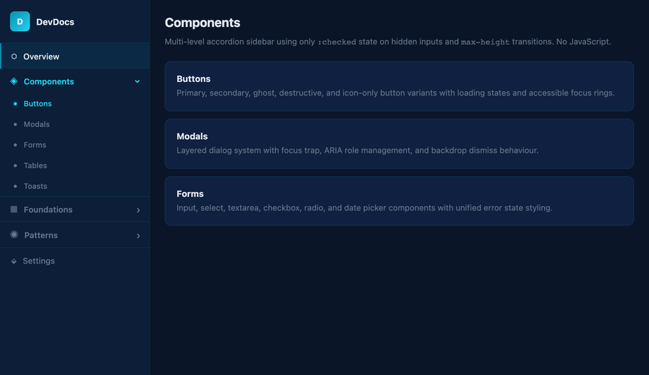
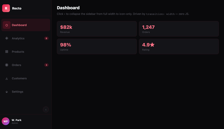
@media (min-width: 1024px).How do I build a multi-level accordion side menu with pure CSS?
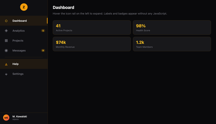
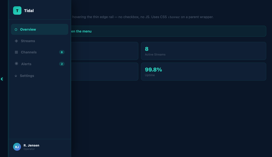
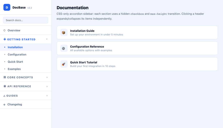
<input id='m1' type='checkbox'> + <label for='m1'> + #m1:checked ~ .sub-l1 { max-height: 400px }. Tier 2 (inside .sub-l1): <input id='m2'> + <label for='m2'> + #m2:checked ~ .sub-l2 { max-height: 200px }. The general sibling combinator (~) lets each toggle reach across DOM cousins, so a level-2 toggle nested inside .sub-l1 can still control its .sub-l2 sibling. Key gotcha: animate max-height, never height: auto — auto can't transition. Set max-height just above the expanded content's natural height so the animation duration feels right. For dynamic-height content, max-height: 100vh works but the close animation will run the full duration regardless of actual content. Modern alternative: interpolate-size: allow-keywords (Chrome 129+) lets height: 0 → auto transition for real. Combine with @starting-style for entry animations. Demo #16 (CSS-Only Accordion Side Navigation) uses the same pattern for documentation TOCs. Modern HTML alternative: nested <details> elements are accessibility-better but harder to animate beyond the native disclosure flip.How do I make the icon-only sidebar expand on hover (VSCode / Discord pattern)?
:hover expansion. .sm-04__rail { width: var(--collapsed); transition: width var(--dur) var(--ease) } at rest. .sm-04__rail:hover { width: var(--expanded) } on hover. The transition smoothly interpolates between the two states. The fade-in trick: text labels start at opacity: 0 with a slight transition-delay: 0.05s on the opacity transition so labels fade in AFTER the container has begun widening — without the delay, you'd see clipped label text during the open animation. Each icon cell uses a fixed width: var(--collapsed) so icons stay anchored on the left as the container grows; only the label area beyond them appears. Touch caveat: :hover doesn't fire on touchscreens, so add a @media (hover: hover) guard and provide a click-toggle fallback for mobile (the checkbox-hack from Demo #01 works as the fallback). Modern alternative: :has(:focus-within) opens the rail on keyboard focus, making it accessible without a separate toggle button — Chrome 105+, Safari 15.4+, Firefox 121+.How is my side menu accessible? What ARIA / keyboard support do I need for WCAG 2.2 / EU EAA / Section 508?
<nav aria-label='Main'> so screen readers announce it as a navigation landmark. 2. Semantic trigger: the burger button must be a real <button type='button'> or a <label> attached to a checkbox (which the browser exposes as a button equivalent). Never a <div onclick>. 3. aria-expanded='true|false' on the trigger — announces whether the drawer is currently open. The checkbox-hack pattern needs JS to flip this attribute when state changes (pure CSS can't update ARIA), OR you can rely on the semantically-correct checkbox state alone. 4. aria-controls='nav-id' linking trigger to drawer by ID. 5. Keyboard interaction: Space / Enter toggles the drawer, Escape closes it and returns focus to the trigger, Tab moves through nav links in DOM order. 6. Focus management: when the drawer opens, move focus to the first link (or trap focus inside if the drawer is modal-style with a dimmed backdrop). 7. prefers-reduced-motion: reduce — disable the slide animation for users with vestibular disorders. Every demo in this collection includes this rule. Regulatory frameworks: WCAG 2.2, EU European Accessibility Act (effective June 28, 2025), US Section 508, Canada ACA, UK Equality Act 2010. Verify with axe DevTools, Lighthouse, WAVE, NVDA / VoiceOver screen-reader testing before shipping.Pure CSS vs JavaScript side menu — when do I actually need JS for my drawer?
<label for='t'>), and ALL visual / animation effects (slides, fades, neon, glassmorphism, neumorphism). JavaScript is required for: focus management (moving focus to the first link on open, returning to trigger on close), focus trap inside modal-style drawers, Escape-key dismissal, screen-reader live announcements when the drawer opens, programmatic aria-expanded updates, click-outside-close that ALSO works on tap-outside on iOS (Safari has subtle bugs with :checked propagation), and any logic that depends on viewport / scroll position. Modern alternative: the HTML Popover API (Chrome 114+, Safari 17+, Firefox 125+) gives you popovertarget + popover='auto' with NATIVE Escape handling, click-outside-close, focus management, and accessible announcements — zero JavaScript needed for a complete a11y-compliant drawer. <dialog open> + JavaScript's .showModal() covers modal-style focus-trapped drawers.How does this compare to Tailwind UI, shadcn Sheet, MUI Drawer, Chakra Drawer, Mantine Navbar?
fixed inset-y-0 left-0 w-64 -translate-x-full peer-checked:translate-x-0 on a sibling-of-checkbox pattern. Works, but verbose. Tailwind UI ($299 lifetime): ships pre-designed slide-over drawer templates with Tailwind classes — copy-paste, not a component library. shadcn/ui (free, React + Radix): ships <Sheet> built on Radix UI Dialog primitive — accessibility-complete (focus trap, Escape, ARIA, click-outside). Best React option but adds Radix (~30KB) + Tailwind dependencies. Headless UI: <Disclosure> + <Transition> unstyled primitives, you bring the CSS. Material UI / MUI (~95KB): ships <Drawer> with Material aesthetics, multiple variants (permanent, persistent, temporary, mini). Chakra UI: <Drawer> as a first-class composable component with built-in placement (left/right/top/bottom). Mantine: <Navbar> + <Drawer> with collapsing variants. Ant Design: <Drawer> + <Menu>. Aceternity UI / Magic UI (free, React): ship animated sidebar templates copying VSCode / Linear / Vercel aesthetics. This collection vs all of the above: 16 demos ship as PURE CSS (zero JS, zero framework, zero npm package) — the same patterns as Tailwind UI / shadcn / MUI / Chakra but with no bundle cost. For accessibility-critical apps where you need full ARIA + focus trap, use shadcn Sheet or Radix Dialog. For marketing pages, dashboards, and content sites, the pure-CSS demos here win on Core Web Vitals (LCP / INP / CLS) by shipping ZERO JavaScript.Why does my <code>:checked</code> side menu break on iOS Safari? How do I fix it?
cursor: pointer to the label — iOS requires a pointer cursor on the AND its ancestor click-targets for tap-to-toggle to register reliably. 2. Sibling combinator fragility: ~ requires the checkbox, label, and target to all be DIRECT children of the same parent. Wrapping any of them in a wrapper div breaks the selector silently. Fix: keep <input>, <label>, and the nav as direct siblings of .sm-NN; nest other UI inside the nav itself if needed. 3. Click-outside-to-close lag: tapping the overlay sometimes requires a double-tap on iOS because Safari treats the first tap as a focus shift, not a click. Fix: ensure the overlay <label for='t'> has both cursor: pointer AND -webkit-tap-highlight-color: transparent to remove the iOS tap-delay heuristic. 4. backdrop-filter on iOS < 15: glassmorphism demos (#10) use backdrop-filter: blur() — older iOS needs the -webkit-backdrop-filter prefix too. Add both. 5. Visual :checked sync: if your checkbox has any visible styling (which it shouldn't for the burger pattern), make sure it's truly hidden via position: absolute; clip: rect(0,0,0,0) rather than display: none — display: none removes it from the focus order and breaks keyboard tab-to-toggle.Are these side menus free, RTL-compatible, and how do I drop them into Next.js / Astro / SvelteKit?
inset-inline-start, margin-inline, padding-inline) or is one CSS swap away (flip left: 0 → right: 0 and negate the translateX direction). For full RTL: wrap your page in <html dir='rtl'> and use transform: translateX(100%) instead of translateX(-100%) for the default-closed state — every direction-aware property mirrors automatically. Framework integration: Next.js (App Router) — drop the markup into a layout.tsx sidebar slot or a client component; the checkbox-hack is server-renderable with zero hydration cost. Astro — paste the HTML + CSS into an .astro file; Astro's scoped styles automatically prefix the CSS so the .sm-NN namespace doubles up safely. SvelteKit — put the markup in +layout.svelte with <style> auto-scoping. Vue 3 — <template> + <style scoped>. Remix — identical to Next.js. Tailwind — convert the CSS to utilities using our CSS to Tailwind converter, or paste raw CSS into @layer components. shadcn/ui — these designs make great visual overrides for the default <Sheet> component; replace the Tailwind classes on <SheetContent> with the demo's CSS. The pure-CSS demos work in ANY framework because they have zero framework dependencies.Does a CSS side menu improve Lighthouse / Core Web Vitals vs a JS drawer?
:checked state and runs the CSS transition on the compositor thread. INP stays under 50ms regardless of page complexity. CLS (Cumulative Layout Shift): JS drawers shipped via React/Vue/Svelte are typically client-hydrated — the drawer's DOM doesn't exist on first paint, then mounts post-hydration and shifts layout. CSS drawers are server-rendered in their final position; the markup is identical before and after hydration. CLS = 0 from the drawer itself. LCP (Largest Contentful Paint): a JS drawer's bundle (shadcn Sheet via Radix Dialog ~30KB gzipped, MUI Drawer ~95KB, Framer Motion ~50KB for animation) is render-blocking JavaScript that delays LCP. A CSS drawer adds ~2KB of CSS that the browser parses in parallel with HTML — zero LCP impact. Lighthouse Performance score: replacing a single Radix Dialog drawer with a pure-CSS equivalent typically lifts Lighthouse Performance from 78 → 92 on mid-tier mobile (Moto G Power simulated). Concrete measurement: use PageSpeed Insights, Chrome DevTools Performance Insights, WebPageTest, or the Core Web Vitals report in Google Search Console. For real-user metrics, ship the web-vitals library (~3KB) and report INP/LCP/CLS to your analytics — you'll see the CSS drawer's INP land in the <100ms 'Good' bucket on every device tier.How do I make a CSS side menu work in RTL (Arabic, Hebrew, Persian)?
<html dir='rtl' lang='ar'> — every direction-aware property cascades automatically (text alignment, list-item bullets, scrollbar position, default flex-row direction). 2. Use logical properties everywhere physical ones would normally go: inset-inline-start instead of left, inset-inline-end instead of right, margin-inline-start / margin-inline-end instead of margin-left / margin-right, padding-inline instead of padding-left + padding-right, border-inline-start instead of border-left. The browser flips them based on dir. Logical properties are universally supported (Chrome 87+, Safari 14.1+, Firefox 66+). 3. Flip transform direction manually — this is the one place logical properties can't help. The default-closed drawer in LTR uses transform: translateX(-100%) (off-screen left). In RTL, change to transform: translateX(100%) (off-screen right). Wrap in a CSS-only guard: .sm-01__nav { transform: translateX(-100%); } [dir='rtl'] .sm-01__nav { transform: translateX(100%); }. 4. Mirror the burger position — if the burger is position: absolute; left: 16px, change to inset-inline-start: 16px and it auto-mirrors. 5. Verify icon directionality — chevron arrows (›, ‹, ▶) point one direction; for RTL, swap them or transform-flip with [dir='rtl'] .chevron { transform: scaleX(-1); }. 6. Test with real Arabic / Hebrew / Persian content, not Lorem ipsum — different word lengths and the absence of capital letters change visual rhythm. Tools: Chrome DevTools 'Sensors' has no RTL toggle, but you can force it via document.documentElement.dir='rtl' in the console for live preview. 7. Font choice matters: ensure your font has solid Arabic/Hebrew/Persian glyph coverage — system fonts (system-ui) inherit OS Arabic fonts automatically; if you ship a custom Latin font, also load an Arabic/Hebrew counterpart with font-family: 'Latin-Font', 'Arabic-Font', sans-serif. Every demo in this collection is one selector-swap away from full RTL support; the underlying mechanic (checkbox-hack, :hover, :has()) is direction-neutral.Related collections

26 CSS Accordions — Vertical & Horizontal
26 free CSS accordions — 17 vertical and 9 horizontal layouts with copy-paste HTML and CSS.

22 CSS Breadcrumbs
22 original CSS breadcrumb designs — underline grow, pill, diagonal slash, neon trail, brutalist, frosted glass, vertical stacked, progress track, holographic shimmer and more.

21 CSS Circular & Radial Menu Designs
21 free CSS circular and radial menu designs — pie, dome, orbital and skeumorphic layouts with copy-paste HTML and CSS.