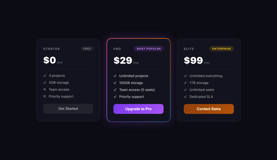
16 CSS Gradient Animations
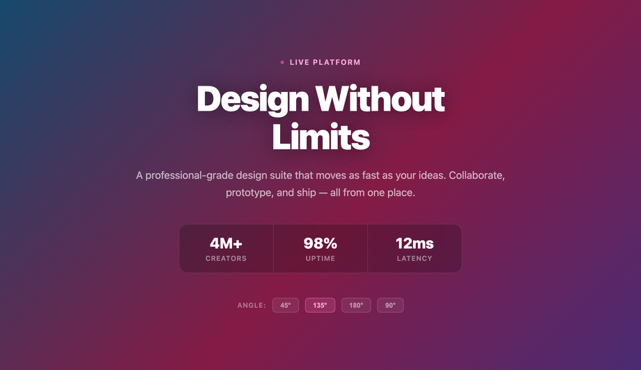
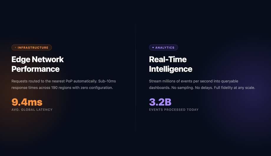
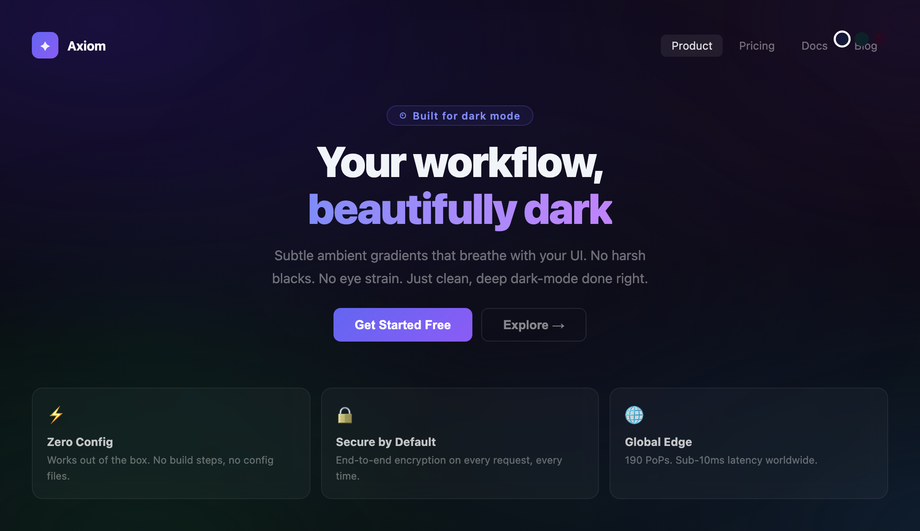
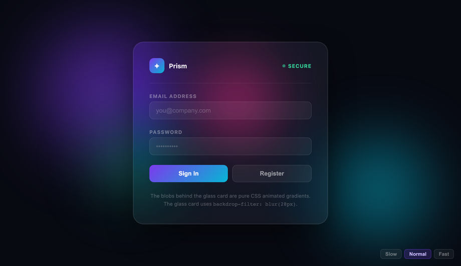
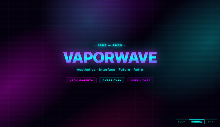
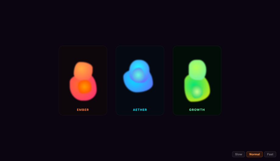
A CSS gradient animation moves, morphs, sweeps, or pulses a colour gradient over time using @keyframes, @property typed angles, or scroll-driven timelines — the dominant pattern for hero backgrounds, glow buttons, skeleton loaders, animated borders, neon links, and dark-mode mesh accents. These 16 hand-coded designs cover the full gradient-animation playbook — aurora mesh, diagonal sweep, radial split, dark-mode pulse, hover glow, animated border, metallic shimmer, neon underline, infinite gradient text, hover-reveal fill, glassmorphism backdrop, vaporwave mesh, lava lamp blob, striped progress, file-upload streaming, and toggle switch glow. Every demo uses scoped .ga-NN class names that never collide with your existing styles, honours prefers-reduced-motion, and ships under the MIT license.

Frequently asked questions
What is a CSS gradient animation and what is the canonical modern recipe?
@keyframes, modern @property typed-angle interpolation, conic-gradient rotation, or scroll-driven timelines — it's the dominant pattern for hero backgrounds, glow buttons, skeleton loaders, animated borders, neon links, and dark-mode mesh accents. The most-shared starter recipe (still taught everywhere): background: linear-gradient(135deg, c1, c2, c3); background-size: 400% 400%; + @keyframes pan { 0% {background-position: 0% 50%;} 50% {background-position: 100% 50%;} 100% {background-position: 0% 50%;} } animation: pan 12s ease infinite; — this pans a 4x-oversized gradient across the element creating the "animated gradient background" effect Stripe / Vercel / Linear / Anthropic / OpenAI ship in their hero sections. The modern 2026 upgrade uses @property --angle { syntax: '<angle>'; inherits: false; initial-value: 0deg; } registered before the animation, then animates --angle: 0deg → 360deg inside conic-gradient(from var(--angle), ...). Without @property registration, browsers can't interpolate the angle (it's an untyped string) so the rotation jumps in discrete steps. With @property the rotation is buttery-smooth on the GPU. This is what makes Demo #06 (Animated Gradient Border Card) and Demo #09 (Infinite Gradient Text) possible without JavaScript. Other foundational recipes covered in this collection: aurora mesh with screen-blended radial-gradient layers (#01), diagonal linear sweep (#02), radial glow split with multi-stop hard transitions (#03), dark-mode subtle mesh pulse (#04), hover-driven glow with radial-gradient(at var(--mx) var(--my), ...) tracking the cursor (#05), metallic shimmer skeleton loader with the Facebook-style sweep (#07), neon flowing underline (#08), and lava-lamp blob morphing with filter: blur() + border-radius: 50% 30% animated (#13).Which gradient animation should I pick for my use case?
Pure CSS vs JavaScript gradient animation — which should I use?
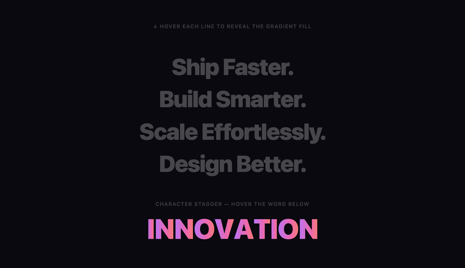
@property --angle), Demo #10 (Hover Reveal Text Fill via background-clip: text + :hover), Demo #05 (Glow on Hover Button using radial-gradient(at var(--mx) var(--my)) with CSS-only mousemove via CSS Houdini-style tracking) — these four ship zero JavaScript. JavaScript is required when: the gradient responds to runtime input (cursor position with high accuracy — Demo #01 aurora tracks cursor velocity, Demo #11 glassmorphism backdrop tracks pointer), the gradient state toggles on click / focus / form-state change (Demo #14 progress bar reads value from a controlled input, Demo #15 file upload reflects upload-percent, Demo #16 toggle switch glows when checked), or per-instance randomized colour seeds prevent identical-looking animations on the gallery page (Demos #02 diagonal sweep, #04 dark mode pulse, #07 skeleton loader, #13 lava blob — each instance picks a different seed so the gallery doesn't show 16 identical sweeps). Modern CSS-only alternative (Chrome 115+, Safari 26+, Firefox 134+): animation-timeline: scroll() + view-timeline() drive gradient animations from scroll position without JavaScript — useful for parallax-style gradient reveals on scroll. We include a commented-out scroll-driven-animations version on Demo #02 (Diagonal Sweep) so you can compare. Choose CSS for marketing hero backgrounds, loading skeletons, and decorative effects; choose JS for cursor-driven, state-reactive, or randomized-per-instance animations.How do CSS gradient animations compare to GSAP, Anime.js, Framer Motion, Lottie, and tailwindcss-animate?
animate prop, supports gradients via backgroundImage as a value. Lottie (~250KB + Bodymovin JSON): pre-rendered After Effects animations — extreme quality for hero gradients but huge bundle weight. tailwindcss-animate (~2KB): just utility wrappers around CSS animations, no library JS. shadcn/ui, Magic UI, Aceternity UI: ship some animated-gradient components for React (Aurora, Spotlight, Background-Beam) but tie you to React + Framer Motion. Tailwind UI ($300+/yr/dev): includes 2-3 animated gradient hero patterns paywalled. What this collection gives you: the same effects in 50-80 lines of CSS that ship inline with your HTML — zero bundle weight, zero npm dependency, zero CVE surface, faster First Contentful Paint, faster Largest Contentful Paint, lower Total Blocking Time, lower Interaction to Next Paint. For 95% of hero / button / loader / link use cases, the pure-CSS approach wins on every Core Web Vitals dimension. Reserve GSAP / Framer Motion for orchestrated multi-step product launches or interactive product demos.Are these gradient animations accessible? What about motion sensitivity, WCAG 2.2, EU EAA, Section 508?
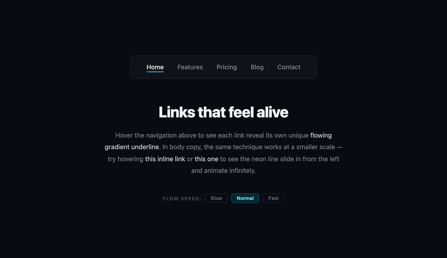
@keyframes in @media (prefers-reduced-motion: reduce) { animation: none; } so users with that OS setting see the final static gradient instantly. WCAG 2.2 Success Criterion 2.3.3 (Animation from Interactions) explicitly requires this. 2. Color contrast over animated backgrounds: a text element rendered on top of a sweeping gradient may have a 7:1 ratio at one moment and 2:1 at another. Fix: layer a semi-opaque dark overlay (rgba(0,0,0,.45)+) between the animated gradient and the text, then verify with the WebAIM Contrast Checker using the WORST-case gradient colour. 3. Cumulative Layout Shift (CLS): animated gradient backgrounds attached to ::before pseudo-elements that resize on viewport change can cause spikes. Fix: use position: absolute; inset: 0 + contain: paint so the gradient never affects parent box dimensions. 4. Interaction to Next Paint (INP): gradient animations driven by JavaScript requestAnimationFrame loops keep the main thread busy and tank INP scores on slower mobile devices. Fix: use the pure-CSS @property typed-angle pattern (Demo #06, #09) — the GPU handles interpolation, the main thread stays free. Regulatory frameworks: EU EAA (June 2025 enforcement), US Section 508, Canada ACA, UK Equality Act 2010, Australian DDA all require WCAG 2.2 AA compliance for public-facing digital products.How do I prevent CLS spikes and keep animated gradients from tanking Core Web Vitals?
::before pseudo-elements that animate height alongside the gradient. CLS fixes: use position: absolute; inset: 0 for backdrop layers, contain: paint on the gradient container, render the gradient inline in initial HTML (no JS hydration delay). LCP root causes: a hero background gradient defined inside a heavy stylesheet that blocks first paint until the CSS file downloads. LCP fixes: inline the hero gradient CSS in the <head> (or via <style> tag), preload the font and only the absolute-required CSS bundle. INP root causes: JS-driven gradient animations using requestAnimationFrame + style.background = ... on every frame keep the main thread busy, blocking user input handling. INP fixes: use pure CSS @keyframes + @property for time-driven gradients (GPU handles it, main thread stays free) — the patterns in Demos #03, #05, #06, #10. For cursor-tracked gradients (Demos #01, #05, #11), use CSS custom properties + pointermove with passive listeners + RAF throttling (the demos in this collection already do this). Tools: Chrome DevTools Performance Insights, Lighthouse, PageSpeed Insights, Web Vitals Chrome extension, Core Web Vitals report in Google Search Console.Tailwind / shadcn / Magic UI / Aceternity UI / MUI / Chakra animated gradient — how do these compare?
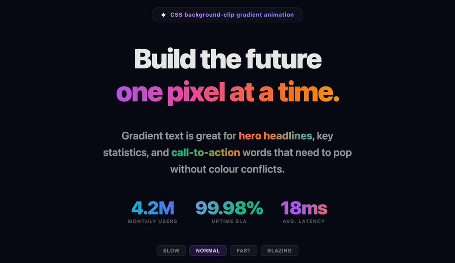
bg-gradient-to-r + bg-gradient-to-br static utilities, but animated gradients require custom @keyframes in your stylesheet + arbitrary-value utilities like bg-[length:400%_400%] animate-[pan_12s_ease_infinite]. Our CSS to Tailwind converter handles the conversion automatically. Tailwind UI ($300+/yr/dev): includes 2-3 animated-gradient hero patterns paywalled. shadcn/ui (React + Radix Primitives): does not ship animated-gradient components directly; the community recommends Magic UI's Aurora / BorderBeam / AnimatedBeam components or Aceternity UI's Spotlight / BackgroundBeams / Aurora. Magic UI: bundles ~30 React-only animated components including Aurora background, BorderBeam, Animated Gradient Text — solid quality but ties you to React + Framer Motion. Aceternity UI: similar React + Framer Motion stack. Material UI / MUI: no first-class animated gradient component; the community pattern is sx={{ backgroundImage: 'linear-gradient(...)' }} with keyframes emotion API. Chakra UI: ships bgGradient + bgClip='text' shorthand statically but no animation utility — pair with the framer-motion adapter. Ant Design / Mantine / HeadlessUI / Radix UI: no animated gradient primitives — intentionally userland. This collection gives you the same effects framework-agnostic (drop into any React, Vue, Svelte, Astro, Next.js, plain HTML), zero JavaScript for 4 of the 16 demos, and no paid licenses or external dependencies.What's @property and how does it unlock smooth gradient animations that background-position can't?
@property (Chrome 85+, Safari 16.4+, Firefox 128+) registers a CSS custom property with a typed syntax — without it, animating --angle: 0deg → 360deg is impossible because the browser treats untyped custom properties as strings and jumps to the final value with no interpolation. With @property --angle { syntax: '<angle>'; inherits: false; initial-value: 0deg; }, you can animate conic-gradient(from var(--angle), ...) buttery-smooth. This is the single biggest gradient-animation upgrade since CSS3. The traditional background-position recipe pans a 4x-oversized linear-gradient — works but the gradient direction is fixed and the pan is linear, often producing a visible "line of contrast" sweeping across the element. @property + conic-gradient rotates the gradient itself around the element, producing organic colour-cycling that looks like aurora light. Three demos in this collection use @property typed angles: Demo #06 (Animated Gradient Border Card — rotating conic border), Demo #09 (Infinite Gradient Text — rotating gradient sweep), Demo #16 (Toggle Switch Track Glow — angle morphing on state change). @supports gate for fallback: wrap @property-dependent rules in @supports (background: linear-gradient(in oklch, red, blue)) — this feature gate correlates 1-to-1 with @property support in current browsers, so the @supports test ensures the animation only runs where it'll be smooth, and falls back to a static gradient on older browsers.Why does my gradient animation break in Safari, Firefox, or older browsers?
@property registration silent failure in Firefox < 128: Firefox ignores @property declarations entirely so animations referencing typed angles fall back to step-change. Fix: wrap @property-dependent rules in @supports (background: linear-gradient(in oklch, red, blue)) — this @supports feature gate correlates 1-to-1 with @property support, and acts as a clean progressive-enhancement gate. 2. conic-gradient interpolation in Safari < 16.4: Safari ignores the in oklch / in srgb-linear interpolation hints inside conic-gradient. Fix: provide the colour stops in a colour space all browsers support (sRGB by default) and avoid color-mix() inside the gradient unless behind a supports gate. 3. animation-timeline: scroll() in Firefox / Safari < 26: not yet implemented as of June 2026 — always wrap in @supports (animation-timeline: scroll()) and provide an IntersectionObserver fallback. 4. Mobile compositor promotion: filter: blur() on a gradient layer (Demos #11 glassmorphism, #13 lava blob) is sometimes not GPU-composited on Firefox Mobile and low-end Android — pair with will-change: filter and transform: translateZ(0) to force compositor promotion. 5. background-clip: text Safari prefix: Safari requires both -webkit-background-clip: text AND background-clip: text on the same element. 6. CSS color-mix() + oklch() + Display-P3: Safari 16.5+, Chrome 111+, Firefox 113+ — wrap in @supports (color: oklch(0% 0 0)) + provide sRGB fallback. 7. Variable refresh rate (120Hz displays): linear-cubic-bezier easing can look juddery; use animation-timing-function: linear or the new linear(...) easing for ultra-smooth motion.Are these CSS gradient animations free, accessible, and how do I attribute them?
prefers-reduced-motion: reduce (animations fall back to a static final gradient), uses semantic HTML, and avoids unnecessary background-animation on focused interactive elements — see the WCAG / EU EAA FAQ above for the full a11y pattern. Verify your specific brand colours and contrast ratios with axe DevTools, Lighthouse, WAVE by WebAIM, or the WebAIM Contrast Checker before shipping to EU EAA / US Section 508 / Canada ACA / UK Equality Act / Australian DDA audits — the demos are AA-compliant by default but final colour choices and layout context matter. Related collections: CSS Text Animations (25 demos), CSS Background Animations (15 demos), CSS Fade In Animation (16 demos), CSS Gradient Text (20 demos), CSS Glassmorphism. Related tools: CSS Gradient generator, CSS to Tailwind converter.Related collections

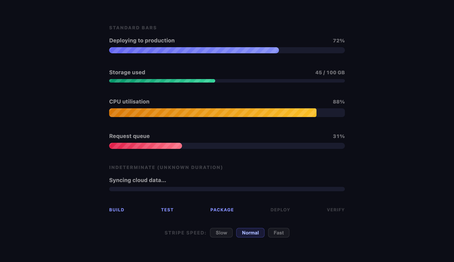
15 CSS Background Animations
15 hand-coded CSS background animations with live demos — infinite shifting gradient, floating particle bubbles, parallax starry night, clickable cyberpunk ripple, sliding geometric grid, SVG wave overlays, glassmorphism orbs, aurora borealis ribbons, matrix digital rain, mesh gradient blobs, falling snow, morphing blob, retro synthwave 3D grid, infinite scrolling diagonal marquee, comic-book halftone dots. 100% Pure CSS, no JavaScript, no canvas, no particles.js. prefers-reduced-motion respected, scoped class names, MIT-licensed.

27 CSS Button Hover Effects
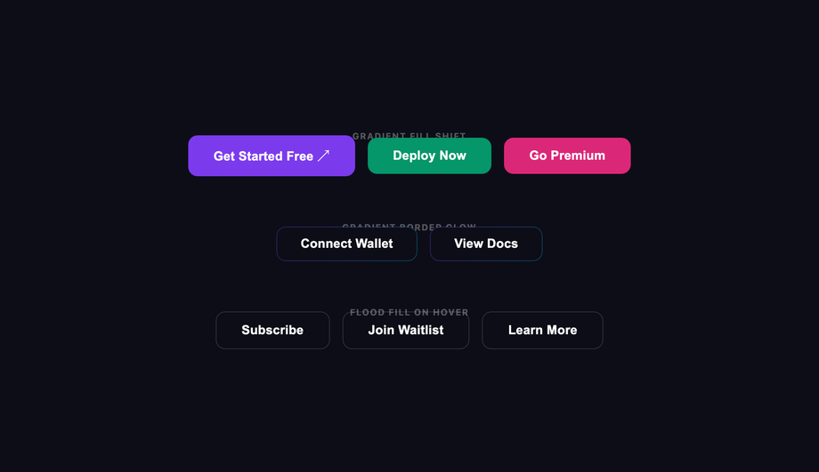
27 hand-coded CSS button hover effects — 3D press, neon glow, gradient slide, border draw, liquid fill, ripple, glitch text, and kinetic flips. Every demo is pure CSS (no JavaScript, no framework), tuned for 60fps with transform and opacity, and respects prefers-reduced-motion out of the box.

33 CSS Card Hover Effects
33 hand-coded CSS card hover effects with live demos — multi-axis 3D tilt with parallax, glowing gradient glassmorphic border, image zoom with content slide-up, front-to-back 3D flip, sibling de-emphasis with :has(), minimalist elevation, plus 27 more (elastic lift, conic-gradient border, holographic foil, neon sign, glitch RGB split, magnetic float, blueprint reveal, aurora drift and more). 26 pure CSS + 7 with a small vanilla JS snippet for cursor tracking. prefers-reduced-motion respected, scoped class names, MIT-licensed.