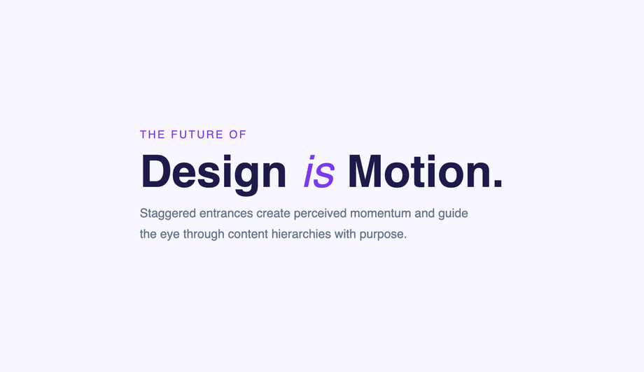
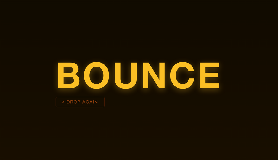
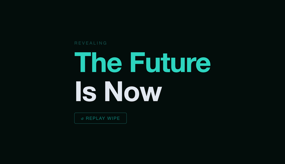
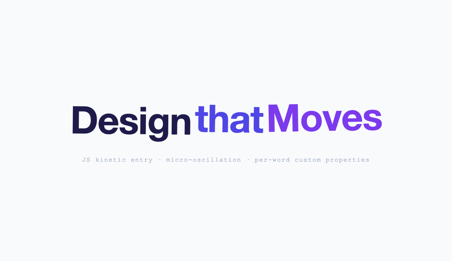
25 CSS Text Animations
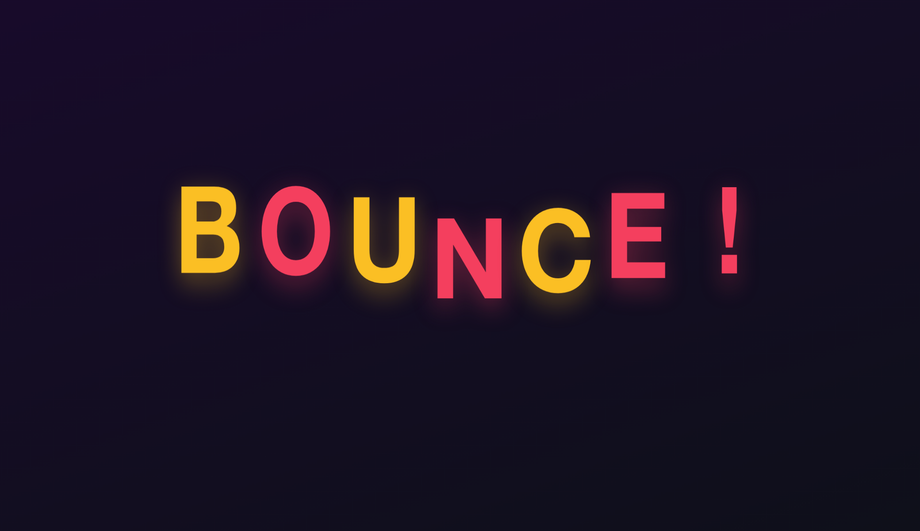
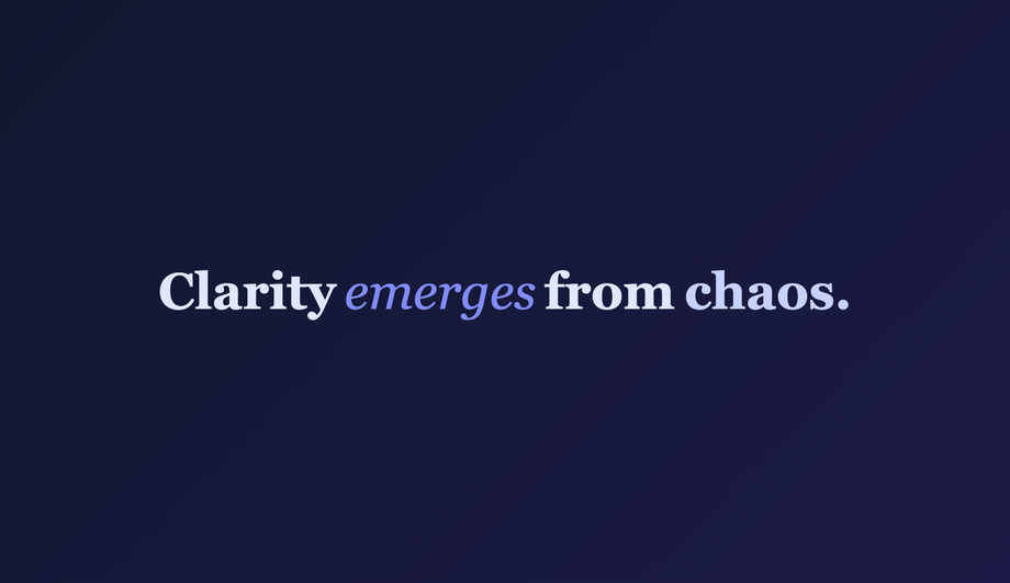
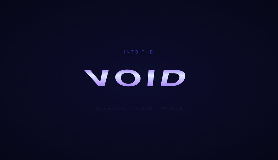
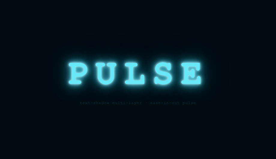
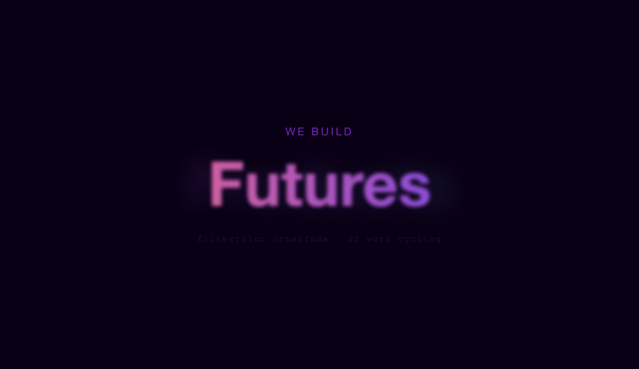
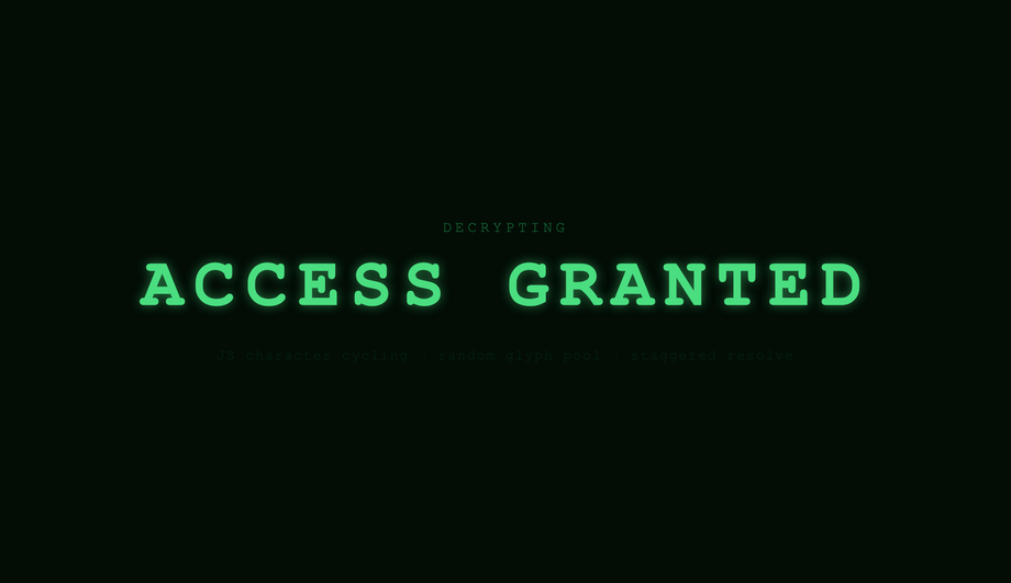
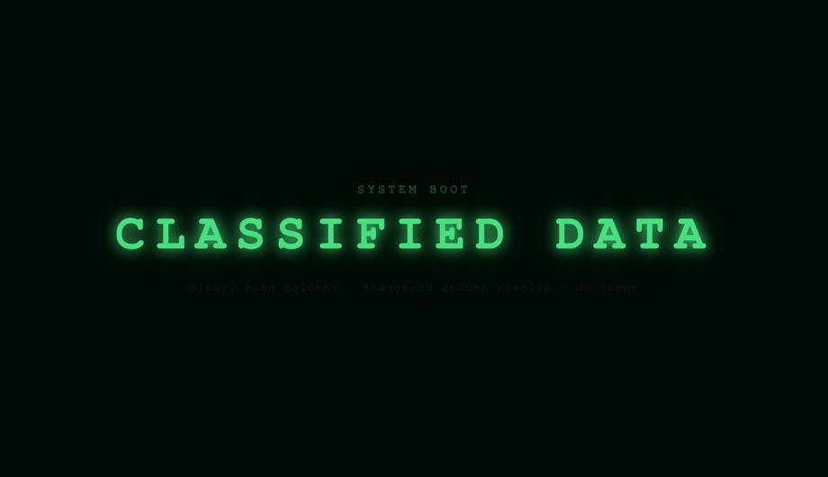
A CSS text animation moves, transforms, reveals, or stylises text using CSS transitions, @keyframes, or vanilla JavaScript — the dominant pattern for hero headlines, landing-page intros, brand reveals, kinetic typography, and scroll-driven storytelling. These 25 hand-coded designs cover the full text-animation playbook — typewriter, gradient text, glitch, neon glow, clip reveal, letter spacing, wave, shimmer, fade-up stagger, 3D flip, SVG stroke draw, bouncing letters, blur reveal, perspective rotation, text-shadow pulse, morphing text, liquid fill, word scramble, split explosion, holographic chrome, decryption, elastic bounce, cursor blink, mask wipe, and kinetic typography. Every demo uses scoped .ta-NN class names that never collide with your existing styles, honours prefers-reduced-motion, and ships under the MIT license.

Frequently asked questions
What is a CSS text animation and what is the canonical recipe?
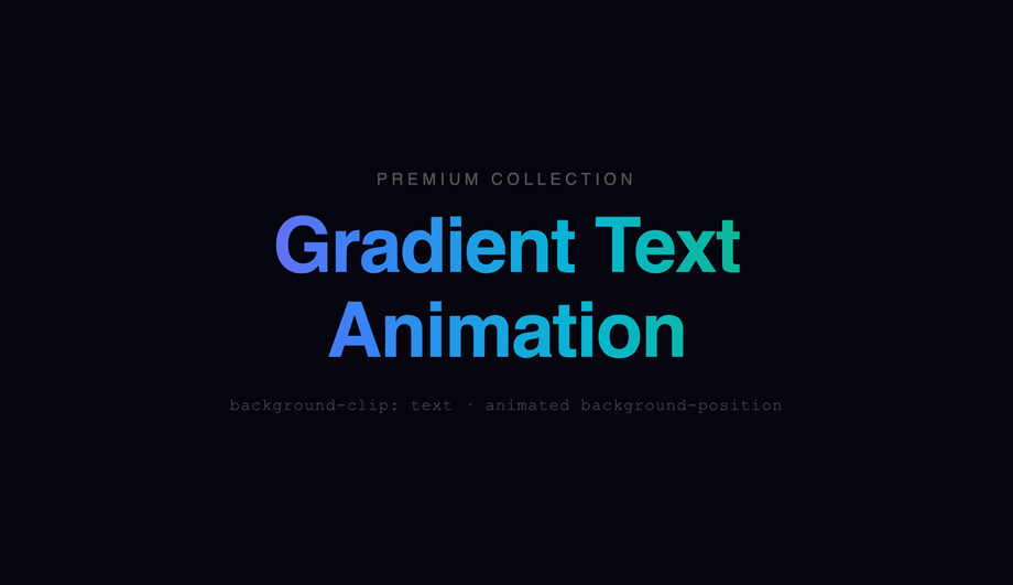
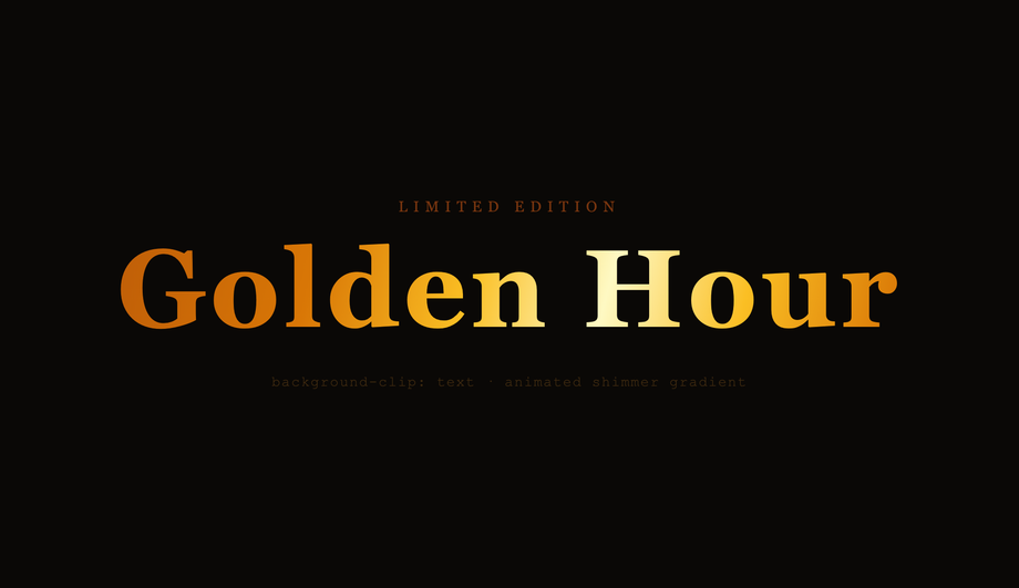
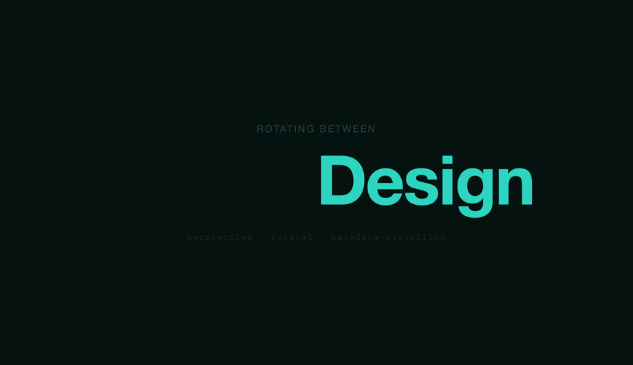
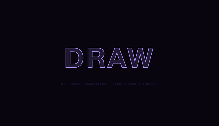
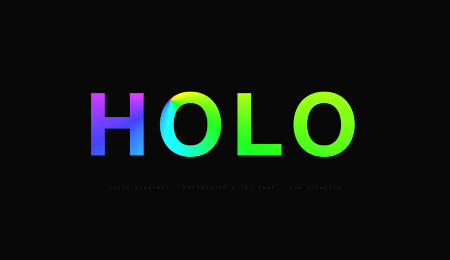
@keyframes, or a small JavaScript snippet — it's the dominant pattern for hero headlines, landing-page intros, brand reveals, kinetic typography, and scroll-driven storytelling. There is no single canonical recipe because text animation is a family of techniques, but the most-referenced starter pattern is the animated gradient text (Demo #02): background: linear-gradient(90deg, color1, color2, color3); background-size: 200% auto; background-clip: text; -webkit-background-clip: text; color: transparent; combined with @keyframes animating background-position: 0% → 200%. The text becomes a window into a sliding gradient, producing the "animated rainbow text" effect every modern SaaS hero uses (Stripe, Vercel, Linear, Anthropic). Modern variant: use @property --angle with angle syntax to animate a conic-gradient rotation smoothly — without @property registration the gradient angle jumps in discrete steps because the browser can't interpolate untyped custom properties. Other foundational recipes covered in this collection: steps() + ch typewriter (Demo #01), clip-path reveal mask (#05), per-character span stagger with --i CSS variable (#09), text-shadow layered glow (#04 neon), filter: blur() reveal (#13), transform: rotateY() 3D flip (#10 + #14), variable-font weight morph (covered in our typewriter collection), animation-timeline: scroll() for scroll-driven text (#25 kinetic typography). Each demo's source uses a scoped .ta-NN class so you can drop multiple onto the same page without naming collisions.Which text animation should I pick for my use case?
Pure CSS vs JavaScript text animation — which should I use?
String.prototype.split('') + injected --i), the animation responds to user input beyond :hover (Demo #23 cursor blink with focus management), or the animation is timeline-driven by scroll position with character-level granularity (Demo #25 kinetic typography). Modern alternative (Chrome 115+, Safari 26+, Firefox 134+): CSS scroll-driven animations via animation-timeline: scroll() and view-timeline() let you do scroll-triggered text animations in pure CSS — Demo #25 includes a commented-out scroll-driven-animations version alongside its IntersectionObserver implementation. Choose based on whether your text is fixed at build time (CSS) or generated at runtime (JS), and whether you need per-character control (JS) or whole-string control (CSS works).How do CSS text animations compare to Anime.js, GSAP SplitText, Framer Motion, Splitting.js, and Lottie?
motion.span per character with variants. Splitting.js (~3KB, ~50K weekly downloads): just splits text into spans with --char-index + --word-index CSS variables — pairs perfectly with pure-CSS animations from this collection. Lottie (~250KB + Bodymovin JSON): not really comparable — Lottie ships pre-rendered After Effects animations, not CSS. Typed.js / TypeIt.js / react-typewriter-effect: typewriter-specific (covered in our typewriter collection). What you gain by using a library: well-tested edge cases, dynamic text support, fluent API, easier React/Vue integration. What you LOSE: 5-60KB of JavaScript per page, an external dependency to update + audit for CVEs, slower First Contentful Paint and Largest Contentful Paint (the library has to download + parse + execute before any text animates), and (for GSAP SplitText) a $99/yr Club GreenSock license for commercial use. What this collection gives you: the same effect in 30-60 lines of CSS that ship inline with your HTML — zero bundle cost, zero npm dependency, zero CVE surface, faster FCP/LCP. For 90% of marketing use cases, the pure-CSS approach wins on every Core Web Vitals dimension (CLS, LCP, FCP, INP).Are these text animations accessible? What about screen readers, motion sensitivity, WCAG 2.2, EU EAA, Section 508?
@keyframes in @media (prefers-reduced-motion: reduce) { animation: none; } so users with that OS setting see the final static text instantly, no animation. WCAG 2.2 Success Criterion 2.3.3 (Animation from Interactions) explicitly requires this. 2. Screen readers: VoiceOver, NVDA, JAWS, and Narrator may either announce each character as it appears (annoying during typewriter / scramble / morph) or announce the empty element + final text (correct). Default behavior varies by AT. Fix: for typewriter / scramble / decryption (#01, #16, #18, #21), set aria-live='polite' on the container so the final text is announced once after the animation completes, NOT per-character. For decorative animations (#02 gradient, #04 neon, #08 shimmer), use aria-hidden='true' on a presentational variant and put the readable text in a separate span. 3. Cumulative Layout Shift (CLS): text animations that change box dimensions (typewriter expanding from 0ch to Nch, split-text duplicating elements, morphing text changing string length) can cause page reflow. Fix: reserve final dimensions with explicit width / min-width in ch units before the animation starts. 4. Color contrast: glitch, neon, gradient, holographic, and shimmer effects can drop contrast ratio below WCAG AA's 4.5:1 threshold for normal text or 3:1 for large text — verify with the WebAIM Contrast Checker, axe DevTools, Lighthouse, or WAVE. Regulatory frameworks: EU EAA (June 2025 enforcement), US Section 508, Canada ACA, UK Equality Act 2010, Australian DDA all require WCAG 2.2 AA compliance for public-facing digital products. Lawsuits under each have specifically cited animated text that didn't honour prefers-reduced-motion or that broke contrast.How do I prevent Cumulative Layout Shift (CLS) with text animations?
width: 0 → 22ch shifts every element below it once per step. (2) Split-text JS that calls String.prototype.split('') and injects 22 span elements rewrites the DOM after first paint — every neighbouring element repositions. (3) Variable-font morphing changes glyph width as the weight axis animates from 100 → 900 — the text's bounding box width changes mid-animation. (4) Web-font swap (FOUT — Flash of Unstyled Text) before the variable font loads causes layout to recompute. Fixes: (1) Reserve final character width with width: 22ch or min-width: 22ch on the parent before any animation starts. (2) Pre-render the final text invisibly (visibility: hidden) as a sibling so the layout reserves the box, then animate a positioned overlay. (3) Use font-variation-settings on a monospace variable font (JetBrains Mono Variable, Inter Variable, Geist Variable) where glyph width is constant across weights. (4) Use font-display: optional or preload variable fonts with <link rel='preload' as='font' type='font/woff2' crossorigin>. (5) For per-character animation, render all span elements server-side or at build time, not in useEffect. Tools to measure: Chrome DevTools Performance Insights (Layout Shift detail), Lighthouse, PageSpeed Insights, Web Vitals Chrome extension, Core Web Vitals report in Google Search Console. Every demo in this collection is designed to avoid CLS by default — explicit comment markers in each demo's CSS flag the reserved-box lines.Tailwind / shadcn / MUI / Chakra / Mantine / Ant Design / HeadlessUI text animation — how do these compare?
bg-gradient-to-r from-pink-500 via-violet-500 to-cyan-500 bg-[length:200%_auto] bg-clip-text text-transparent animate-[gradient_3s_linear_infinite] — but you still need a custom @keyframes gradient in your stylesheet because Tailwind doesn't ship background-position animation out of the box. Our CSS to Tailwind converter handles the conversion automatically. shadcn/ui (React + Radix Primitives): does not ship text animation; the community recommends Magic UI or Aceternity UI for per-character motion. Magic UI: bundles ~30 React-only animated text components — solid quality but ties you to React + Framer Motion. Aceternity UI: similar, also React + Framer. This collection gives you the same effects framework-agnostic (drop into any React, Vue, Svelte, Astro, Next.js, plain HTML), zero JavaScript for 16/25 demos, and no paid licenses.What's @property, animation-timeline, and view-timeline — and how do they unlock modern text animation?
@property (Chrome 85+, Safari 16.4+, Firefox 128+): lets you register a custom property with a typed syntax. Without it, --angle: 0deg → 360deg animation is impossible because the browser doesn't know --angle is an angle — it treats it as a string and jumps to the final value with no interpolation. With @property --angle { syntax: '<angle>'; inherits: false; initial-value: 0deg; }, you can animate conic-gradient(from var(--angle), ...) smoothly. This is what makes Demo #02's modern gradient sweep and Demo #20's holographic shimmer possible without JavaScript. 2. animation-timeline: scroll() (Chrome 115+, Safari 26+, Firefox 134+): drives an animation from scroll position instead of time. Demo #25 (Kinetic Typography) uses this to animate text in sync with scroll progress — no IntersectionObserver, no requestAnimationFrame, no JavaScript at all. Falls back gracefully via @supports (animation-timeline: scroll()). 3. view-timeline() (Chrome 115+, Safari 26+): like scroll() but scoped to when a specific element enters / exits the viewport — perfect for "text reveals when this section comes into view" without IntersectionObserver. Why this matters for SEO / Performance: scroll-driven text animations in pure CSS reduce Total Blocking Time (Lighthouse) and Interaction to Next Paint (INP) Core Web Vitals score because there's no JS executing during scroll. Demos #02, #20, and #25 use these modern APIs.Why does my text animation break in Safari, Firefox, or older browsers?
background-clip: text Safari prefix: Safari requires both -webkit-background-clip: text AND background-clip: text on the same element — without the -webkit- prefix the gradient text doesn't render at all in Safari < 26. Every demo using gradient text in this collection ships both. 2. @property registration silent failures: Firefox < 128 ignores @property declarations — the animation falls back to a step-change. Workaround: provide a fallback @keyframes using direct values, then progressively enhance with the @property variant inside @supports (background: linear-gradient(in oklch, red, blue)) (a feature gate that correlates with @property support). 3. animation-timeline in Firefox / Safari < 26: not yet implemented as of June 2026. Always wrap in @supports (animation-timeline: scroll()) and provide an IntersectionObserver fallback — Demo #25 ships both side-by-side. 4. steps() + animation-fill-mode: forwards in Safari < 17: drops the final keyframe state. Fix: use animation-fill-mode: both instead. 5. Variable-font axis animation: requires the variable font to be fully loaded before animation starts. Fix: font-display: block on the @font-face rule, or preload with <link rel='preload'>. 6. filter: blur() performance on Firefox: hardware acceleration support varies — pair with will-change: filter and a containing layer to force compositor promotion. 7. Per-character span layout on resize: when text wraps mid-character-span the animation breaks. Use display: inline-block on each span and white-space: pre on the parent. 8. Emoji / RTL / ligatures with split-text: String.prototype.split('') splits surrogate pairs incorrectly. Use [...string] (spread iterator) or Intl.Segmenter for grapheme-cluster splitting.Are these CSS text animations free, accessible, and how do I attribute them?
prefers-reduced-motion: reduce (animations fall back to instantly-displayed final text), uses semantic HTML, and is designed to work with aria-live regions for screen readers — see the WCAG / EU EAA FAQ above for the full a11y pattern. Verify your specific brand colors and contrast ratios with axe DevTools, Lighthouse, WAVE by WebAIM, or the WebAIM Contrast Checker before shipping to EU EAA / US Section 508 / Canada ACA / UK Equality Act / Australian DDA audits — the demos are AA-compliant by default but final color choices and layout context matter. Related collections: CSS Typewriter Effect (14 demos), CSS Fade In Animation (16 demos), CSS Gradient Text (20 demos), CSS Hover Effects. Related tools: CSS to Tailwind converter, CSS Text Shadow generator.Related collections

15 CSS Background Animations
15 hand-coded CSS background animations with live demos — infinite shifting gradient, floating particle bubbles, parallax starry night, clickable cyberpunk ripple, sliding geometric grid, SVG wave overlays, glassmorphism orbs, aurora borealis ribbons, matrix digital rain, mesh gradient blobs, falling snow, morphing blob, retro synthwave 3D grid, infinite scrolling diagonal marquee, comic-book halftone dots. 100% Pure CSS, no JavaScript, no canvas, no particles.js. prefers-reduced-motion respected, scoped class names, MIT-licensed.

27 CSS Button Hover Effects
27 hand-coded CSS button hover effects — 3D press, neon glow, gradient slide, border draw, liquid fill, ripple, glitch text, and kinetic flips. Every demo is pure CSS (no JavaScript, no framework), tuned for 60fps with transform and opacity, and respects prefers-reduced-motion out of the box.

33 CSS Card Hover Effects
33 hand-coded CSS card hover effects with live demos — multi-axis 3D tilt with parallax, glowing gradient glassmorphic border, image zoom with content slide-up, front-to-back 3D flip, sibling de-emphasis with :has(), minimalist elevation, plus 27 more (elastic lift, conic-gradient border, holographic foil, neon sign, glitch RGB split, magnetic float, blueprint reveal, aurora drift and more). 26 pure CSS + 7 with a small vanilla JS snippet for cursor tracking. prefers-reduced-motion respected, scoped class names, MIT-licensed.