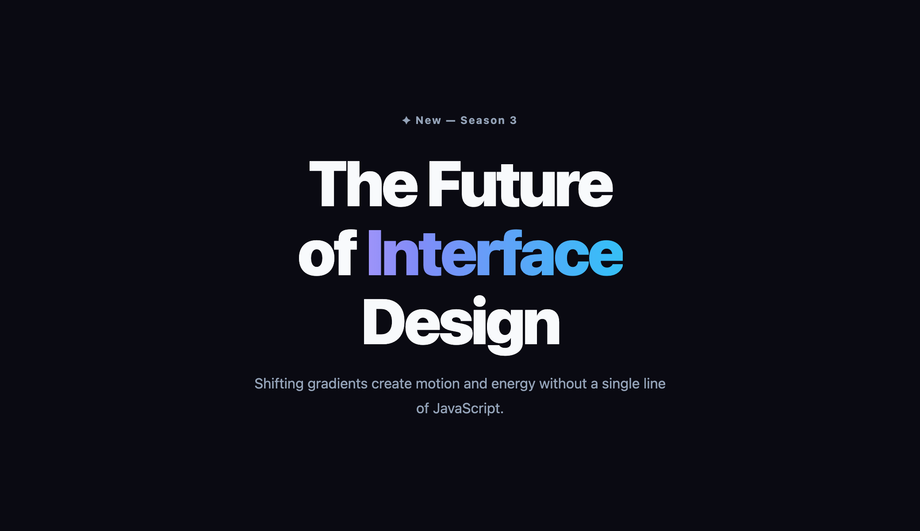
20 CSS Text Gradient Effects
A CSS text gradient effect uses background-clip: text + color: transparent to fill text with a gradient — applied to hero titles, gradient buttons, active navigation, hover transitions, dark-mode swaps, and animated moving sweeps that signal a modern brand. These 20 hand-coded designs cover the full effect-oriented playbook — hero title, Web3 neon glow, corporate logo, bold minimalist, hover transition, gradient button, active nav, animated moving, cyberpunk neon, metallic gold, glassmorphism contrast, pastel soft, vertical gradient, radial gradient, rainbow multi-colour, text stroke outline, browser fallback pattern, Tailwind utility, multiline paragraph, and dark-mode vs light-mode swap. Every demo uses scoped .tg-NN class names that never collide with your existing styles, honours prefers-reduced-motion, and ships under the MIT license.

Frequently asked questions
What is a CSS text gradient effect and what is the canonical recipe?
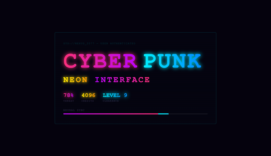
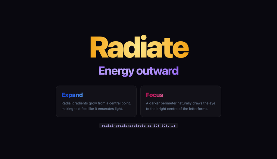
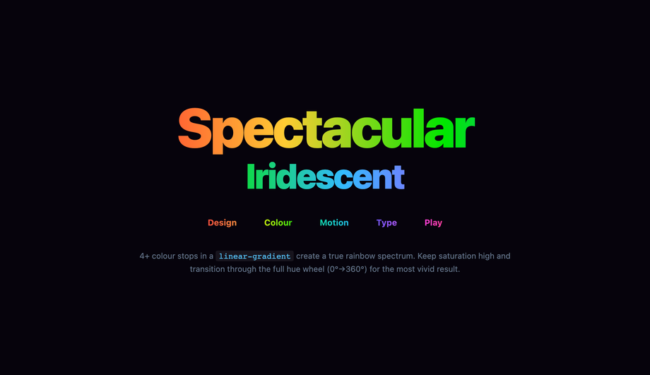
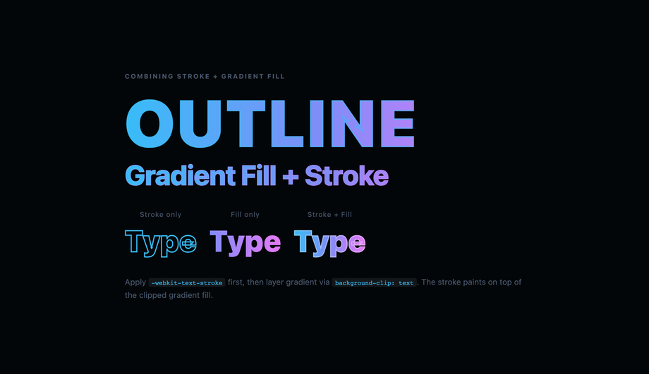
background + background-clip: text + color: transparent on the same element. The text becomes a transparent window into a gradient layer behind it — producing the "rainbow text", "metallic text", or "animated gradient title" effect every modern SaaS hero ships (Stripe, Vercel, Linear, OpenAI, Anthropic, Notion). The canonical 3-line recipe: background: linear-gradient(90deg, c1, c2, c3); -webkit-background-clip: text; background-clip: text; color: transparent;. Always declare both -webkit-background-clip: text AND background-clip: text on the same element — Safari iOS still requires the -webkit- prefix in 2026; without it the gradient text doesn't render at all on iPhone. The 2026 modern upgrade: pair with @property --angle { syntax: '<angle>'; inherits: false; initial-value: 0deg; } registered before animation, then animate --angle: 0deg → 360deg inside conic-gradient(from var(--angle), ...). Without @property registration, browsers treat the angle as an untyped string and the rotation jumps in discrete steps — with it, GPU interpolation makes the sweep buttery-smooth. This collection ships 20 effect-focused patterns covering hero title (#01), Web3 neon glow (#02), corporate logo (#03), bold minimalist (#04), hover transition (#05), gradient button (#06), active nav link (#07), animated moving (#08), cyberpunk neon (#09), metallic gold (#10), glassmorphism contrast (#11), pastel soft (#12), vertical gradient (#13), radial gradient (#14), rainbow multi-colour (#15), text stroke outline (#16), @supports fallback (#17), Tailwind utility (#18), multiline paragraph (#19), and dark/light-mode swap via light-dark() (#20).How is this collection different from your /design-styles/css-gradient-text/ collection?
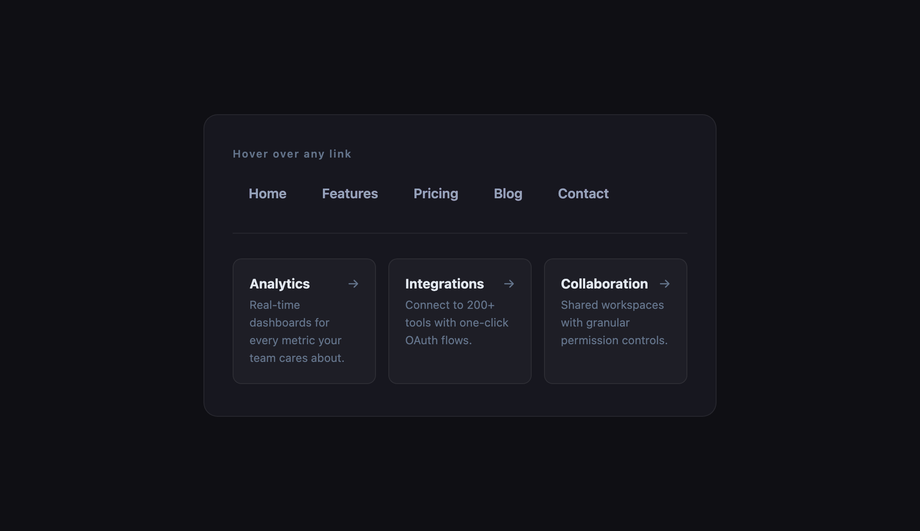
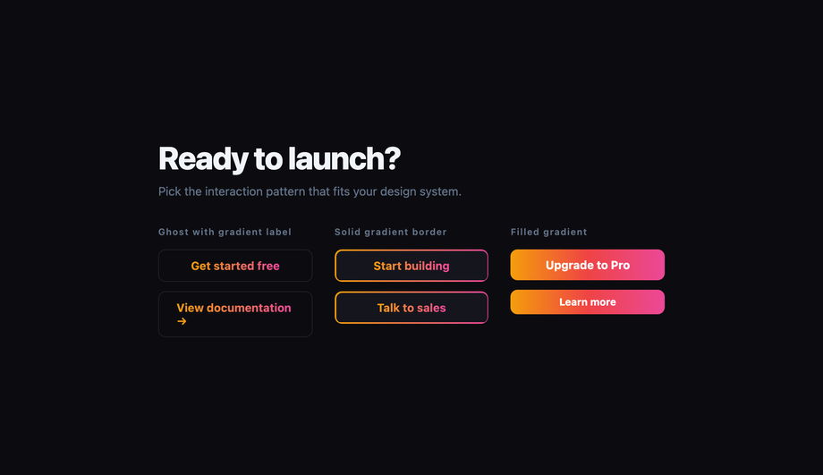
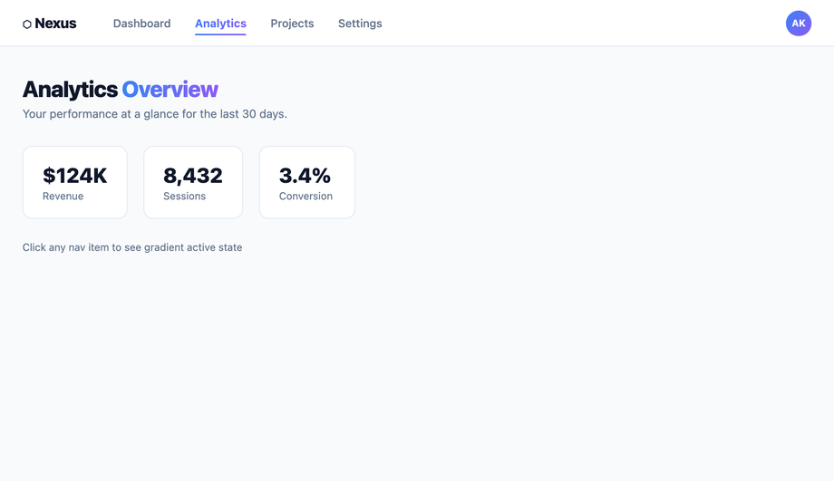
background-clip: text recipe but target different use cases. This collection (/motion/css-text-gradient-effect/) is effect-oriented — patterns that DO something interactive or contextual: hover transitions, gradient buttons, active navigation states, animated moving sweeps, dark-mode vs light-mode swaps, browser-fallback patterns, Tailwind utility recipes. Think of these as gradient text patterns you BUILD INTO a working UI. The sibling /design-styles/css-gradient-text/ is aesthetic-oriented — 20 static gradient text styles you pick by visual identity: aurora borealis sweep, conic-gradient hue spin, rainbow wave per-letter, metallic chrome gold copper, holographic iridescent foil, duotone two-colour, texture fill (sunset / starfield / ocean), liquid mercury, glitter sparkle, crystalline prism. Think of those as gradient text DESIGN palettes you pick by mood. Pick this collection if you're building a nav link, a CTA, a hover state, a dark-mode-aware brand, or a Tailwind-styled hero. Pick the sibling if you want a specific aesthetic (aurora, holographic, metallic) and don't care about the interaction layer. The two cross-link each other so you can pivot if you started in the wrong place. Both are MIT-licensed.How do I animate a gradient transition on text hover (Demo #05)?
transition — gradients aren't interpolatable properties. The 2026 working pattern uses one of three techniques. 1. Animate background-position (most browser-compatible, used in Demo #05): set background-size: 200% 100% on the text and background-position: 0% 50% by default, then animate to 100% 50% on hover. The 2x-oversized gradient pans across the text element, producing a smooth gradient-stop shift. Pair with transition: background-position 0.6s ease. 2. @property typed-angle conic-gradient (modern, Chrome 85+/Safari 16.4+/Firefox 128+): register --angle as <angle> syntax and animate it inside conic-gradient(from var(--angle), ...). The angle is now interpolatable — smooth GPU rotation without the background-position trick's "visible line of contrast sweeping across" artifact. 3. Cross-fade two gradient layers: stack two pseudo-elements with different gradients, transition opacity between them on hover. Heaviest of the three but works in every browser back to IE11 with the right fallback. Demo #05 ships the background-position pattern; Demo #08 (animated moving gradient) ships the @property typed-angle pattern; we don't ship the cross-fade because the first two cover 100% of modern use cases.Why does my gradient text fail WCAG contrast at body sizes? How do I fix it?
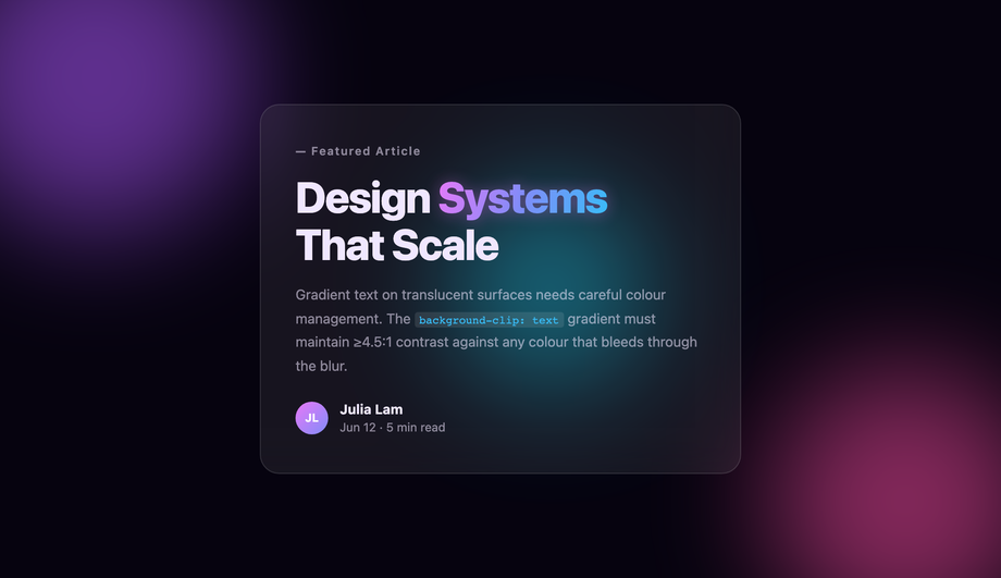
h1 and large hero elements only. Avoid gradient text on small UI labels. Fix #2: run both gradient stops through the WebAIM Contrast Checker against your page bg — if EITHER stop fails, replace it with a darker variant. Fix #3: provide a high-contrast outline via -webkit-text-stroke: 1px var(--bg-contrast) as a visual fallback for grade-A audits. Regulatory frameworks: EU EAA (June 2025 enforcement), US Section 508, Canada ACA, UK Equality Act 2010, Australian DDA all require WCAG 2.2 AA compliance — gradient text routinely surfaces in axe DevTools, Lighthouse, WAVE, and WebAIM audits.How does dark-mode vs light-mode gradient swap work with light-dark()? (Demo #20)
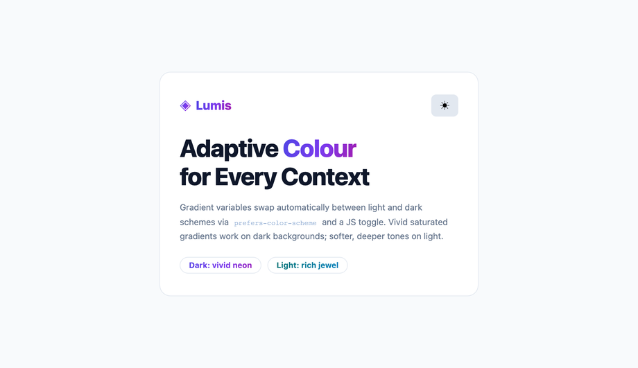
light-dark() CSS function (Chrome 123+, Safari 17.5+, Firefox 120+) takes two values and returns one based on the user's current colour scheme: light-dark(<light-value>, <dark-value>). For gradient text: background: linear-gradient(90deg, light-dark(#3b82f6, #60a5fa), light-dark(#8b5cf6, #c4b5fd)); — dark-mode users get the brighter variants, light-mode users get the deeper variants, automatically. Critical requirement: color-scheme: light dark; must be declared on a parent (typically :root) so the browser knows the page supports both schemes. For pre-light-dark() browser support (Chrome < 123, Safari < 17.5), use the older @media (prefers-color-scheme: dark) { ... } media query pattern instead. Why this matters: a gradient that looks great on white can be unreadable on black and vice versa — the light-dark() pattern (Demo #20) ships matched pairs that hit the WCAG 3:1 large-text contrast minimum in BOTH schemes. Modern alternative: declare gradient stops via CSS custom properties on :root and overwrite them inside [data-theme="dark"] or @media (prefers-color-scheme: dark) — slightly more verbose but works everywhere.What's the difference between text-shadow and filter: drop-shadow on gradient text? Which should I use?
background-clip: text + color: transparent makes the text glyphs themselves transparent — they're just a clipping mask, not real text colour. text-shadow draws a shadow of the GLYPH SHAPE — which is invisible because the glyph is transparent. So text-shadow: 0 4px 12px rgba(0,0,0,0.3) on gradient text does nothing. filter: drop-shadow draws a shadow of the RENDERED PIXELS — which include the gradient fill. So filter: drop-shadow(0 4px 12px rgba(0,0,0,0.3)) on gradient text produces a real shadow following the visible coloured shape. Use filter: drop-shadow for any glow, depth, or shadow effect on gradient text. Use text-shadow only when the text has a solid colour (i.e. not gradient text). The Web3 neon glow (Demo #02), corporate logo with depth (#03), and metallic gold with reflection (#10) all use filter: drop-shadow for this reason. Performance trade-off: filter: drop-shadow triggers compositor promotion (use will-change: filter for animations) and is more GPU-expensive than text-shadow — fine for hero titles, avoid on dozens of body elements.Tailwind / shadcn / MUI / Chakra / Mantine gradient text — how do these compare? (Demo #18)
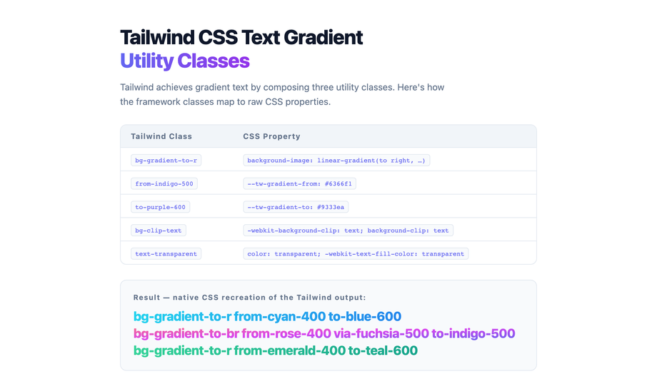
bg-gradient-to-r + bg-clip-text + text-transparent as utility classes. The 3-utility recipe: <h1 class="bg-gradient-to-r from-pink-500 via-violet-500 to-cyan-500 bg-clip-text text-transparent">Hello</h1>. Demo #18 ships this exact pattern. For arbitrary colours not in your config: bg-[linear-gradient(90deg,#ec4899,#8b5cf6,#06b6d4)] bg-clip-text text-transparent. Our CSS to Tailwind converter handles the conversion automatically. Tailwind UI ($300+/yr/dev license): includes a handful of pre-styled gradient hero patterns paywalled. shadcn/ui (React + Radix Primitives): no first-class gradient text component; community pattern is the 3-utility Tailwind recipe inline. Magic UI + Aceternity UI: React + Framer Motion gradient-text components — solid but React-only and add ~15KB dependency. Material UI / MUI: sx={{ background: 'linear-gradient(...)', backgroundClip: 'text', color: 'transparent' }} via emotion. Chakra UI: ships bgGradient="linear(to-r, pink.500, violet.500)" bgClip="text" shorthand — the cleanest API of any framework, though Chakra alone supports this pattern out of the box. Ant Design / Mantine / HeadlessUI / Radix UI: no first-class gradient text — userland. This collection gives you the same effects framework-agnostic (drop into any React, Vue, Svelte, Astro, Next.js, plain HTML), zero JavaScript for 18 of 20 demos, and no paid licenses.Why does my gradient text break in Safari (especially iOS Safari)?
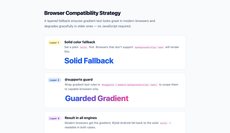
background-clip: text requires the -webkit- prefix in Safari iOS through at least Safari 17.5 (June 2026). Without it, the gradient simply doesn't apply — the text renders with its color value. Always declare both: -webkit-background-clip: text; background-clip: text;. Every demo in this collection ships the layered declaration. 2. color: transparent vs -webkit-text-fill-color: transparent: Safari historically respected only -webkit-text-fill-color. In Safari 16+, both work, but for maximum compatibility ship both: -webkit-text-fill-color: transparent; color: transparent;. 3. @property registration in Safari < 16.4: Safari ignores @property on older versions, so --angle animations fall back to step-change. Gate the modern recipe behind @supports (background: linear-gradient(in oklch, red, blue)) — this feature gate correlates with @property support in Safari and acts as a clean progressive-enhancement boundary. 4. light-dark() in Safari < 17.5: not implemented. Provide a @media (prefers-color-scheme: dark) fallback alongside. 5. filter: drop-shadow performance on iOS Safari 16.x: known to drop frames on low-end iPhones when applied to large text with animations. Pair with transform: translateZ(0) to force GPU compositor promotion. Demo #17 ships the @supports fallback pattern explicitly to handle all of these older-browser scenarios.How do I prevent CLS and keep gradient text from tanking Core Web Vitals?
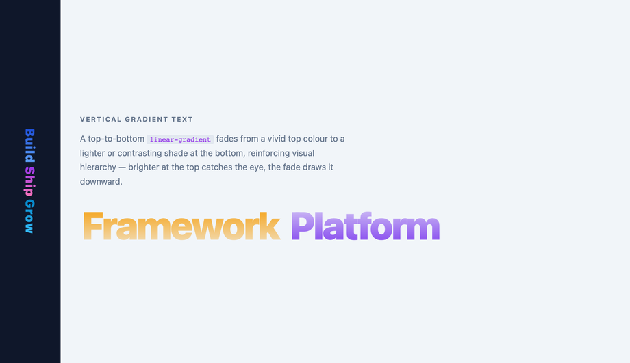
filter: drop-shadow applied via JavaScript after hydration causes a visual shift; (3) background-size: 200% + animated background-position on a hero title that resizes on viewport change triggers a layout recalc. CLS fixes: preload the variable font with <link rel="preload" as="font" type="font/woff2" crossorigin>, set font-display: optional (skip swap, use fallback if font isn't ready), inline the hero text + its gradient CSS in initial HTML (no JS hydration delay), reserve box dimensions with min-height or explicit line-height. LCP root causes: gradient hero defined in a heavy stylesheet that blocks first paint. LCP fixes: inline the hero gradient CSS in <style> in the <head>, defer non-critical CSS, use font-display: swap with a metric-matched fallback font so the gradient text appears within LCP budget. INP root causes: JS-driven gradient animations using requestAnimationFrame + inline-style mutation per frame keep the main thread busy. INP fixes: use pure CSS @keyframes + @property typed angles for time-driven gradients — GPU handles interpolation, main thread stays free. Tools to measure: Chrome DevTools Performance Insights, Lighthouse, PageSpeed Insights, Web Vitals Chrome extension, Core Web Vitals report in Google Search Console.Are these CSS text gradient effects free, accessible, and how do I attribute them?
prefers-reduced-motion: reduce (animations fall back to instantly-displayed final gradient), uses semantic HTML, and avoids gradient text on body-size copy (gradient text at <18pt routinely fails WCAG 1.4.3) — see the WCAG / EU EAA FAQ above for the full a11y pattern. Verify your specific brand colours and contrast ratios with axe DevTools, Lighthouse, WAVE by WebAIM, or the WebAIM Contrast Checker before shipping to EU EAA / US Section 508 / Canada ACA / UK Equality Act / Australian DDA audits — the demos are AA-compliant at large-text sizes by default but final colour choices and layout context matter. Related collections: CSS Gradient Text (20 demos — aesthetic-oriented sibling), CSS Text Animations (25 demos), CSS Gradient Animation (16 demos), CSS Background Animations (15 demos). Related tools: CSS to Tailwind converter, CSS Text Shadow generator.Related collections

15 CSS Background Animations
15 hand-coded CSS background animations with live demos — infinite shifting gradient, floating particle bubbles, parallax starry night, clickable cyberpunk ripple, sliding geometric grid, SVG wave overlays, glassmorphism orbs, aurora borealis ribbons, matrix digital rain, mesh gradient blobs, falling snow, morphing blob, retro synthwave 3D grid, infinite scrolling diagonal marquee, comic-book halftone dots. 100% Pure CSS, no JavaScript, no canvas, no particles.js. prefers-reduced-motion respected, scoped class names, MIT-licensed.

27 CSS Button Hover Effects
27 hand-coded CSS button hover effects — 3D press, neon glow, gradient slide, border draw, liquid fill, ripple, glitch text, and kinetic flips. Every demo is pure CSS (no JavaScript, no framework), tuned for 60fps with transform and opacity, and respects prefers-reduced-motion out of the box.

33 CSS Card Hover Effects
33 hand-coded CSS card hover effects with live demos — multi-axis 3D tilt with parallax, glowing gradient glassmorphic border, image zoom with content slide-up, front-to-back 3D flip, sibling de-emphasis with :has(), minimalist elevation, plus 27 more (elastic lift, conic-gradient border, holographic foil, neon sign, glitch RGB split, magnetic float, blueprint reveal, aurora drift and more). 26 pure CSS + 7 with a small vanilla JS snippet for cursor tracking. prefers-reduced-motion respected, scoped class names, MIT-licensed.